Branding design tips: Approaching a client brief
-
 The MOO Team
Share the post

MOO Designer Jon Misarski takes us through his approach to creating a brand identity for a fictional restaurant, from initial approach to knowing when it’s time to share a first draft with a client.
The client brief
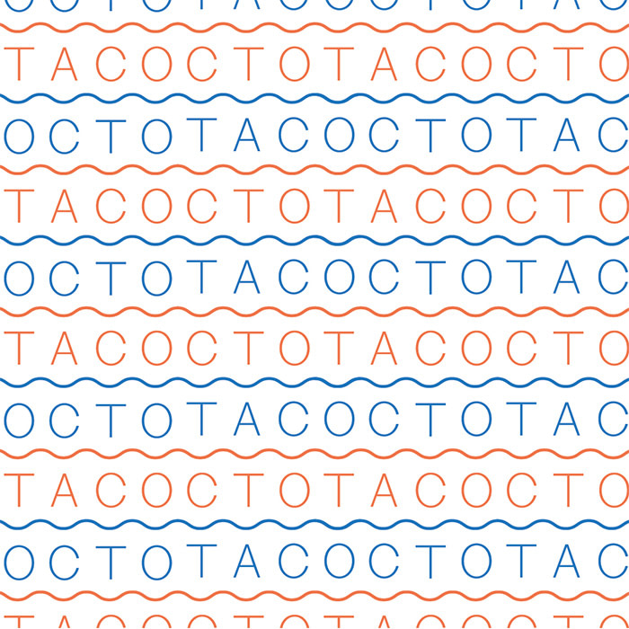
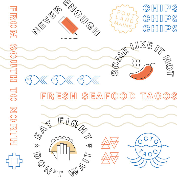
“Design a logo and visual identity for (fictional) seafood taco restaurant, Octo Taco. Using a suite of MOO print products, show us how you would bring the brand to life.”
The approach
Looking at the brief, my first instinct is to make note of what the parameters are and the must-haves. This brief had just enough detail to give me constraints to work in, while not being so open that I would be lost in the ether. Once I saw what the fictional brand should be (a casual restaurant that served local food), I then started brainstorming a restaurant that I would actually want to go to that didn’t seem to exist.
The ideas process
Once I had the name down, I started just scouring the internet for cool and interesting branding to take as inspiration. There were a few restaurants that I had in mind, and I tried to find the designers behind those brands. After pulling so many inspiration images, I had to narrow down to a few looks and feels for Octo Taco. Then I took out the sketchbook. I just start writing the name over and over in different ways: is it just a wordmark? is it handwritten text or a san serif font? Is there some sort of mark to go with it? Does the text fit into some sort of shape? I just want to try as many possibilities as possible, and drawing in a sketchbook helps me do that fast. I’m able to then start going through what I have down and start circling the ones that really work.
When to stop and share your work
This is really a hard distinction to make. I usually end up trying to build out as many assets of the branding as I can to see all the ways I can use the mark. If I have a good looking option but I’m not able to build it out that easy, I’ll usually table it for that round. I want to be able to make a few variations of the logo to be used for different applications. I then take a look at each direction and try to make sure that they each feel very different – to make the Client’s decision making as easy as possible. Since the first round is just the beginning of the process, I don’t want to get too far into building out brand until the Client agrees on the direction. The last thing I would do before showing a client would be to show a peer what I have and see what they think. I always get so deep in concentration when I’m designing that it really helps to get someone else’s opinion – they may like options that you don’t like or give reasons why one is better than the other. Once I’ve gotten through all of this, it’s usually ready to go in front of the Client.
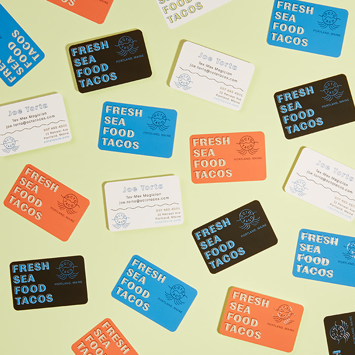
Original Business Cards With Rounded Corners
The inspiration
My main inspiration for this project was a bagel shop in Portland, Maine called Rose Foods. I was blown away by the branding and design when I went into Rose Foods, and I had to know who was behind such great design direction. With my mouth still full of bagels and lox, I googled “Rose Foods branding” and quickly found out that Office of Brothers (an agency out of Atlanta, Georgia) were the brains behind that brand. They do such an amazing job putting that Americana feel into their designs – each brand that comes out of that studio looks like it could have been around for 100 years.

The color palette
Since my brand was a taco restaurant, I went straight for a South Western palette of yellow, orange, and tan. But then I needed to pull in a bit of an ocean feel (you know….Portland, Maine….seafood tacos…), and that’s how the bright cerulean blue was brought in. I’m a big fan of bright colors! It really helps brands to stand out.
The font
I wanted a really simple sans-serif font that also looked pretty classic – so I chose Moriston by the Lost Type Co. It has that classic 1950’s quirk, while still feeling bold and readable.


MOO Products
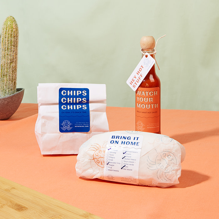
My favorite products that I designed for the Octo Taco suite are the Rectangle Stickers as labels, it was such a different use case for them so it was fun to innovate on ways of using the stickers.
Branding advice
I would say, that you can totally give your client what they want while also innovating and doing something that you are proud of. A lot of designers get disheartened when clients have a specific vision for their brand or project – but remember that you should just see their vision as a spring board rather than a brick wall. I’ve found it’s really nice to have parameters when you start out a project, but as you go those parameters might stretch a little as you continue to build out the design – and that’s a good thing. And the last thing I would say – keep it simple! Brands that stand the test of time have always kept it simple, and by doing that you will be able to stand out in this overwhelming world.

Products used
- Square Postcards as brand info cards to take away
- Rectangular Stickers as hot sauce bottle labels + ingredients labels
- Business Cards w/ Rounded Corners
- DL/Long Flyers as menus
- Round Stickers for packaging details
- Mini Cards as hot sauce tags
- Square Business Cards as Loyalty Cards
Keep in touch
Get design inspiration, business tips and special offers straight to your inbox with our MOOsletter, out every two weeks.
Share the post
Keep in touch
Get design inspiration, business tips and special offers straight to your inbox with our MOOsletter, out every two weeks.


