About this design
Back to designs
This is pure playfulness, done in a contemporary way. I wanted something where the message would be focus. The variety of typefaces and layouts give anything you say a kind of energy and brightness. Almost like fridge poetry.
About the designer
Stephen Turner is a graphic/product designer who grew up in Kent, and graduated from London's Brunel University with a BA in Industrial Design. Steve has a particular interest in brands, and loves everything minimal. When not at a computer, he’ll be playing sport (until injured, probably).
Browse Business Card designs by category
By industry
- actors (6)
- any (117)
- architecture (65)
- arts (28)
- beauty (37)
- beverage (32)
- caregivers (6)
- computing (27)
- consulting (35)
- crafts (28)
- dental (9)
- design (65)
- dj (14)
- education (15)
- estate (19)
- events (11)
- fashion (16)
- film (29)
- florist (13)
- food (32)
- gardening (13)
- health (37)
- it (27)
- journalism (22)
- landscaping (13)
- marketing (28)
- medical (9)
- models (6)
- music (14)
- parties (11)
- photography (29)
- pr (28)
- professional (53)
- real (19)
- recruitment (35)
- retail (18)
- services (53)
- spas (37)
- students (2)
- training (15)
- veterinary (9)
- weddings (11)
- writing (22)
By style
- graphic (235)
- illustration (35)
- photographic (95)
By colour
By category
Share this design
New to MOO?
-

Business Cards
From CDN$ 26.00 -
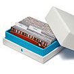
MiniCards
From CDN$ 26.00 -
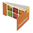
StickerBooks
From CDN$ 16.00 -

Sticky Labels
From CDN$ 28.00