Freelance Marketing: What Marketing Materials Do You Need?

Going freelance can seem scary, but make sure your customers aren’t afraid to pick you by creating sleek and professional marketing materials.
Deciding to go freelance is no small decision and it can seem understandably daunting. In earning the freedom of being your own boss, you’ve also lost the network of a whole office, where your PR, marketing, and admin were all taken care of by someone else. But not to fear, with MOO’s products, you can become a marketing material whizz in no time and get customers coming to you.

Freelance Marketing
Marketing yourself is the cornerstone of freelancer success, you may be the best photographer, baker, writer or artist around, but unless other people know that, you’ll not get any clients. Just like a storefront, your marketing materials should be impeccably presented and should have the same high standards that you are promising in your products or services.
You shouldn’t limit yourself to just Business Cards or just Flyers, he who dares, wins, and as a freelancer, you’ve already taken the risk of breaking free of the 9-5 so creatively marketing yourself should come naturally. But, just in case it doesn’t, here are some top tips for marketing materials and how to use them:
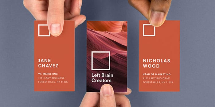
1. Business Cards
The classic. No business person should be without a Business Card. They may be an obvious choice but that doesn’t mean you have to go for obvious design. Make sure your card stands out, whether that’s by going Square, going Luxe or adding a bit of gold. Make sure your key details are included on here; your name, job title, contact number, email, website, and social media contacts should all be listed. If you have a brick and mortar location, make sure that’s on there too.

2. Postcards
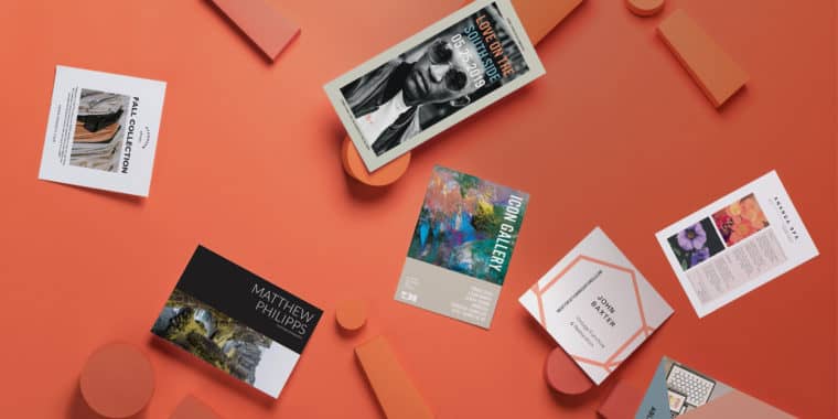
A great way to get the word out, Postcards neatly fit through letterboxes and are an eye-catching marketing item to distribute at events or leave on the countertops of neighboring businesses to spread awareness. Just like your Business Card, this should include all the key contact information for your freelance venture and should be designed to look and feel as professional as you are. If your brand is in a creative field like photography or art, then this little Postcard is a big introduction to your work, so take full advantage of the prime real estate that is its front. Use it to showcase your best works to potential clients and tempt them to look up your whole portfolio.
If you are happy to run introductory offers, add something like “10% off with this card” to encourage people to pick it up and then to engage with you.
3. Flyers
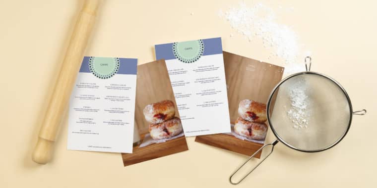
The timeless marketing material, Flyers should have a solid place in your freelance marketing tool kit. Flyers lend themselves to text just as much as imagery, so if you are offering a service like writing, consulting, etc., then they can be a better way to get your USPs out there if you don’t have a visual side to your brand. That’s not to say your flyers shouldn’t still look great, but with the generous space of a flyer (ours go up to US letter size) you can add in anything from a price list, a summary of your resume or a list of your professional skills.

4. Posters
As a freelancer, you’ll probably be looking for every opportunity to market yourself, so make sure you do it in style. Posters are a great way to draw attention to your brand. Talk with nearby businesses like coffee shops, bars and libraries and ask if you can put your poster up. Of course, they’re much more likely to say yes if its something worthy of being put in their window, or displayed in their shop. Our US letter size posters are a great choice for freelance marketing, they’re modest enough to not seem vulgar (we don’t advise you go making your brand a movie poster claiming your arrival in the area) and they’re instantly ready to be displayed on a wall for effortless exposure. In fact, all our poster sizes have been cleverly designed to be smaller than the regular, so they’re perfect for being pinned up wherever you need, without being too imposing.
Don’t think the display of your posters are up to other people, either, stick one on your car windshield, or in your window if you operate from home. Give them to friends, put one in the foyer of your apartment block (if that’s allowed). With a strong and professional design, no matter where you place your poster, its professionalism will shine through, even if it has been placed on a local lamp post.

5. Stickers
There are different ways to look at stickers as marketing materials. See them as stationary, to be placed on outgoing packages (eye-catching designs will still grab plenty attention as it makes its way to your client) and used to seal envelopes, or second, as a fun distribution tool. Ever notice how people stop if they think they’re getting something for free? Adding a bit of interactivity to your marketing is a great way to engage with people long before they become your clients. So, if you’re heading to an event to hand out flyers, bring some stickers with you. If they’re as beautifully designed as the rest of your marketing materials, why would anyone say no? It’s an especially good tactic for more playful brands or those aimed at kids, or you could even just give out a sticker instead of flyers (so long as you brand name and site is included in the design) as potential clients are less likely to immediately dispose of something that serves a function (or doesn’t need to be carried) and free art is always a plus.
6. Social Media
You may not think there is a connection between your printed products and your social media presence, but your designs should be a common factor among them all. Pick brand colors that run through all of your marketing materials and channels. Plus, if you have an Instagram for your business, then why not take a photo of your gorgeous, freshly printed marketing materials? Just see MOO’s Instagram for some great examples of how a digital photo of physical marketing products can be incredibly impactful.
You can also use social media to alert people of the events you’ll be at, or the locations where they can find your marketing, e.g., “We’ll be giving out our new stickers for free tomorrow at xxx!” or “Thanks to @nearbybusiness for representing! Pick up one of our freshly printed posters when you’re next in!” In short, if your marketing campaign isn’t tapping into social media, you’re doing it wrong.
Underestimate Nothing
Freelance marketing can’t be done half-heartedly. You need to see everywhere as an opportunity to display your brand. Sure, maybe your time with a client has come to an end but that doesn’t mean they won’t return. Sign off the work with a personalized flyer used with a compliment slip, a gesture of appreciation that clients are sure to love.
Keep on top of your client contacts list, and send out newsletters with your latest updates. If you’re a photographer and have new images to show off, add them to a Postcards and send them out to past clients to let them see your latest work and maybe tempt them to work with you again.
Back on the topic of social media, if you keep your channels updated and always give your followers something to engage with, you’ll always be fresh in their mind. But you also don’t have to wait for them to come to you. If you see a client you baked a birthday cake for is now preparing for a wedding, comment on their page, maybe with an offer of 10% to sweeten the deal. Even if you are rejected, other people will certainly take notice of this personalized gesture.
Be a fearless freelancer with marketing materials from MOO.com!
Whether you’re a first-time flyer designer or an old hand looking to improve your skills, we’ve got you covered. Here’s how to create a flyer with eye-catching looks and a compelling message.
So you’ve decided to promote your business by distributing flyers. Awesome choice! Flyers are an amazingly versatile form of marketing that can help you reach a wide audience in a short space of time.
Whether you hand them out in person, include them in your product packaging or have them handy at your premises, a well-designed flyer is a major promotional asset. But what does a good flyer look like?
What makes a good flyer?
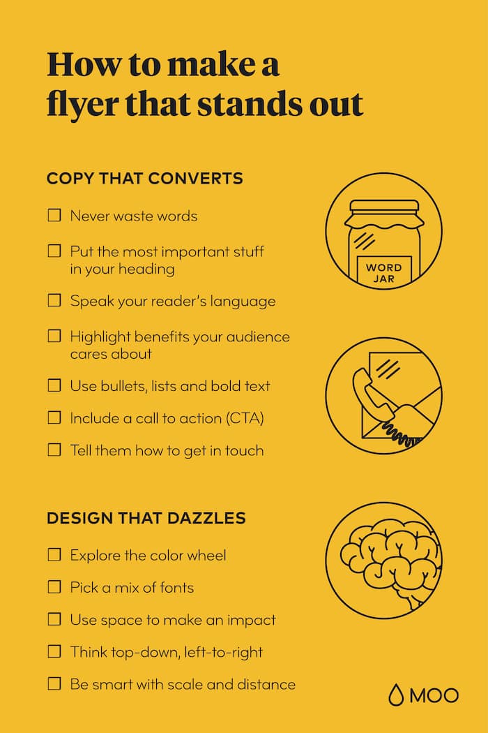
The best flyers have two essential ingredients:
- Copy that convinces and converts
- An appealing design that grabs attention
In this article we’ll run you through everything you need to get both these elements 100% nailed so you can start spreading the word with flyers.
Copy that converts
When it comes to writing copy for your flyers, here are the golden rules…
- Never waste words
Every word on your flyer needs to be there for a reason. Unlike a book or magazine, a flyer only gets a fleeting chance to make an impression. If your audience doesn’t connect with its message in that brief window of attention, it’s game over. So make sure every word matters and cut out any non-essential content before you send the final version off to the printer.
. - Put the most important stuff in your heading
Whether it’s “free lunch!”, “cool new store” or “restaurant opening”, the key message of your flyer should be stated in the most visible part of the copy – that big, bright attention-grabbing heading. Don’t think beginning-middle-end, and don’t build up to a big finish. Remember that short attention span and put your main message in big bold text at the front and center of your flyer.
. - Speak your reader’s language
Who is the target audience of your flyer? Young people, tech savvy professional nerds, those with English as a second language? Understanding who you’re talking to will help you to pick the right vocabulary to connect with your audience. It will also help you to…
. - Highlight benefits your audience cares about
What’s more compelling – “4 inches across, 1oz weight, ” or “feather-light and pocket sized?” The first statement gives the product’s features, the second is its benefits. And it’s benefits that get people interested.
. - Use bullets, lists and bold text
Copy is easier to read and digest if it’s written in an accessible way. Just look at this list – how easy would it be to absorb the information if it was all one long paragraph? Use bullet points, columns and bold text headings to break up your content and list key information such as price points, dates and times or product features.
. - Include a call to action (CTA)
A CTA is the part of your copy that spurs the reader into action. It tells them what to do next, whether that’s visiting your website, picking up the phone or booking tickets to your event. The CTA should be short and focused – pick a single action for the reader to take rather than including multiple suggestions, otherwise things can get confusing and the message loses its impact.
. - Tell them how to get in touch
Your flyer is a bit like a message in a bottle from your business. Unlike a website or social profile, it isn’t connected to anything, so you need to make it as easy as possible for people to find you and stay in touch. Add your street address (if you have one), URL, social profiles, and maybe a QR code for smartphone users to scan – especially handy if your flyer includes a discount or deal they can claim.
Design that dazzles
Here’s our cribsheet for creating a design that looks great, enhances your brand and amplifies your flyer’s message.
- Explore the color wheel
When you’re choosing a palette of colors for your flyer, it can really help to have a reference point for which colors go together, especially if you haven’t yet established your brand colors. A color wheel can help you achieve bold contrast and avoid any cringe-worthy clashes.
. - Pick a mix of fonts
Decorative fonts can add flair and style to your creative flyer design. They’re great for large headings because they’re bold and attention-grabbing. But body copy in smaller point sizes needs to be legible and clear, and in this part of the flyer, decorative fonts can create a cluttered reading experience. Mix your decorative headings with a plainer font lower down, such as a sans-serif or modern style, to get the best of both worlds.
. - Use space to make an impact
Sometimes empty space can be as effective as filling a flyer with design and excitement. White space or a plain background can create more emphasis for the content you do include. It ramps up the contrast and acts as a frame for your message and imagery.
. - Think top-down, left-to-right
For English and most other Western languages, we read things from left to right, starting at the top. Use this to your advantage by structuring your flyer design with the heading at the top and any smaller copy further down the page. Your CTA can appear further down or in the lower right corner, as it will come into play once the reader has absorbed the headline and main message.
. - Be smart with scale and distance
Your flyer needs to tempt people from a distance so they’ll pick it up. It also needs to keep their attention when it’s being read at arms-length. Cater to both these viewing distances by putting key messages in large fonts and high-contrast colors. The same goes for your hero images – they need to be recognizable and effective from a distance, but contain enough detail to add value close-up too.
.
Too long, didn’t read?
Fear not: this handy checklist will help you create a Flyer everyone will remember.
Browse a wide range of MOO flyer templates to gain inspiration for your project, or customize them into one-of-a-kind designs with your own logo and images.
Designing your flyer from scratch? Check out our guide to flyer sizes and dimensions.