Lucy’s Logos: the lowdown on creating a great brand mark
We caught up with Lucy Barr-Richardson to find out how she makes businesses shine.
-
 The MOO Team
Share the post

Self-taught UK designer Lucy Barr-Richardson has made a career from understanding brands and creating the perfect logo design to represent them.
We caught up with the creative brain behind Lucy’s Logos to find out exactly what goes into making a great brand mark and how she makes businesses shine with her fiercely feminine palettes and retro typefaces.
Tell us a bit more about yourself and your background. How did you end up launching your own business, Lucy’s Logos?
If I’m completely honest, Lucy’s Logos was never in the plan. And if I’m even more honest, I never really had a plan. I left school, went to college and studied professional cookery. Once I figured out I much preferred to eat the food rather than make it, I got myself an office job and worked as an administrator and marketing assistant for two years.
Lucy’s Logos was never in the plan
Then I landed my first graphic design job and spent every spare minute teaching myself the applications, practising and creating. Friends then started asking me for logo designs. I moved jobs to an amazing design, print and manufacturing company and really honed my skills. I learnt so much being there, all while my business was blossoming in my spare time and I unintentionally turned my little side-hustle into a fully-fledged business. It got to the point where my business was so busy and I felt ready to take the leap. I’ve never looked back since.

What are the first steps you take to create a logo?
The first step is always to find out what the client wants. That’s visually and verbally. I always get my clients to write me a brief, explaining what their business is about, their target audience, goals, hope and dreams for their business. This gives me the best vision of where they see their new branding taking them. Then, what styles they like visually. As brand design is mainly a visual process, a mood board created by them is often the best indicator and guide for how they envision their branding.
From there, it’s all about chatting and refining ideas until we reach a mutual agreement on the direction we want to go in. Some clients know exactly how they’d like the design to be, others need a little more guidance and advice, but that’s what I’m here for!
Where do you find your inspiration?
When I first started my business, I spent a lot of time looking at similar logos in the industry; gauging what colours, styles, fonts, and illustrations worked and were trending. As I’ve never had any formal training, I was very much just winging it and learning from whatever I could get my eyes on.
Now I have more experience, I find I get a much better outcome from just focusing on my brief rather than filling my head with hundreds of ideas from Pinterest (or other sources). Although, one thing I do always use Pinterest for is colour palettes. Not from other logos, but from paint sample pictures and aesthetic photographs. They’re much more muted and soft, which lends itself to the colours I gravitate towards.

What are the most important elements of a brand’s personality you look to capture in their logo?
Lots of my clients are self-employed, so the most important personality to capture is often theirs.
Blondy was designed for a friend of mine, so distilling her personality through branding was easy for me. There was a trust already there, and she was happy to give me full freedom without any brief at all.

For clients I don’t know, it all comes back to the brief. You can actually tell a lot about someone’s personality by the styles of design they’re drawn to. Everything from the colours to the style of illustrations, interior decor and typography they like gives me a clue to what they want in their own branding. Nail Chark, Get Tipsy Nails and Nostalgia Nails are just a handful of my nail technician clients whose brands are unique to them – I had to reflect their personalities without knowing them personally.

Your lettering has a lovely retro vibe to it. What inspires you to design this way?
I’ve always been described as an “old soul”, but I definitely think my style has developed over time alongside my skills. I’m also a massive fan of Andy Warhol’s pop art paintings, which has probably had an influence.
I first discovered a love for 3D retro-style lettering just over a year ago after getting some practice creating my own little quotes and inspirational posts on Instagram. I then convinced my client Lashin’ Ell to have the same style for her logo. Now, people send me her brand all the time as a reference for what they want for their own business.

How does the process of creating an illustrated logo differ from one that’s type-based?
For me, illustrated logos are easier to get right the first time. With typography, I find that because there are so many different typefaces out there, my clients sometimes struggle to explain the style of font they want or I may take a slightly different impression from their brief than they do. I’ve found that sometimes, even when I do get the style they’re after, it unfortunately just doesn’t work for that brand. That then just requires some additional discussion to explain why and suggestions for what will work better to achieve the same goal just in a better way visually.
With illustration, it’s much easier for clients to describe what they want and show you the styles they like. They’re often more consistent too. A unicorn is still a unicorn whether it’s in a logo or not — it just takes a little while to perfect.
How do you ensure a client’s logo works across a range of branding materials?
Make more than one! I live for submark designs. They make life so much easier. As much as I’d love to say I’m perfectly capable of creating one single logo for every client that works on every platform of design they could possibly ever want, I can’t. Sometimes it’s just not doable. And anyway, why would you want one logo when you can have more?
The first client I created lots of branding collateral for was Daisy Chains. We did everything from the logo and submarks, to brand patterns and nearly every piece of promotional print there was — as well as website banners, packaging, swing tags and wallpaper. The fun and friendly nature of her brand made it so easy to add extra design quirks across the board. We even created a mascot dog, Rupert, who features on Business Cards, Stickers and illustrated stamps on Postcards.

Many of your logos use pastel palettes — are these colours you typically like to work in?
My clients are predominantly women, so I often naturally work in “feminine” palettes. I personally prefer working on this type of branding because I find it much easier to relate to, but it’s equally refreshing when I then get a more “masculine” brief — such as the ones I received for my clients Lone Wolf Flooring and On The Marc Kitchens.

The colours, illustration style and fonts I used for these brands’ aesthetics are different to the ones I usually work with and it was nice to switch up my approach. After all, I didn’t become a designer to do the same thing every day!

What happens when a client has a really clear idea of what they want, but you have a different direction in mind?
If my idea is completely different, I’ll explain the reasoning behind my thought process and try and meet in the middle. If it’s only slightly different, I’ll often design both options and let them choose their favourite. If they don’t like my idea at all, then I just do my best to meet their expectations. After all, it’s their logo, not mine, so they have final say — you can’t win them all.
Since becoming more established, I’ve had a lot more people come to me saying “just do what you think. I trust your approach,” which is really rewarding. The lovely ladies at The Seven put so much trust in me to create the perfect brand for them and we hit the nail on the head! I don’t remember making any adjustments to the initial design at all.

I do occasionally get briefs that are completely not my style and so I don’t take them on. The most important thing to me is that my clients are happy at the end of it all, so if I don’t think I’m the right person for the job, I’ll try to refer them to another designer that’s better suited and I have a relationship with via Instagram.
What’s the most challenging brief you’ve ever worked on?
Every brief and client has its own challenges. Of course, some can be more challenging than others. But there’s nothing a good conversation and regrouping can’t solve. I think when I was less experienced, I would panic in situations where I didn’t immediately know what direction to go in if the initial design didn’t work. But seriously, it’s all about talking! A lot of the time you’re working with people you don’t know, so understanding how they communicate their visual ideas is key. Once you’ve mastered that, you’re good to go.
I recently worked with a new start up business called Good Grief – who create care packages for all of life’s twists and turns (the unfortunate ones). The design turned out amazing, but we definitely struggled initially to find that perfect vibe and visual for the main logo. After a bit of back-and-forth we of course found “the one”, combined it with a great colour palette and the rest was pretty smooth sailing after that!

How do you think our physical experiences with branding changes how we connect with businesses?
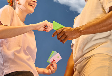
People always feel much more connected to things if they can hold them in their hands. I’m one of those people that walks through clothing stores and touches every single item (pre-covid, obviously). The nicer they feel, the more likely I am to buy them, and I think the same principle applies to how people engage with branded print.
For a long time, I only ever posted Photoshop mockups, which as we all know, is incomparable to a snap of some high-quality print. When I started posting pictures of my clients’ printed work, it boosted my business massively because potential clients got a true picture of what their brand could look like.
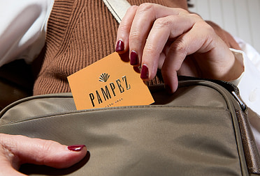
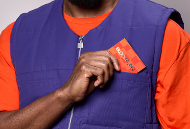
When it comes to print, if it feels rubbish and looks rubbish, it will become rubbish. So if you want someone to keep your Business Card in their purse, you better make sure it’s amazing — and that’s why MOO is always my print partner.
You’ve been a freelance designer for over a year now. What do you find the most rewarding and the most challenging about being your own boss?
I’m not sure I could exactly pin-point what is most rewarding about being self-employed. Basically, just being your own boss comes with a whole heap of perks. I’ve never been the best with “authority” as such, so working for myself is definitely better suited to me and my personality.
It’s true what they say; you reap what you sow
There are parts of being employed that I miss, my life was definitely less stressful. You don’t quite realize how much goes into running a business, no matter how small, until you do it. You are literally every job role. Owner, designer, admin, payroll, cleaner, stockist, HR, PR, social media manager… The list is literally endless. But it’s true what they say; you reap what you sow. The 3am working is worth it. I don’t know who I’d be without Lucy’s Logos and I don’t ever intend to find out!

What does your workspace look like and how do you stay productive?
My office is my pink, productive heaven. It’s where I’m most productive and where I feel most inspired. My worst fear about home-working is definitely getting cabin fever, so I’ve tried to make the space as clean and breathable as possible. My desk is right by the window so I get a good amount of daylight and fresh air (plus I can spy on my neighbours too for a little daytime entertainment). I do switch around sometimes though, one of the perks of working from a MacBook and having a decent lap-desk is that you can move around the house. Somedays you just need the comfort of your sofa or your bed – major WFH perks too.

As a designer I’m easily pleased by anything pretty, so most of the things in my office are for display purposes only. I have a custom neon sign of my logo, pictures of pink things, personalized pencils, and the coolest orange juice vase. The main thing I have to make me feel productive is my mesh board with all my Business Card and Loyalty Card designs pinned to it. If I’m honest, it’s basically a MOO shrine, but it makes me feel so incredibly proud and helps keep me motivated when I’m feeling a little bit “meh” about my work. I also have my radio which keeps me sane and stops me talking to my lamp.

Do you have any tips for fellow creatives looking to make the leap?
There are obviously huge financial risks in leaving your secure full-time job to run a business, so make sure you have a backup of savings behind you. Remember, no sick or holiday pay when you’re self-employed! It’s also vital to have a designated space to work, whether that’s in your home or a coworking space, or even a coffee shop.
Take your time and build up your business gradually
I think my main tip would just be not to rush and speak to as many people as you can who’ve done it before. Take your time and build up your business gradually until you feel completely ready in both your business and yourself – the world isn’t going anywhere but being self-employed definitely isn’t for the faint-hearted. You have to really love what you do to convince yourself to get out of bed in the morning when you’ve got no one to answer to but yourself.
Give your logo design the canvas it deserves with MOO Business Cards.
Keep in touch
Get design inspiration, business tips and special offers straight to your inbox with our MOOsletter, out every two weeks.
Share the post
Keep in touch
Get design inspiration, business tips and special offers straight to your inbox with our MOOsletter, out every two weeks.