MOO’s Head of Brand Design on how to build a color palette for your brand
Building a color palette for your brand? MOO’s Head of Design gives us the lowdown on perfecting your visual identity.
-
 The MOO Team
Share the post

Want to create a standout color palette but new to the branding game? Or perhaps you’re looking to shake up your visual identity with a brand refresh?
We caught up with MOO’s Head of Brand Design, Anna Ebubedike, on how to build an identity that best suits your brand – from finding inspiration, to choosing and testing colors.

Why is it important to choose the right colors for your brand?
Choosing the right colors for your brand is like putting the right clothes on in the morning. It all says something about what you stand for and represent.
Your personality does a large amount of that through what you say and how you act, but what you choose to dress yourself in will also have a bearing on how people perceive you. It’s another opportunity to strengthen your brand proposition. For instance, if your brand has a fun, vibrant and playful outlook, you probably wouldn’t choose to support it with a palette of entirely muted, dark colors.
Not sure what colors are right for you? Check out our beginner’s guide to choosing your brand colors.
How did the creative team decide on our MOO palette and logo colors?
We did an extensive amount of research into how we were using our old color palette, and how the UX team used color online, versus how it was used in print.
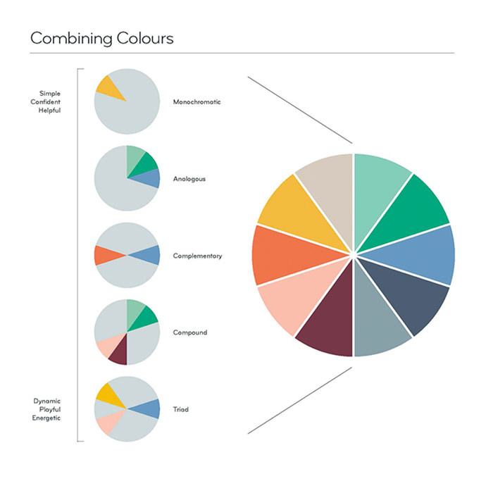
From that, we could identify roughly how broad we needed the spectrum of colors in our palette to be. We wanted to ensure there was enough flex to use the palette across a range of touchpoints, while not being so vast that we couldn’t have a sense of consistency across our brand.
We also identified that beyond the core palette, there would also be a need for both tints and shades of each of those colors – mainly for use online. This also allowed us to slightly shift our color choice in photography to give a sense of seasonality. The neutral colors in our palette may not be as memorable, but they’re an important inclusion to allow the brighter colors, or product to shine through.
Our logo is predominantly used in our MOO Green – and in instances where people may not have seen the brand before – to build brand recognition. This specific shade was selected because in the competitive field, it stood out. Greens also tend to have quite a positive emotional response, so we spent time identifying a green that would ‘pop’, read well on a white and be distinctive to us. When people are familiar with the brand, we then use the logo in other colors from our palette.

Building a palette seems like a big job. Where do you start?
Yes, it can take a lot of testing to build out a color palette which is flexible enough for all your needs and touchpoints, which prints well and is accessible online.
I would always start any color exploration by undertaking an ‘audit’ of how you presently use color, to identify what is working and perhaps what your new requirements are. For instance, you may think you need a much larger palette, but upon doing this research, you may actually find you don’t need more, you just need a harder working selection that works better cross-platform.

Where do you go for color inspiration?
Color inspiration can come from literally anywhere – a florist’s window, a print of a painting on a postcard, your socks. Sourcing inspiration in this way is more likely to ensure that what you end up with is personal to you or your brand.
That said, if you feel you need a steer, then fashion is always a great cue for exciting and modern color palettes, via fashion blogs, magazines or Instagram accounts. You may want to be careful not to pick anything too ‘of the moment’ though as it will possibly date quickly. It could also become popular for many other brands too, making it hard for you to stand out. So for a more timeless palette, and greater brand differentiation, always add your own twist.

What are the signs your business needs a color rebrand?
If your color palette is noticeably dating your brand, then it’s probably time for a rethink. This could take the form of a complete shift, or just a ‘freshening up’ of your existing colors.
The other thing to watch out for is if your brand is getting lost amongst any competitors who have opted for a similar color range. If you want people to notice you, then you need to be doing something different from everyone else, and color is one way to achieve that.
If you want people to notice you, then you need to be doing something different from everyone else, and color is one way to achieve that.
How can you ensure your color palette is consistent across your brand?
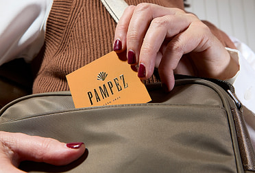
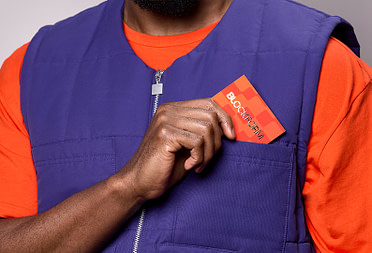
If you are a relatively young brand, it’s essential to use every touchpoint as an opportunity to gain more recognition – and the consistency of how you use all your brand elements, including color will be key to this. Try to ensure when you select your color palette that everything works equally well for print as for online use. You want your Business Cards, Postcards and any other printed material to look consistent with the digital versions. Try and keep your color selection to the bare minimum for your requirements. Color swatch books are a great tool for this, as they will always give you a hex breakdown for online too. But be prepared at times to choose a slightly different color reference to get the best match.
As your brand gains more notoriety, you can afford to take greater risks with how you use your color palette, and have a more free and playful approach.
Ready to get your brand colors out in the world? Put your palette on print with our range of products
Keep in touch
Get design inspiration, business tips and special offers straight to your inbox with our MOOsletter, out every two weeks.
Share the post
Keep in touch
Get design inspiration, business tips and special offers straight to your inbox with our MOOsletter, out every two weeks.