About this design
Back to designs
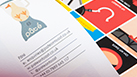
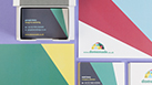
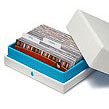
My inspiration for the front of this design actually came from pharmaceutical packaging, which is very clear and to the point. But I wanted to add something unexpected to it. As I was thinking, I noticed a candy wrapper on my desk (I have a sweet tooth), and had a lightbulb moment! So it was colorful packaging that inspired the patterned back you see on this design.
About the designer
Felix Ackermann is a freelance graphic designer and self-confessed typography geek. He graduated from Central Saint Martins College in BA Graphic Design, after spending his first two undergraduate years at Curtin University of Perth, Australia. Felix has worked for City & Guilds, Queen Rania of Jordan, and is part of Ludopoli's design team. He has a special interest in pushing the boundaries of conventional typography and his work has been featured in Wallpaper magazine, among other arts and design related publications. Felix has spoken at Typography Day, an international typography conference. Felix grew up in Germany and has lived in both Swaziland and Australia. He now resides in London.
More Luxe Letterhead Designs like this
More about MOO Luxe Letterheads
Browse Luxe Leterhead designs by category
By industry
- actors (12)
- any (16)
- architecture (54)
- arts (31)
- beauty (26)
- beverage (12)
- caregivers (8)
- computing (27)
- consulting (34)
- crafts (31)
- dental (11)
- design (54)
- dj (12)
- education (13)
- estate (21)
- events (24)
- fashion (29)
- film (19)
- florist (10)
- food (12)
- gardening (10)
- health (26)
- it (27)
- journalism (23)
- landscaping (10)
- marketing (38)
- medical (11)
- models (12)
- music (12)
- parties (24)
- photography (19)
- pr (38)
- professional (37)
- real (21)
- recruitment (34)
- retail (44)
- services (37)
- spas (26)
- training (13)
- veterinary (11)
- weddings (24)
- writing (23)
By style
- graphic (67)
- illustration (8)
- photographic (19)
By colour
By category
Share this design
New to MOO?
-
Business Cards
From $21.00 -
MiniCards
From $21.00 -
StickerBooks
From $13.00 -
Sticky Labels
From $22.00