


Volete provare la qualità del nostro cartoncino e della stampa? Create una confezione campione di biglietti da visita!
Potrete caricare le vostre immagini o guardare le nostre per farvi un'idea di come funziona.

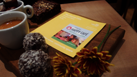
This design was inspired by architecture, structure and a sense of organization, since everything is centered, separated and easy to read. I used a clean type layout on the front, with classic serif details mixed with the modern sans serif name on the back. A full upload slot allows for extra customization with an image or logo.
Emily is a Boston-based designer who earned her BFA in Visual Communication Design at the Hartford Art School. When not working at MOO she's most likely in her tiny home studio, sewing her own dresses, reading lots of non-fiction, and making breakfast for dinner.
Volete provare la qualità del nostro cartoncino e della stampa? Create una confezione campione di biglietti da visita!
Potrete caricare le vostre immagini o guardare le nostre per farvi un'idea di come funziona.