Acerca de este diseño
Volver a los diseños
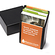
I’ve used the negatives to steer the design. The imagery is meant to be beautiful, almost epic. And to me, monochrome just feels quite classic. The other side continues the negative theme, but overlays bold monochrome details over the top. It’s a great design if you’re a director or producer .
Acerca del Diseñador
Sthephen Turner es diseñador gráfico y de productos criado en Kent y licenciado en Diseño Industrial por la Universidad Brunel de Londres. Steve tiene un interés especial en las marcas y le gusta todo lo minimal. Cuando no está frente al ordenador, pasa el tiempo haciendo deporte (esperemos que no se lesione).
Ver diseños de Notecards Luxe por categoría
Por estilo
- graphic (92)
- ilustración (6)
- photographic (14)
Por color
Por categoría
Compartir este diseño
¿Eres nuevo en MOO?
-
Tarjetas de Visita
Desde 16,94€(14,00€ IVA no incl.) -
MiniCards
Desde 14,52€(12,00€ IVA no incl.) -
Cuadernos de Adhesivos
Desde 8,47€(7,00€ IVA no incl.) -
Etiquetas adhesivas
Desde 18,15€(15,00€ IVA no incl.)