Behind the brand refresh: 500px
-
 The MOO Team
Whether you’re hoping to attract new customers, inject some newness into your business or maintain your market position, a brand refresh may be in order. This is exactly what 500px, an online community of photographers and stock photo marketplace, did last last year. Here’s the story behind their refresh.
Why redesign?
For 500px, the reason for the rebrand was simple: Growth. When 500px launched the high-end photography photo-sharing site six years ago, they were determined to bring the “best of the best in photography” to market. With 7 million registered photographers and over 65 million photos to date, 500px has reached a certain level of visibility. But as their community grew they discovered the original logo wasn’t translating to the audience as well as it had in the past.
From old to new
The former logo, which was designed by co-founder, Evgeny Tchebotarev in 2009, worked well for six years. It was recognizable — with the infinite zoom, focal length and camera references. “It’s scary to change something that’s so important [and recognizable] to your brand. We knew that we needed to do this redesign to best represent the brand and what we do. But there were clear objectives before we kicked off the project and we were keen to keep the existing brand values” the 500px team was determined for the logo to “match” their community.

Process
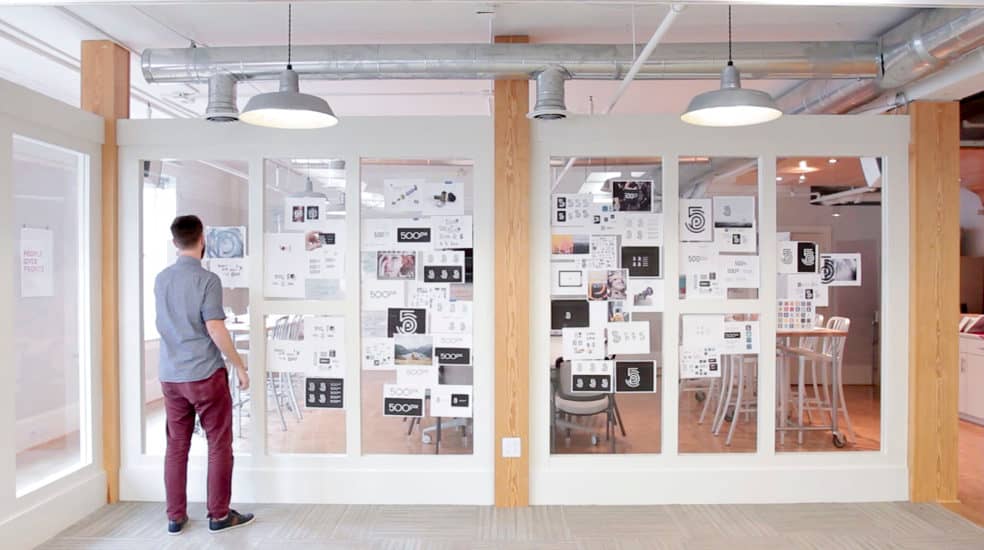
The team appointed branding experts at Focus Lab, to work through all phases of the redesign. Ellen Desmarais, VP of Marketing, led the effort on the 500px side, working very closely with Focus Lab’s Branding Designer Chase Turberville and Creative Director Bill Kenney to bring the new look to life. But the ask was big: Executing on a logo that would convey personal expression, or an artist’s touch within the mark, to suit their community of expert photographers — and fitting a lot of different concepts into one.
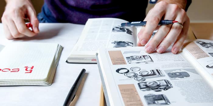
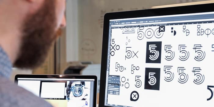
New to Focus Lab in August, Turberville wasted no time and dug in to the discovery process, business and competitive audit before moving to creative concepting. He spent time in analog mode, drawing the ideas in his head, working them out on tables covered in butcher paper, with books and other materials by his side. “We want to get as many concepts in front of the client as possible during this ‘throwing at the wall’ phase.”
After eight weeks and 50 different iterations of concepts, the collective team narrowed to two concepts they were comfortable moving forward with. Turberville cites the two concepts, “running parallel for quite some time — it was hard knowing which road to go down. Approaching the deadline, we had to choose at the fork in the road.” They hit a stalemate, and as the one producing 95% of the design work, Turberville, weighed in with a recommendation for 500px to “preserve their reputation as photography experts” by pursuing concept #1 … and they did.

The new look 500px
In effect, the mark is sophisticated and text-focused, preserving the rich history of the name with the “500px” inside the mark, and shaped to look like a lens. It’s photographer-focused, with the “p” (or photographer) in the middle — and it also resembles a film canister.
The new mark has been likened to a fingerprint because of the treatment of concentric circles. But that wasn’t Turberville’s initial intention. “I was trying to mimic the movement of the camera lens – which brings in concentric circles = community – then it started to turn into a fingerprint. It turned out this way organically.”


Launch into focus
Despite the collaborative nature of the relationship between creative and client, there were some nerves around the launch last October. The team’s hard work paid off as the new look of 500px has received high praises overall from both the design and photography communities, as well as positive press reactions. “We’re having an easier time talking about who 500px is and what we do,” Shutsa says. “We did a lot of research and user-testing, and it was obvious to our audience that we’re a photography company.”
“I love it — and I’ve never been through such a big unveiling before,” Turberville says. This refresh was more than just a new logo. “It was the start of a new 500px, which is why we created meetthenew.500px.com. We have an awesome and engaged community, and we thought it would be great to show them why we did it.”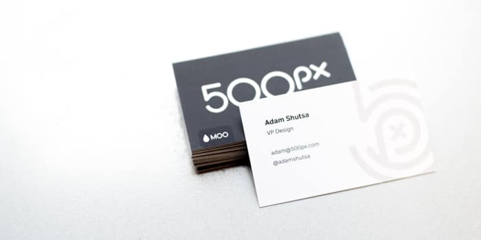
Have you been through a business-wide rebrand? Or perhaps have been inspired to ‘press refresh’? Let us know in the comments below.
Keep in touch
Get design inspiration, business tips and special offers straight to your inbox with our MOOsletter, out every two weeks.
Share post
Keep in touch
Get design inspiration, business tips and special offers straight to your inbox with our MOOsletter, out every two weeks.