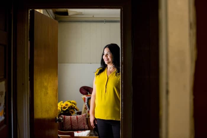
They make MOO: Meet Jaslene, email marketing specialist
Jaslene tells us about her secret superpower, her thought on hybrid working, and more.
It takes a talented bunch to make the MOO magic happen. Lucky for us, that’s exactly what we’re made of. Meet the people who make MOO a great place to work – starting with Jaslene.
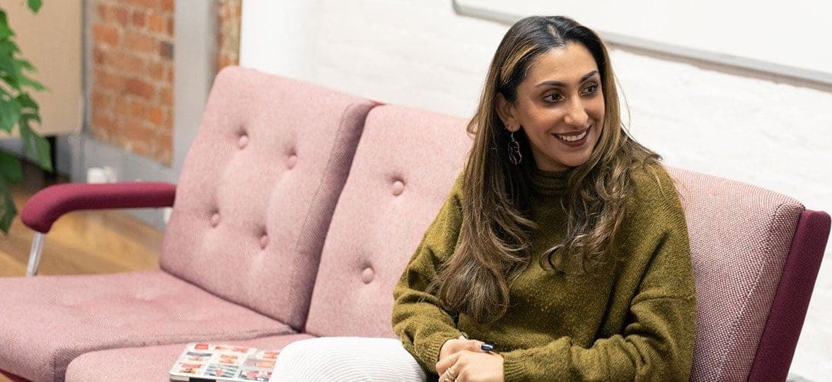
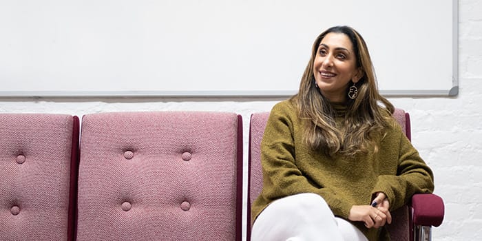
Jaslene Ubhi is an email marketing specialist in the London team. She’s also a calligraphy expert, a soccer fan, and head over heels for her maltipoo, Ziggy. We stacked a deck of questions to pick from in front of her and let chance decide her (interview) fate.
What do you do at MOO?
I’m primarily focused on email marketing as part of our wider digital marketing strategy. My role involves end-to-end planning, building and execution of all our marketing email campaigns, sales promotions, and broader cross channel marketing across the business.
What would your motto be?
I don’t really think I have one single phrase that I totally live by. Probably just something along the lines of “You do you, boo” – except I guess it’s just me saying it to myself? Not sure how inspiring of a motto that is really. Maybe it’ll sound better in Latin.
If you weren’t doing this as a career, what would you do?
I’ve always thought that I’d make a great primary school art teacher. You know, finger painting, paper maché, all the fun stuff. It would probably be super messy, but I guess you get to create positive art experiences. Plus, little kids just crack me up all the time – they’re hilarious.
Productivity-wise, are you an early bird or a night owl?
Definitely a night owl – I’m practically full-on nocturnal! As the rest of the world tucks into bed, for me it’s like a light switch flips on and I can finally think clearly. I am just so much more creative and productive at night because that’s the time when there are no interruptions and minimal distractions. I’m a big believer in bi-phasic sleep patterns, so sometimes I’ll have a short nap and then wake up later so I can focus on those tasks that require me to bring my top mental “A game”.
What’s your take on hybrid working?
I’d been an advocate for hybrid working even before the pandemic hit because I know myself when and how I am most productive and I know it’s not the same for everyone. The flexibility of hybrid working allows people to have more control of their work schedules and make their own decisions on how to best use their time without it being frowned upon. As long as there are clear boundaries or guidelines, I believe it can lead to more efficient productivity and better work-life balance – which is a win-win for everyone.
What’s your secret superpower?
Super (brain) speed. The ability to have a zillion thoughts racing at once, only to forget them three minutes later.
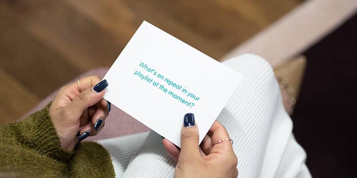
What’s on repeat in your playlist at the moment?
I like all different kinds of music genres, but I can’t live without my reggaeton music – so at the moment it’s probably Poblado (Remix) by J Balvin.
How do you recharge?
My job tends to involve me sitting and looking at a screen for hours, so when I want to disengage, I try to stay away from my phone and laptop as much as I can (unless it’s super urgent or I’ve got like 246 missed calls from mum). A nice, long soak in the tub always helps me feel a bit more rejuvenated. I’ve also got into ASMR a bit recently – there’s this channel on YouTube called The French Whisperer, so sometimes I’ll pop that on for a listen and practice my breathing for a bit before I go to bed.
What’s your favorite MOO product?
It would have to be the MOO Hardcover Notebooks! I just love the premium quality and thick feel of the paper, plus the lay-flat design makes it the perfect notebook for my bullet journaling and brain dump doodles.
What do you like to do when you’re off duty?
I like to try and tap into my creative side when I’m unwinding, so I often paint in the evenings after working in the day. Doing some painting while watching a juicy serial killer documentary on Netflix is basically my perfect idea of relaxation.
Want to join the MOO crew? Connect with us on LinkedIn and check out our current vacancies here.
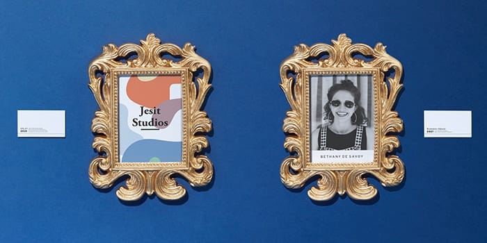
Thirsty for gifting inspiration? Get inspired with four brands who created unique Water Bottles with MOO.
Blue Ion: let creativity flow
Blue Ion is a full-service marketing and creative agency in Charleston and Greenville, South Carolina. Curiosity and creativity are embedded in the brand’s DNA, making them a powerful multi-disciplined team up for any challenge.
They were looking for a client gift that could also be a treat for their employees. “We do a lot of project-based work and it is our little way of saying thank you to our clients.” Since the pandemic, they have also decided to share client gifts with their employees, too.
“Every year we try to come up with a theme that can show off our design skills and encourage our clients to stay creative.” This year, the theme was “Quench Your Creativity”. Needless to say, MOO’s custom Water Bottles were the perfect fit.
For the Water Bottle design, Blue Ion went all in with an illustration that wouldn’t look out of place on a band poster. “Our brand colors are black, blue, and yellow. We thought that the design would pop off of a black bottle the best. We did color as that allowed us more flexibility with our design and allowed us to use our other brand colors.” We heard even the mock-ups got rave reviews.

Factomos: drink pink
Factomos is an invoicing platform based in Paris. With their winged pig mascot, they’re distancing themselves from the overly serious reputation of accounting to build a fun yet trustworthy brand.
They turned to MOO to find a “quality and differentiating gift” for their partners. “[We wanted] a thank you gift to give at the start of a new year, with a hope of renewal, closely linked to water. When we discovered the custom bottles on the website, we really appreciated the shape and the exclusive choice of colors.”
Factomos worked closely with MOO’s design services team to create a unique Water Bottle. “We chose pink to assert our brand, because our graphic charter is a pink pig. Then, because it’s a pig [it evokes the farm], and the shape of the bottle made us think of milk. [So we wanted] to recreate a bottle of milk with our logo.”
The team loved their “pig milk” idea, and came up with three proposals. “In general, we like working with MOO for their design [approach]. The team was attentive and the proposals were relevant.” The winner was a minimalist pink bottle with an elegant white design.
Factomos already has more plans for their custom Water Bottle. “We have put a few aside to organize a contest with our customers (we’ll keep one or two for ourselves, of course).” Pigs do have wings.

MainStreet Bank: new avenue
Based in Fairfax, Virginia, MainStreet Bank is a customer-focused community bank that offers a variety of services. As part of their new corporate brand launch, they decided to design a gift that would introduce this service to employees, shareholders and customers.
MainStreet created a full brand identity for this new part of their business. “Our design team developed a brand image and graphics package to cover all areas of our brand presence. The icons included on the bottle are part of a total brand image package that invokes the idea of movement, while utilizing a contemporary and international color palette.”
The team picked both Cloudy Grey and Midnight Blue to make the brand elements stand out. “We felt the Cloudy Grey provided a great contrast to display our standard color palette, and the Midnight Blue allowed us to show off some of our secondary palette as well.”
“It will be included as part of a larger package […] to generate excitement and show appreciation”
These personalized Water Bottles will spread the word about the new brand across the business – and outside, too. “The bottle will serve different occasions. For our employees, it will serve to kick off a new corporate brand. It will be included as part of a larger package that we will present to the team to generate excitement and show appreciation for their hard work. For new employees, it will be part of an onboarding gift package. And finally, it will definitely make an appearance at a trade show or two.” A multifaceted gift.

Beam: laser vision
Beam is a US-based home improvement software company. They connect homeowners and professionals to help everyone build their dream home easily.
For their first company off-site in Colorado, Beam wanted to celebrate with a custom employee gift. They found inspiration on MOO’s site to create a gift that reflects their brand: quality-focused, design-savvy and, most of all, making life easier. Custom Water Bottles ticked all the boxes.
They picked the Alpine Green bottle and chose the laser engraving option as a nod to the company name. “The color was close to our brand color. [Plus] the laser cut-outs look futuristic and fly!”
Beam nailed their employee gifting with a present that made the whole team happy. “Everyone has loved them!” We hope they’re all staying well hydrated for the exciting things to come for the company.

Like what you see? Get in touch with your account manager to design your own Custom MOO Water Bottles or fill out the form below to learn more about our business services.
Here at MOO, we love sharing recommendations with each other. Books, podcasts, movies… we want it all. And because there’s a lot of us, we’ve even dedicated a Slack channel to it. It’s called Goldmine – and we thought it was about time we shared it with you.
Each month, we’ll share what made us smile, inspired us or changed our perspective. Discover some of our favorite finds for January here.
Book Cheat
Barry Murphy is a merchandising & optimisation manager in London – but he’s also a podcast nerd (no offence, Barry). Amongst the many podcasts he recommended, Book Cheat seemed the perfect one to keep our New Year’s resolutions.
This book club podcast is presented by Dave Warneke, who invites two special guests to tell them all about a classic novel or play so they don’t have to read it. “[It’s] funny summaries of classics, a book club with Aussie comedians. It allows you to stay connected to literature and have a laugh while working full time and juggling the hectic modern life.”

Eat like a fish
Matthew Rees is MOO’s director of manufacturing strategy in Lincoln. He’s currently reading Eat like a fish by Bren Smith, an account of his journey from traditional commercial fishing to restorative farming.
“I highly recommend it. It’s caused me to rethink how, where and what I’m sourcing within my food supply chain. Bren also creates a compelling narrative for companies looking to improve their sustainability missions to invest in restorative ocean farms through carbon offsetting credits.”

Hardspace: Shipbreaker
Adam Miller, associate engineering director in London, found the perfect video game for eco warriors. “It’s called Hardspace: Shipbreaker. It’s a game based on recycling! It’s a bit more exciting than it sounds. The premise is that you’re a Cutter, who works in orbit slicing up old spaceships for the raw materials.”
“The job is pretty hazardous though – these old ships have fuel pipes ready to explode, electrical systems ready to fry you and a nuclear reactor ready to melt down. And you have to handle all of them with care, while up against the clock. It has a subtle anti-corporate sense of humor and a cool art style reminiscent of the sci-fi art books of the 1970s and 1980s that I grew up with.”
His favorite part? “That it’s non-violent. Okay, you can die a violent death if you decompress a ship accidentally, but you’re trying not to – it’s about being patient and cautious while still under stress, with no killing. Sure makes a change from all the first-person shooter video games.”

Traindoodles
James North is our creative director in London. He was inspired by Traindoodles, an art project by Kevin Rooi. “It started as filling time when there was nothing to do during three hours of train rides and turned into a five-year passion project”
When asked why he found it so inspiring, James gave us an exact dosage: “Half for the commitment to building a habit and half for the sheer quality of the typography on every single page.”

Ted Lasso
Felix Ackermann, product designer in London, finds watching Ted Lasso to be the best way to relax after a long day. “By no means a hidden gem anymore, but I think we all could do with a little more Ted in our lives. It’s like wrapping ourself in a warm blanket on a cold day.”
This comedy-drama series tells the story of American football coach Ted Lasso, who gets hired to manage a struggling soccer team in the UK. As a company spread across two continents, this is a cultural shock we like to see.

Want more? Connect with us on LinkedIn to meet (or join) the MOO team.
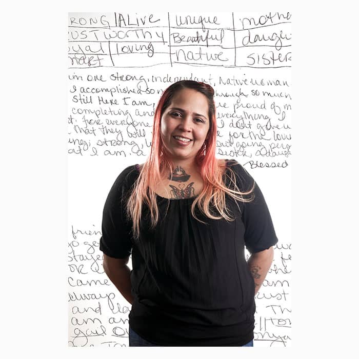
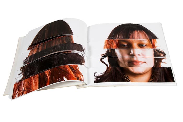
Ashley Minner was destined for creativity. Born into a family of artists and musicians and raised in the Lumbee culture, she knows the power of storytelling to build relationships. The Baltimore community artist dedicates her work to nurturing these connections, drawing from her roots and her environment to create meaningful projects that stay with the viewers.
We asked Minner about community art, fostering connections through storytelling, and the benefits of branding yourself.
Tell us a bit more about yourself. Where does your love for art come from?
I was born, raised, and still live and work in Baltimore, Maryland. I’m also an enrolled member of the Lumbee Tribe of North Carolina.
I was blessed to be raised around my extended family. All of my grandparents migrated to Baltimore from points farther south, seeking work and a better quality of life. With them, they brought knowledge and customs of their home places, and many of them used their artistic traditions to leverage opportunities.
My love for art comes from my love for my family and their love for art
For example, my maternal grandmother was a painter from the mountains of East Tennessee who lived by her art for some years and who also gained some notoriety for projects that she did. My dad is a musician who retired as a music educator. My mom is an amazing cook among other things. My aunt sings…
I guess my love for art comes from my love for my family and their love for art. They always taught and encouraged me along the way.
You identify as a “community artist”. Can you tell us what that entails for you?
Being a community artist means that my work is either made in collaboration with or in response to community. In this way of working, the process is at least as important as any product.
I think of “art” in an expansive way. While I was formally trained in drawing, painting, printmaking, etc in the western academy, my practice encompasses so much more. It’s about relationship building and honoring and respect. Some people call it “socially engaged art.”
How do you encourage meaningful connections in your work?
Storytelling seems to be part of everything that I make. My work begins with the sharing of stories and often is, itself, the sharing of stories. For example, I might record an oral history interview as part of my process and then the recording itself is incorporated into whatever art is produced, or it is the art.
Humans connect and relate to one another through story
It’s always incredible how experiences that are so intensely personal end up being almost universally relatable. Humans connect and relate to one another through story. I love it when my work can be a vehicle or platform to foster those connections.
How does your identity as a Lumbee Tribe member and your background in American Studies influence your work?
I was born Lumbee and raised in my culture, so that colors everything I do, including art. A lot of my work has been expressly about Lumbee identity and honoring Lumbee history and presence, especially in Baltimore, which is still the site of the largest Lumbee community outside of tribal territory in North Carolina.
I actually went back to school and got my degree in American Studies, in part because I wanted to be a better artist. I had been making work about being Lumbee and received a lot of speaking and writing requests. I started to feel like I needed a formal credential beyond my own lived experience to really represent us well in art or otherwise.
I learned a lot and certainly improved my research and writing skills through that training, which also shows up in my creative work and sometimes is my creative work. However, having spent about seven years in the program, I now feel like I have catching up to do in the studio. I’m finding my way back to certain aspects of my practice.
How do you think art can help us pass on knowledge?
Art is a primary source. It can relate how folks live, where they live, what is important to them, their aesthetics, the constraints of their lives, and maybe most importantly instructions for how to carry on in our own lives.
As a mixed media artist, how do you select your medium for each project?
The media I use is usually determined through an iterative, organic process with collaborators and with a lot of consideration for who will be the audience for the work.
Very rarely will I set out at the beginning of a project knowing that I want it to take this or that form. Sometimes I/we decide it needs to exist in a form outside my area of expertise, so I either do some learning or partner with someone who is expert in that particular media.
Can you walk us through your creative process?
I like to walk a lot. I get ideas while walking. In pre-pandemic times, I often drove long distances and would get ideas while driving. Then sometimes inspiration comes from dreams, or something someone said when they were telling a story. I write ideas down, by hand. Then I usually write or sketch my way through that first part of an idea. If I’m working with partners, I bring them in next and the next steps are determined together.
I recently finished up a few big projects, so I’m in between projects right now. I’m taking time to practice skills I haven’t used in a while like drawing. One day a week, I go to my studio and just draw. I like to listen to music while I work. It’s been 1960s country for the last couple of weeks.
What’s your favorite art piece and why?
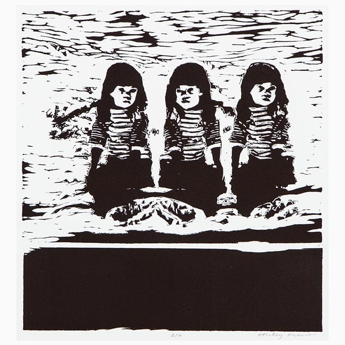
I have a few favorites. Felix Torres-González’s Untitled (Portrait of Ross in L.A.) (1991) is a great favorite because it so poignantly represents the love the artist felt for his partner, and it exists in such a way that the public can partake of that sweetness forever. It is instantly relatable and visceral and beautiful. I kind of feel that way about all of Torres-González’s work and it is such a tragedy that his life was cut so short. I just realized he was my age when he died, which is crazy.
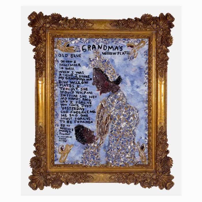
Missionary Mary Proctor’s Grandma’s Old Blue Willow Plates (1997) is another favorite because its message is so earnest and true. The message is actually spelled out for us through text in the piece, but the other elements are just as communicative. One iteration of this work is at the American Visionary Art Museum (AVAM) here in Baltimore and that is how I first encountered Missionary Mary Proctor. I have been a huge fan and small-time collector of hers ever since.
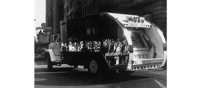
Mierle Laderman Ukeles’s whole body of work about Maintenance is also on my mind a lot these days. It was brilliant and necessary in the seventies and has possibly become even more relevant in the time since. My favorite aspects of the project are those where she personally interacted with workers of the New York City Department of Sanitation. I really think her piece, “The Social Mirror (mirror covered sanitation truck)” (1983) was and is so effective.
What about your work?
If we’re talking about my stuff, “The Exquisite Lumbee book” (2010) is probably my favorite object I ever made because the form really follows the function and is aligned with the concept, it’s aesthetically pleasing, and fun to play with.
The panel discussion that was part of the opening for “Hard Workin’ Pilgrims: Lumbee Indians in Baltimore City Industry” at the Baltimore Museum of Industry was my favorite event because four of the elders who participated in that project got to speak about their own experiences and be publicly recognized for the lives they have led. They were proud and so was I.
You’ve recently rebranded. What sparked this decision?
I wanted to bring the public presentation of who I am and what I do into alignment with who I am and what I do now. My website hadn’t really been updated since it was made some ten years ago, and my old logo and print materials weren’t particularly reflective of my identity and practice.
I wanted to bring the public presentation of who I am and what I do into alignment with who I am and what I do now
To achieve this new look, I went through a process led by designers Sophie Nolan and Katie Lively. I’m really pleased with the results. They said again and again that they wanted to convey “the warmth” of me and I believe they did.
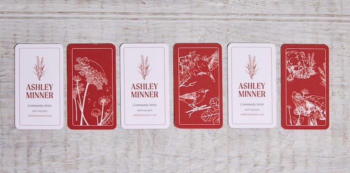
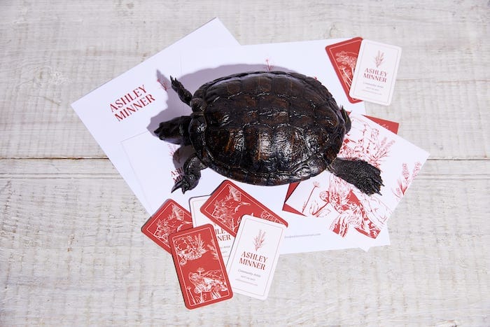
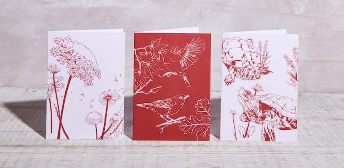
The palette Sophie chose is very place-based, considering my rootedness here in Baltimore, which is known for its brick. The nature spot illustrations and animations are wonderful personal touches. They even highlighted my beloved pet turtle, Leadbelly, who is a big part of my life. My print materials were documented by my friend, photographer Sean Scheidt, who had just gone through a similar process with Sophie and Katie. He actually invited Leadbelly to the studio, which was a lot of fun.
How did you use MOO to support your rebranding?
MOO products are so high quality. I have loved the look and feel of everything I’ve ever ordered. I send a lot of handwritten cards and personal packages, so it’s important to me to have print materials that represent me well. If the pandemic ever subsides, I imagine I’ll be handing out a lot of Business Cards. They are so thick and toothy and nice to handle. Sophie referenced my love of playing cards and old book plates in her design work and I feel like that really comes across.
Do you have any projects coming up you’d like to share?
Folks can visit baltimorereservation.com to check out the big projects I just finished up in collaboration with a whole team of other artists, scholars, and culture bearers. The site documents some of the history of the American Indian community of East Baltimore.
Visit the “About” page to download a PDF of the Illustrated Guide to East Baltimore’s Historic American Indian “Reservation.” Local folks can actually stop by the Baltimore American Indian Center or the Baltimore National Heritage Area office to pick up a print copy. Folks can also visit the App Store or Google Play to download the Guide to Indigenous Baltimore walking tour app, wherever they are.
Any advice for young creatives looking to create a powerful body of work?
Keep making art!
You heard Ashley Minner, keep making art and spread the word about it with Luxe Business Cards and custom marketing materials by MOO.
It’s no secret: here at MOO, we love print. We love it so much, actually, that we can’t let it go. And you do too, based on our recent survey. In fact, 63% of you said you’d already kept a promotional print product. So we asked ourselves how prints make it to the cork board – or wherever we end up keeping them.
We spoke to MOOsters about print materials they held on to and why. And we weren’t disappointed.
Family heirloom
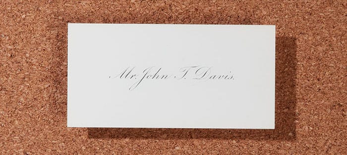
This story from John Davis, manufacturing workflow technician in Lincoln, knocked our socks off.
“Five years ago, I inherited four boxes of business cards from my great uncle, Mr John T Davis. The business cards were printed in 1931 using a letterpress and slip sheeted.” He keeps them in the original boxes, nested inside his sock drawer as a precious family treasure.
“We share the same name”
Beyond the thrill of getting these 90+ years old cards, John had a nice Back to the Future experience as his great uncle and him share the same name. His favorite part? “Its simplicity and elegance. It’s just a name, nothing more. Simple, uncluttered and classical.”
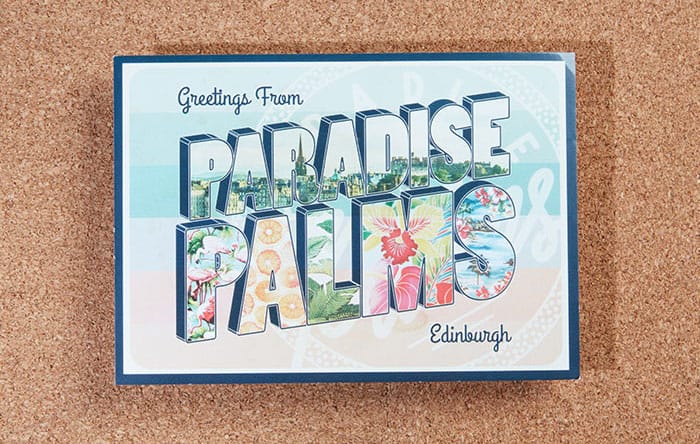
A piece of home
Originally from Scotland, Helen Daglish is our social media manager in London. She keeps a promotional postcard from Edinburgh bar Paradise Palms displayed on her fridge. “It’s from one of my favorite bars in Edinburgh I went to during uni. It’s a little reminder of home and makes me feel nostalgic.“
“It’s a little reminder of home”
Helen has kept this piece of home for about four years. Aside from being a nice reminder of Edinburgh, it doesn’t hurt that it also looks great. “I love the tropical design, it looks great on my fridge!”
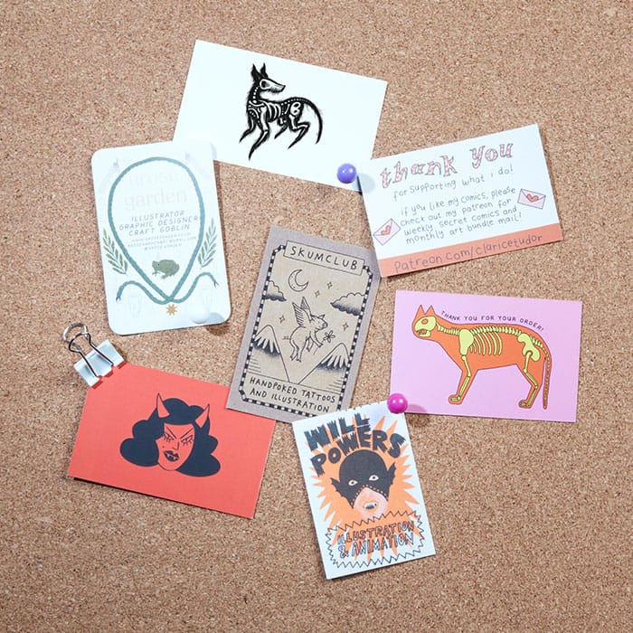
Arty collection
Laëti Soubrier, content marketing associate in London, is big on illustration. Everytime she finds a nice artist business card, be it in an Etsy parcel, an art fair, or an exhibition, she adds it to her ever-growing collection. “I love creating a mini gallery for myself. I keep most of them on a grid mesh display in my home office and it makes me happy seeing them when I look up.”
“I love creating a mini gallery for myself”
Laëti started her collection when she moved to London four years ago and she’s never looked back since. “I want to honour the work artists put into creating a great design to promote their art. It’s also always fun to spot MOO products when I add a new card to my collection!”
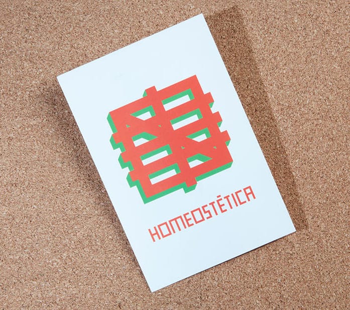
Travel keepsake
Phil Bailey is a senior graphic designer in London – you might have already spotted his expert advice on the blog. He brought this postcard back from Zürich where the minimalist, colorful design caught his eye at The Museum of Design. “I know nothing of the Homeostética movement per se, I just liked the graphic.”
“It reminds me of a great trip to Zürich, the last holiday pre lockdown”
Phil understands the power of great design – even if the meaning escaped him. “I kept it purely because I like the simplicity of the design and the bold colors. I didn’t understand what the word means and I still don’t (even after a quick Google search)”. Phil kept the postcard on his peg board for a while, before moving it to the safety of a box since moving home during the pandemic. “It reminds me of a great trip to Zürich, the last holiday pre lockdown. *sob*”
Business Cards, Postcards… Ready to create memorable prints people will hold on to? Get started here.
Are your old business cards out of date? Instead of popping them straight into the trash, try these five ideas to give your outdated business cards a new life. All tried and tested by the MOO crew.
1) Keep it as a mini art print
You put a lot of time and energy into making your business cards look amazing. Now they’re obsolete, you’re left with a pile of mini masterpieces you can’t bring yourself to throw away. And why should you?
They’re tiny, yes, but they’re also pieces of you. And if you used Printfinity to showcase your portfolio, chances are you have a full exhibition’s -worth of business cards. So let them make it to the cork board, the grid mesh display, or even that makeshift exhibition hall in your kid’s dollhouse.
2) Mark your page
Tired of using receipts as a bookmark? You might have just found a new role for your old business cards. Thick and strong, they make a great bookmark and a nice reminder of where you’re coming from – career and design-wise.
You can use them as they are or, if we’re talking MiniCards, punch a hole at the bottom and add a ribbon to make them extra-fancy. All set for your next chapter.
3) Make an earbud holder
Hear us out. If you’ve ever had a case of the tangles, this project is for you. Grab one of your outdated business cards (standard or MOO size) and follow these steps:
- Punch a hole in the middle of the short side of your business card.
- On the other short side, punch two equidistant holes.
- Using scissors, cut straight lines from the short sides of the card to the center of each of the three holes.
- Cut out symmetrical trapezoid shapes on both of the long sides of the card. It should make your business card look a bit like a floss bobbin.


Ta-da! Push your earbuds in each of the top holes and wrap the cords around the notches. You can pop the jack into the bottom hole and forget about tangled earphones for a long, long time.
4) Turn them into espresso coasters
Yes, it’s a thing – and your espresso cups deserve it. If you went for a square format your obsolete business cards could get a new life supporting your coffee addiction.
You can use them as disposable coasters or laminate them so they stand the test of time. It’s an original way to protect your surfaces from coffee rings. After all, coffee got you where you are as much as your previous role, didn’t it?
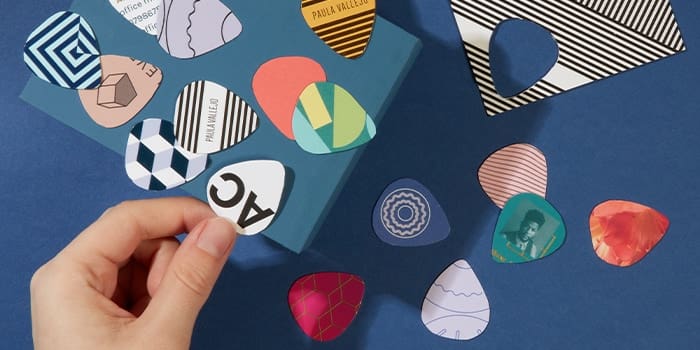
5) Create a DIY guitar pick
Too sturdy for origami, our Super Business Cards can be great for the rockstars among you. While they don’t make the best drumsticks (we tried), they’re perfect to tickle your strings when your usual guitar pick is out of sight.
If you went for rounded business cards, your disposable guitar pick is pretty much ready to go. Otherwise, you can give it a quick snip to shape it like the real thing. It should serve you well for a few songs before you move on to the next one.
Need to replace your obsolete business cards? Get creative with MOO cards that stand the test of time.
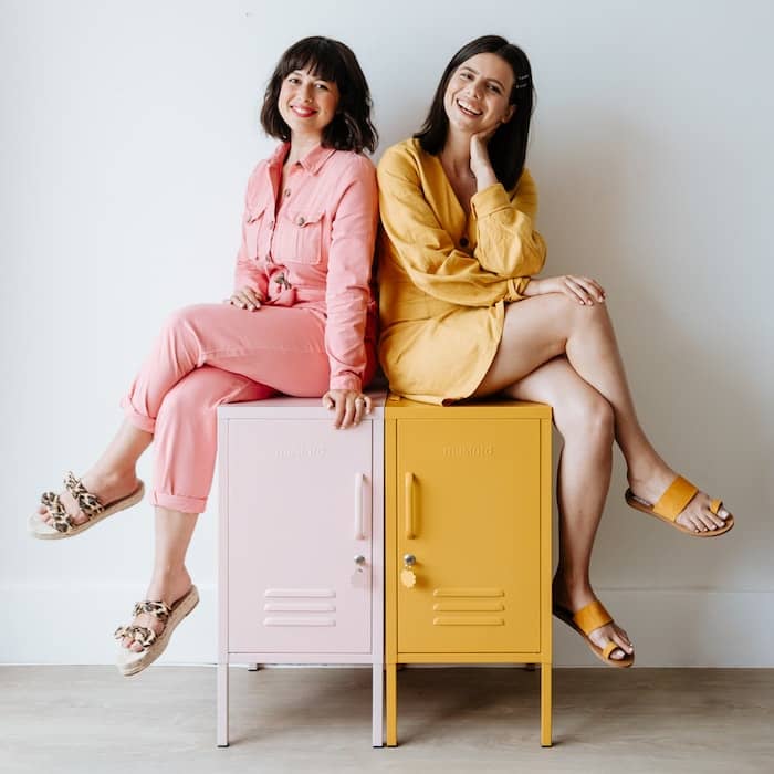
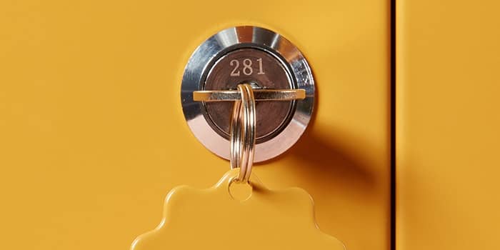
Mustard Made have reimaged old-school lockers to make them pretty, practical and bursting with personality. Now the same can be said of their welcome packs, too.
About Mustard
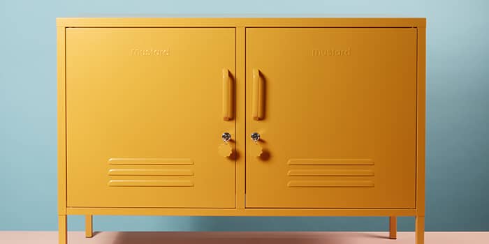
Mustard create colorful, practical lockers that help you tidy up and look good while you’re at it. With versatility and functionality at the core, their range suits any space – from a cool co-working hub to a new baby’s nursery.
Founded in 2018 by Becca and Jess – two sisters living on opposite sides of the planet – Mustard has quickly grown into an instantly recognizable brand, with a loyal fanbase of customers and renowned stockists.
As Becca says: “We like to joke that Mustard is just a way for us to hang out more often, but it’s more than that. We’re a family business, with a big heart, big dreams and a love for lockers in all shapes and sizes.”
Where it all began
The initial inspiration came from Becca’s love of vintage metal furniture – especially her random selection of lockers, which include antique store finds and a flaky old one found on the side of the road.
These vintage finds were practical and full of character, but hard to come by. However, if they could work out how to manufacture them, maybe others would fall for their quirky charm too?
So that’s what they did. Every possible moment was spent researching, reading, drawing and testing until they had their perfect practical product. Mustard launched first in Australia (where Becca lives) and then the UK (where Jess lives). They’ve been sharing the Mustard Made locker love ever since – from Australia to the USA.
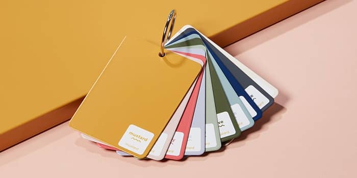
It started with two products and six color options – Blush, Mustard, Olive, Navy, Slate and White. These proved to be the ideal foundation for their brand and the beginning of a journey that has seen the sisters become closer than ever, despite the (roughly) 9, 443 miles between them.
The challenge
Mustard’s lockers were a hit. Soon they started appearing in gorgeous boutique shops and much-loved stores around the world. You can even find Mustard Made lockers in the USA.
But, in a retail space, lockers take up a lot of room. Far too much room to let stockists showcase the whole colorful range of products. This was going to make it much harder for customers to picture them in their homes and offices – and tougher for Mustard’s fun and playful personality to shine through.
The solution
Becca looked to her past for inspiration. Before Mustard, she had run House of Bec – a handmade (and beautiful, of course) jewelry business.
“I’ve been a MOO customer (and fan!) for years. Way back when, I fell in love with the Printfinity option – it’s so nice to have that flexibility even as a very small business. Being able to cut out the trickier parts of printing but still get beautiful custom quality results was such a win for me.”
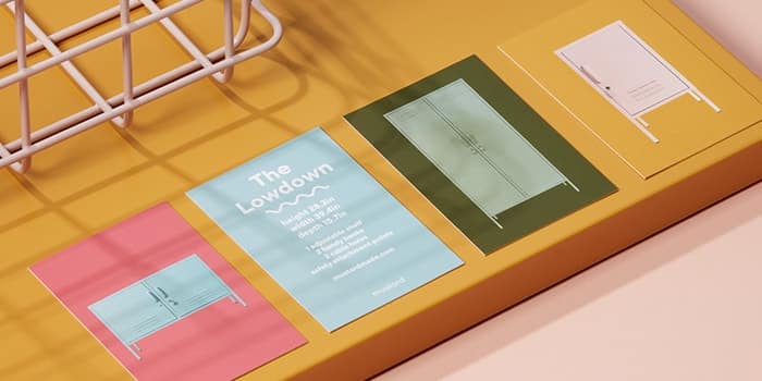
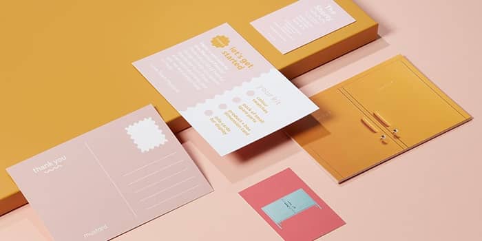
That relationship with MOO, and clever use of Printfinity, continued with Mustard. Business Cards were used as info cards, showcasing the full range of colors and styles available. These are now sent out to every stockist so retailers can help their smitten customers to go home, measure up their space and feel 100% confident in their choice of Mustard Made locker. These printed pieces embody the Mustard aesthetic, with a matte finish and one (perfectly matched) color.
We want everything our customers touch, feel and see to feel like ‘Mustard’
Becca: “We want everything our customers touch, feel and see to feel like ‘Mustard’. For us that is the ‘secret sauce’ (see what I did there!) to building a strong and memorable brand identity and experience.”
With customers finding Mustard both online and in retail stores, building a connection with their audience has been vital. “Having considered ‘moments’ like our info cards or a postcard when we send a swatch makes all the difference,” says Becca.
Results
Mustard’s range (and success) continues to grow. Now launched in America, Mustard’s retailer welcome packs and printed promotions are helping to ensure that a whole new audience can fall in love with their signature lockers and accessories.
Becca: “Our stockists love the info cards because they are compact, useful and give the customer something physical to take home so the product stays top of mind. It’s a nice little touch we offer them and we know they work because they keep asking for top-ups!”
With the brand rapidly expanding, Mustard decided to upgrade to MOO’s Business Advanced plan to support their growing needs. As Becca explained: “My journey with MOO has evolved over the years as Mustard has grown. Being able to print at small or large scale, with so many products and consistent quality means we are always finding new ways to incorporate MOO products into our business.”
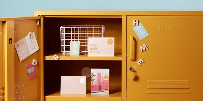
Whenever a new stockist joins, a whole welcome pack now arrives that’s full of MOO goodies
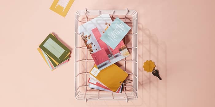
Alongside info cards, Mustard now use MOO Postcards when sending out swatches, spare parts and for any gifts, promotions or PR campaigns. Square Stickers have been perfect for sticking on the color swatches so people can know the name of the color. In fact, whenever a new stockist joins, a whole welcome pack now arrives that’s full of MOO goodies.
“My litmus test for designing print materials is always ‘would I stick this on my fridge?’’ says Becca. “I want our customers to pick up a postcard and feel like it’s something they want to keep. MOO helps us deliver that moment of connection.”
Want to see what we’ve got in our locker for your brand? Check out our range of subscription plans, designed to support your business at every stage.
Fill out the form here and a friendly Account Manager will reach out to you.
February 1st marks the beginning of the Lunar New Year. It’s a time to celebrate the start of spring in the northern hemisphere, when 5pm stops feeling like the middle of the night. So in many ways it’s like the other new year, but better. And to give you some ideas for your own Lunar New Year cards, MOO’s design team have created a series of Greetings Cards and Postcards for the occasion.
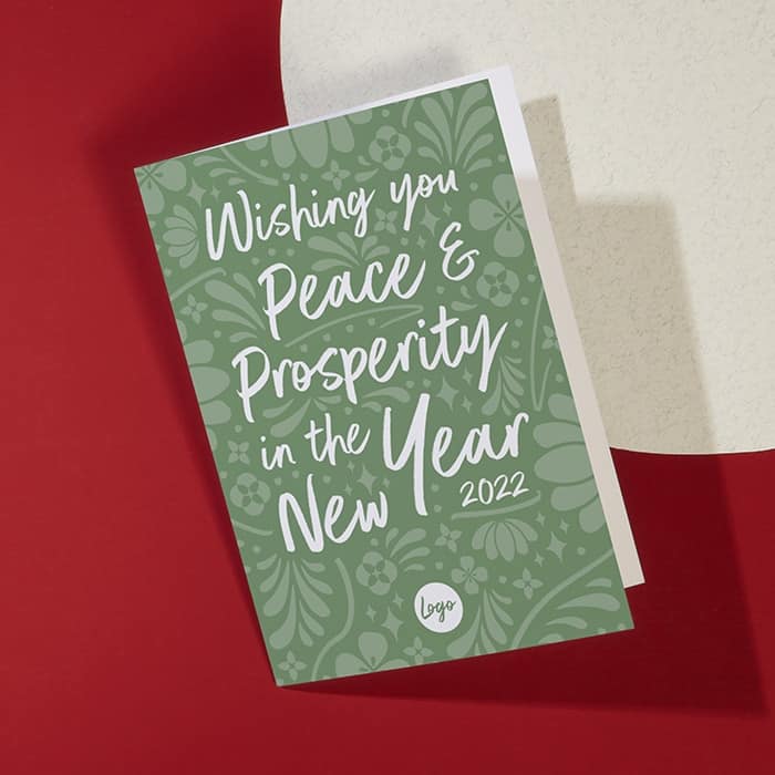
Peace, prosperity and a pop of green
“My favorite thing about Lunar New Year is all of the colorful celebrations,” says graphic designer Katie Thermos, whose Chinese New Year Greetings Card has a very specific color in mind. “I chose green because for my Lunar New Year card because it’s often a symbol for prosperity, as well as peace and harmony. It’s also the most common color associated with nature, so it complements the organic design elements.”
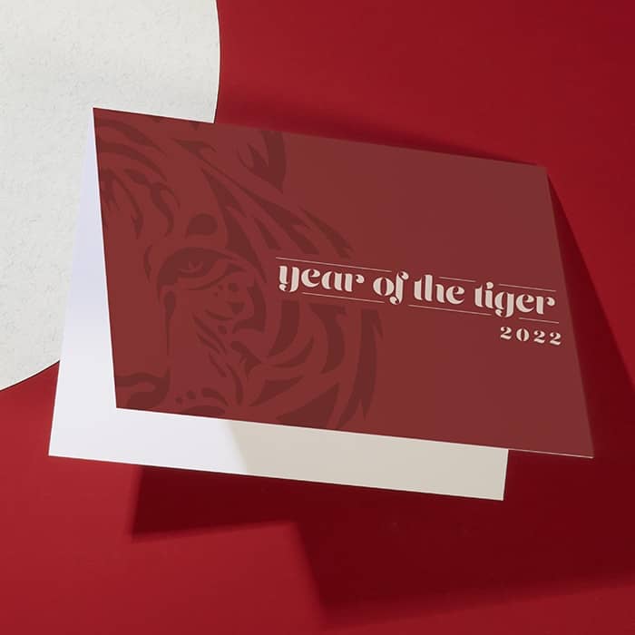
All eyes on the tiger
The tiger is a symbol of strength and courage. Things that somehow feel very “2022”. And it’s the inspiration for Michela Tedesco’s Lunar New Year Greetings Card, too. “I wanted to create something that distilled down everything recognizable as a tiger to its most well-known feature – the stripes!” she says. And her advice for the months ahead? “Don’t be afraid to look the upcoming year in the eye and make it better than your last.”
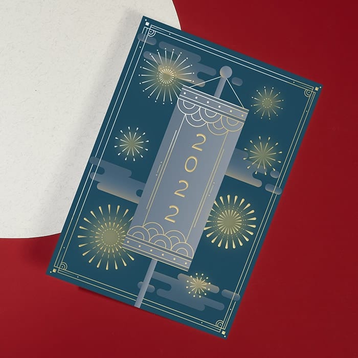
Fire works really well
Michela is big on sharing the Lunar New Year wishes, because she’s also designed a Postcard, too. And it’s quite an explosive design. “Since fireworks and lights tend to come at the end of Lunar New Year celebrations, I wanted it to feel like a joyful finale to the holiday,” she explains. “I used the shine of our Gold Foil to emphasize this universal moment of light to ring in the new year!”
“For color, I did some research on the origins of Lunar New Year celebrations, and found some really gorgeous artwork spanning thousands of years! In some of the earliest work, I saw a lot of blues and yellows that I felt could work really well as part of the night sky behind the fireworks, and would be a bit of a contrast to the more traditional red colors commonly used today.” And she has a top tip if you’re choosing between landscape or portrait: “A taller card gives the impression of the lights rising higher and higher.”
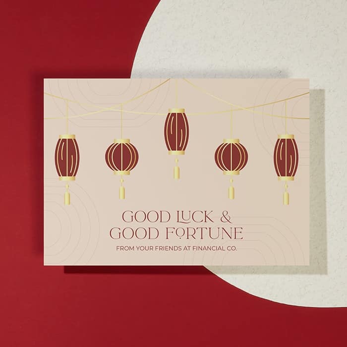
The lucky one
We’re all hoping for good fortune in 2022, and that’s what Katie Thermos’s Postcard design is all about. “Different color lanterns can symbolize different events, and red symbolizes good fortune and joy,” she tells us. It’s also a good excuse to add some Gold Foil because: “Red and gold [are both] associated with good fortune, so it works well with the messaging.” And if red’s in your brand palette, then you’re in luck.
So that’s our designers’ take on all things Lunar New Year-y. Now it’s your turn to create your Lunar New Year card. Whether you show your Tiger stripes or do something totally different, your customers and clients are sure to love it. (And we’d love to see what you come up with on #hashtagmoo.)
Start making your very own Chinese New Year Greetings Cards and Postcards.
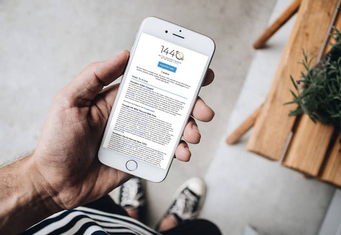
Independent online newsletter 1440 was looking for a way to celebrate one million subscribers, and MOO had just the right product.
About 1440
1440 is on a mission to give readers an objective view of exactly what’s happening in the world – something its founders were looking for when they first came together. The newsletter launched with a clear aim: providing “just the news.” No more, no less.
Instead of cleverly crafted messaging and media narratives, 1440 gives its audience a factual rundown of exactly what’s happening around the world so readers can form their own opinions. Scouring hundreds of sources each day, it delivers expertly curated news with breadth and depth in a single, digestible morning briefing.
The challenge
After launching, it quickly became clear that the newsletter’s founders weren’t the only ones looking for the facts. What began as an email among 78 friends quickly grew into hundreds of thousands of daily readers.
Following this growth, 1440 recently reached a milestone in its history – one million subscribers. To celebrate, the team wanted to run an exclusive, premium giveaway to reward loyal readers and encourage them to share the newsletter with their network.
Readers didn’t need another piece of “swag”
The 1440 team knew readers didn’t need another piece of “swag”. Their mission is high-quality news over quantity – facts not frivolity. But they quickly found the branded merch industry to be like the news business: crowded, overwhelming and, more often than not, full of clickbait.
“When it comes to choosing branded merchandise, we wanted to ensure our products wouldn’t be thrown in the back of a cupboard or worse, the trash,” says Pierre Lipton, Co-founder and COO at 1440. “We were looking for a premium product that would be reliable for our subscribers throughout their day. Just like our news.”
The solution
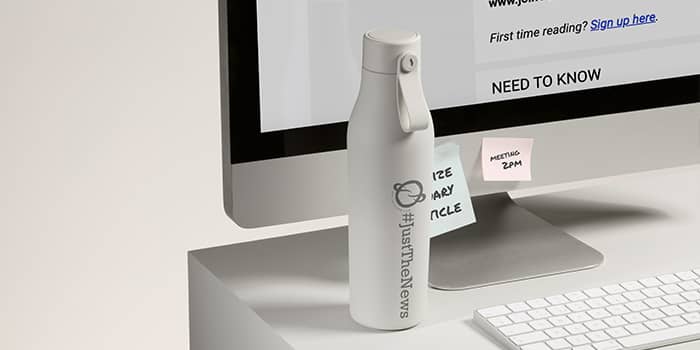
Even before they hit their subscriber milestone, 1440 were no strangers to MOO. “Many of us know MOO for helping make a memorable first impression with business cards and customizable stationery,” said Lipton. And they were excited about new products like the MOO Water Bottle.
“For a small team like ours, it was exciting for us to be a part of their expansion into branded merchandise. And true to form, MOO made the design process super simple. We love working with them because we know they’ll always go the extra mile to make sure we’re happy with the end result.”
Our readers’ new swag will outlive the next newscycle
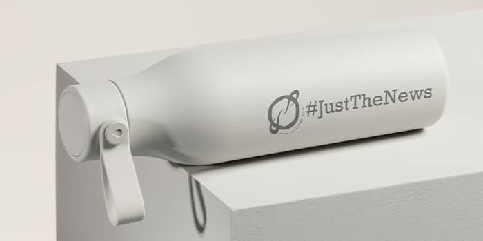
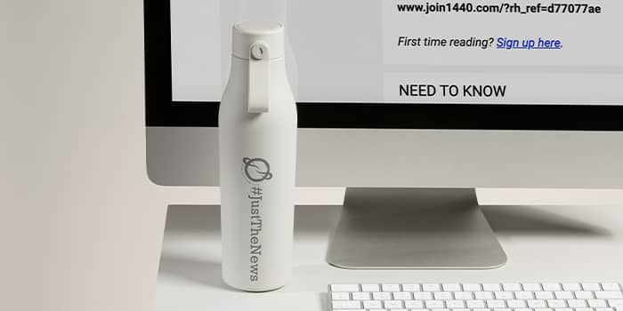
The two teams collaborated to create a branded bottle that 1440 could be proud of – and which their readers could rely on. In the end, they chose a cloudy grey bottle to spotlight their logo and boldly display a simple hashtag: #justthenews.
“With MOO, we knew we’d get a premium product that our subscribers could depend on throughout their day,” says Lipton. “We’re thrilled with the sleek design we ended up with, as well as the high quality materials that went into the bottle itself. We’re more than confident that our readers’ new swag will outlive the next newscycle.”
Results
After creating the final product, 1440 gave 50 of their readers the chance to win one of the branded bottles. All they had to do was get a friend to sign up for the newsletter. And the response was even better than expected.
“Our readers’ response to the MOO giveaway was stronger than many past campaigns: even when compared to a Peloton giveaway,” says Lipton. “It only speaks to the company’s reputation for premium materials and great design. With their clever packaging and above-and-beyond customer service, we strongly recommend working with MOO.”
Daily organic referrals increased by 158% during the 48-hours of the giveaway
Not only did the MOO partnership drive 24% more subscribers per shoutout than 1440’s earlier giveaway, it also drove over a half million unique opens – and daily organic referrals increased by 158% during the 48-hours of the giveaway.
“This past year and a half has made it difficult to make meaningful connections,” admits Lipton. “We love that MOO used this challenging time to [help] brands like us reach out in a relevant and memorable way.”
So they may be delivering “just the news,” but the giveaway gave 1440 the opportunity to celebrate their hard work and their readers’ support.
And if you’re looking for a way to thank your own customers and colleagues with a branded product they can use again and again, check out the MOO Water Bottle. It could get your ideas flowing.
Fill out the form here and a friendly Account Manager will reach out to you.
We asked and you answered. We ran a customer survey to find out what you’re using from MOO and why. And we got some great results.
Firstly, thank you to everyone who completed our survey (a huge 90% of everyone we asked answered!). We’re always grateful for all the ways you show your support – from rave reviews to opening our emails.
Now, the nitty gritty. From maximum marketing impact and stand out branding – this is how you MOO it.
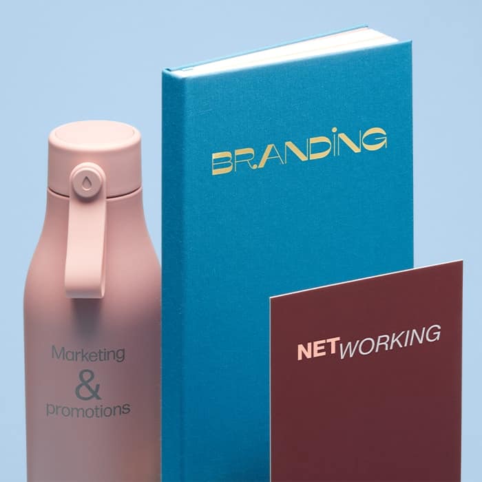
TLDR:
- Branding, promotions and networking are top of your business agenda.
- High quality handouts like Business Cards and Flyers are a mark of a quality business.
- Flyers, Postcards and Business Cards are priority for your marketing and networking.
- You’re using print marketing to help you drive sales and win new business.
- Memorable print with unique finishes help your brand stand out.
Branding and promos for the win
Top of your marketing agenda are branding, promotions and networking. But to surprise and delight your customers and clients came in a close fourth, proving that you like to think outside the box. We know you’ve used Business Cards for branded jewelry backs and MiniCards for swing tags. The possibilities are endless!
Quality is everything
61% of you said MOO’s high quality reflects well on your business and 21% said they choose MOO for innovative product options, with consistency sitting in third place. We asked you a few questions and 90% of you agreed:
My MOO purchases make my brand feel more credible
It looks like we’re helping you to nail that all important first impression. In fact, 63% of you said you keep a piece of promotional print when you like the design and quality.
The key takeaway?
High-quality handouts like Business Cards and Flyers are a mark of a quality business. Because we don’t cut corners and neither do you.

Your top product picks
What do you love most from MOO? A whopping 94% of you said Flyers, Postcards and Business Cards were important to your marketing mix. In fact, you ordered over nearly a million of them this year. Print truly isn’t dead – these business essentials are still flying off our printers to support your digital marketing.
The key takeaway?
Flyers, Postcards and Business Cards are top priority for your marketing and networking.

Driving traffic and sales
We know you love Flyers, Postcards and Business Cards, but what are you using your print for? Nearly 70% of you said to drive potential customers to your site or online store. And it seems to be working too, a third of you saw an increase in traffic of up to 30%.
Some of you even said that MOO products have a positive impact on your businesses profits and helped you win clients or new business. Now that’s pretty impressive stuff.
The key takeaway?
You’re using print marketing to help you drive sales and win new business.

Making an extra impact
We know that first impressions count. And there’s no surprises here – 60% of you said that special finishes helped you and your brand make more of an impact. Let’s break it down.
Our MOO Luxe paper came out on top, followed by unique sizes (rounded corners, square Business Cards and MiniCards), then gold and silver foil.
The key takeaway?
Memorable print with unique finishes helps your brand stand out.

There’s no denying, MOO + you is a winning combination. Don’t forget to show us your winning creations on social using #hashtagmoo – we love to see it.
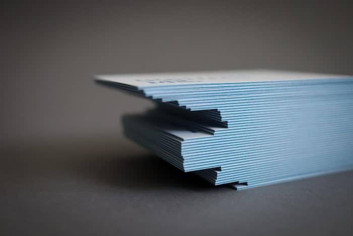
Luxury is a state of mind. It’s about quality, elegance, and a little bit of boldness. That’s how we developed our 32pt Luxe Business Cards and their colored seam – and how these brands made the most of them.
Get inspired with four creatives who made their business stand out with bold, extra-thick, extra-memorable Business Cards.
Melanie Martin: premium appeal
Based in Germany, Melanie Martin is a freelance multidisciplinary art director and graphic designer specializing in editorial, corporate design and print. She describes herself as a typography enthusiast and visual researcher – which shines through in her own business cards.
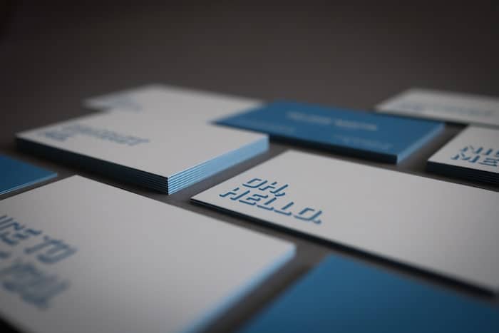
Melanie chose Luxe for its multisensory quality. “The eye-catching colored seams and the extra thick paper just appealed to me. The Luxe Business Card not only has a great haptic, but is also an absolute eye-catcher.” Choosing a blue seam, she matched it to her design, with blue lettering on one side and a blue background on the other.
As a designer and art director, she knew the impact of cleverly used negative space. “Since my logo is only a lettering, I wanted to place my contact details on one side in a reduced form and address the recipient of the business card directly on the other side.”
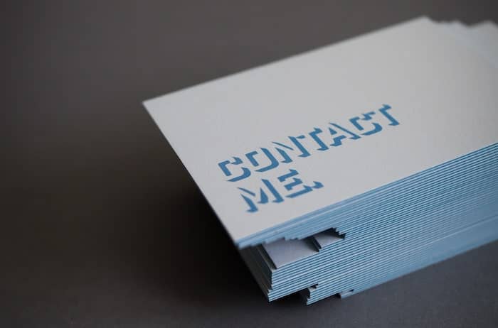
She created three variants for the back, all in one batch thanks to Printfinity. A simple reminder spelled out in big letters, “Oh, hello”, “Nice to meet you”, or “Contact me” invites the recipient to take the next step using a simple yet bold geometric font. Her favorite part? “I like the colored seam and the thickness best, because the overall picture is simply extraordinary and will be remembered.”
Ten Partridge Road: flying high
Sue Krevlin is a jewelry designer and maker based in Westchester, New York. A graphic designer by trade, she moved to jewelry in search of a craft that would require more tactile work and indulge her sense of touch. With Ten Partridge Road, she makes what she calls “wearable graphic design”, using semi-precious and precious stones to create the perfect balance of color, shape, space, and scale.
For her business cards, Sue wanted to convey the story behind her brand. “My studio name comes from the place where I grew up, 10 Partridge Road. It’s where my creativity was fostered and where I was given the space to play with making things. I loved the idea of using an illustration of a partridge, both to represent that home, and because my mom is a fan of birds.”
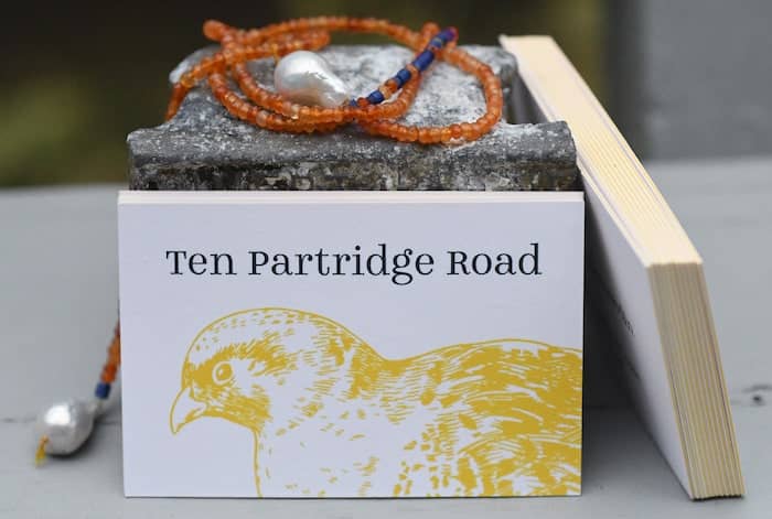
Drawn to yellow for its cheerful quality, Sue matched her design with the Luxe Business Cards’ seam. She used the Winslow Book font by Kimmy Design for its subtle details. “[It has] the perfect lower case ‘g’. It has a little plume that I thought was birdlike, and even though partridges generally don’t have head feathers, I loved that detail.”
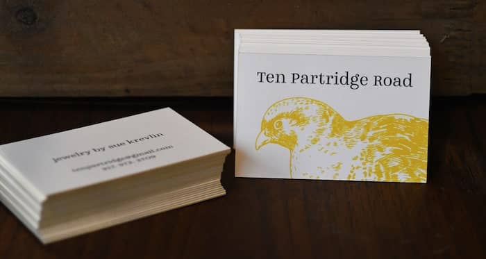
The result is a memorable design, with a great use of space to make the brand stand out. “I knew I wanted to try the Luxe for my own business because of the weight, the texture, and the ability to add color to the edges. […] My favorite thing about my cards is that they feel substantial and at the same time, not too ‘precious’. The material makes them more memorable.”
Boushi Boots: the right feeling
An Australian based in Tokyo, Sinead is the founder of handmade hat brand Boushi Boots. Her colorful, 100% cotton hats are designed and printed in Japan, reversible, and made to order. In other words, they tick all the boxes.
Sinead knew how important good business cards would be to grow her business in Japan (you can learn more about the etiquette here). “Business cards are a big deal in Japan. The exchange of them between two parties is almost ritualistic. I wanted a business card that was weighted, soft to the touch and had flair.” With a focus on sustainability, she also wanted to find a supplier that aligned with her brand values. She found out how Mohawk and MOO developed Luxe in a respectful way to the environment, from sourcing to production.
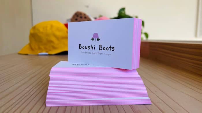
When it comes to design, Sinead let the premium paper stock speak for itself with a minimalist yet bold design, matching the colored seam to Boushi Boots’ pink logo. “I wanted a simple yet artistic business card that reflected my love for color and design. I kind of let the card paper handle that with its bright pink seam color. The rest of the design was kept really bare with only the logo and necessary information to be printed on either side.”
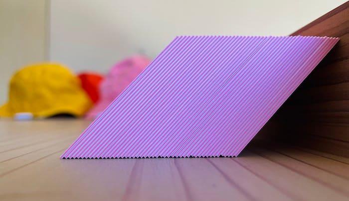
Her favorite part? “How they feel in my hands. The natural texture and double thickness speaks quality to me – even without looking at them. And then when you do, POW you’re delighted with the colorful seam. They make anyone who holds them smile.”
Commoner design co: style and substance
Based in Atlanta, interior designer Emma Flynn taps into her experience in architecture, hospitality, and commercial design to create beautiful, functional spaces. With her studio Commoner design co. she bridges the gap between luxury design and interior decor, combining premium expertise with a warm, friendly service.
For the brand’s Business Cards, she used Luxe paper with a bold square format to double her impact. “I decided on the Luxe Business Cards because they offered a more substantial feel, a unique square format and something more than just your typical flimsy card that often gets tossed or lost in a sea of sameness.”
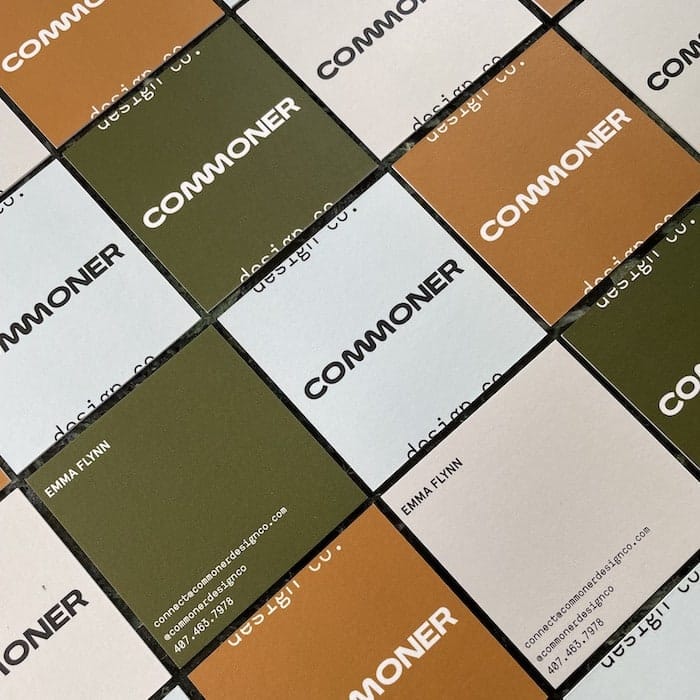
Emma worked with Vania Lin to design her official brand mark. “When deciding on and designing a brand mark we decided on a square as the most basic building block of any foundation. Using it as a symbol of accessibility, openness, plus the stability that comes with putting down roots. Everything the commoner brand encompasses.”
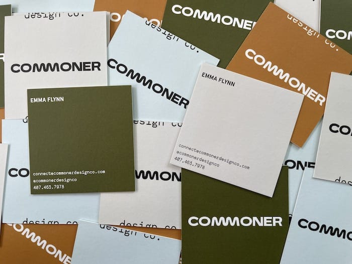
Using Printfinity to showcase her brand palette on the cards, she chose the white seam color for an elegant look. The result is a unique design that conveys her brand identity in a powerful way. “I love that they stand out! Everyone is surprised by the shape and the substantial weight of the cards. It is something not everyone is used to seeing. I love breaking the mold of what is perceived as the norm – why not let that translate into my business cards too?”
Tell your story and leave your mark with Luxe Business Cards.
Last year was a hotbed of creativity. Soothed by subtle color palettes and inspired by eco-conscious brands, we rediscovered collage and opened packages that were genuine works of art. Needless to say we’re excited to see what the year to come has to offer.
Here are the six graphic design trends we’re looking forward to seeing more of in 2022.
Visual storytelling
Storytelling is central to a good brand. Millie Davies, head of design at MOO, is well positioned to know this: “Brands are having to work even harder to engage audiences and for it to be authentic, making the storytelling of our products more important than ever. We need to explain how they are made, where they are from and then what as a business we are doing to consider our impact with these products.”
How do we tell that story, though? Brands are relying more and more on images to share their message, and for a good reason. According to Dr John Medina, people can recall 65% of the visual content they’ve seen, even three days later, while only 16% of readers take content word by word. One picture is worth a thousand words, so why write what we can show?
Visual storytelling can convey narratives in a memorable way, from explaining concepts to walking people through your brand story. Video content, infographics, comics, photography… Each medium has its own strengths. Identify the best fit for your narrative, and give it a try.
Psychedelic patterns
Last year, we toned down our designs to convey a sense of calm. This year, we’re ready to counterbalance with visuals that ooze the joy of being back together. Inspired by the 1960s, psychedelic patterns are doing a comeback.
Wavy lettering, moving shapes in vibrant colors… This trend puts graphic design on acid to open the doors of perception and bring the festival spirit to our everyday life. Insert some Woodstock-inspired visual elements into your designs or go full-on psychedelic for a mind-bending experience.
Arty typography
Designers have raised font-making to a fine art and they’re pushing the boundaries of typography further. The lines between typeface, illustration and icons are getting blurry, shaping new fonts that transcend the rules. These merge message and medium into powerful, memorable branding.
Are arty fonts the future of typography? For Millie Davies, it’s all about balance. “Brands are realizing that rigid guidelines can be helpful for consistency but also restrictive to creativity. Balance is needed. Using type formally and then playfully allows you to stay within your brand while slightly breaking the rules, allowing yourself to be more relevant to current trends.”
While they’re definitely not the best friends of fine print, arty types make great logos and titles, conveying emotion and personality in a handful of letters.
90s pop
With their flashy color palettes and cartoonish icons, the nineties perfectly reflects our impatience for a brighter tomorrow. No muted or natural tones here. It’s all about playful references to old school video games, MTV celebrities and sticker-covered skateboards.
This graphic design trend has been escalating in the past few months, from prints to websites and social media. Our star customer Lucy Jennings certainly knows how to ride the 90s design wave with fun fonts and colorful sticker-like illustrations. “I really enjoy nostalgia in design, each decade of the mid to late 20th century has its own unique look and story to tell! The 1990’s of course remind me of my own childhood – anything is possible when you’re a kid, so it just feels so fun, hopeful and carefree.”
View this post on Instagram
Aestheticizing humor
From memes to GIFs and fun pop culture references, we’re looking forward to seeing more designers inject humor into their creations. The boundaries between Internet culture and design are fading away, giving birth to a new age of visual content.
The strength of meme culture lies in its relatability. Creatives are exploring different media to show they have more than one string to their bow, tapping into humor as one more format to convey a great brand experience – and bring a smile to customers’ faces. See something that resonates with your brand? Get the meme engine started.
Vintage advertising
We’ve been looking back at the “good old days” throughout the pandemic. Now, creatives are celebrating days to come, using the nostalgia aesthetic to romanticize the present. This graphic design trend embraces old school advertising to convey a vintage, slightly ironic vibe.
In practice, this design trend needs to be diluted with some more contemporary elements. Whether it’s colors, illustrations, or subjects, pick your weapon to create retro-inspired, aesthetically pleasing designs that talk to your audience.
Put your own twist on 2022 graphic design trends with MOO’s print materials.