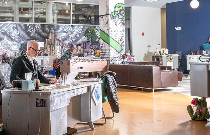
NAIL: the ad agency that kind of hates advertising
We talked to NAIL about how they developed their viral campaigns.
The advertising agency with a difference talks to MOO about ad-blocking, viral videos, and why it chose to break up Mike and Ike.
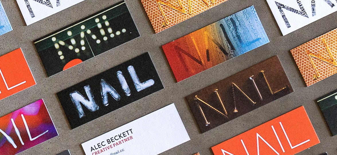
Based in Providence, Rhode Island, NAIL was set up 20 years ago by friends Brian Goss, Alec Beckett and Jeremy Crisp. Describing itself as, “an advertising agency that kind of hates advertising”, its eclectic roster of clients includes New Balance, Rhode Island Blood Center, and Mike and Ike candy.
NAIL advertising has also embraced pro-bono social projects including the “Don’t Vote” campaign, which went viral and gained over 20M views. MOO met Creative Director Alec Beckett to talk about ad-blocker dodging, NAIL’s alternative approach to selling, and why the team were responsible for breaking up Mike and Ike.
How did you come to join NAIL?
I initially went into advertising because I didn’t want to wear a tie to work – that’s pretty much all I knew about the industry. But eventually, I was offered jobs at two big agencies, and also had an offer to join two buddies on a crazy start-up advertising company that had been going for six months.
One night, I had an epiphany: NAIL scared me – and I should do the thing that scared me. At that point, the agency only had one client, so it wasn’t the most sensible thing to do. But although we had some hungry years, not a day went by when we didn’t have fun – and 19 years later, I’m still here.
What’s the company ethos?
We offer creativity and ideas to our clients, and don’t care what platform they’re delivered on. Give us a business problem you think communications might be able to help solve, and we’ll try to come up with the ideas that’ll make it happen.
We don’t buy media, so we have no financial gain in saying, “Do a TV spot.” We might help create the interior design of a store or some packaging instead. We deliver creativity where we think it’ll give you the most bang for your buck.
You’ve described yourself as an ad agency that “kind of hates advertising”. How does that fit with your ethos?
We’re in advertising, but the definition of advertising is changing very quickly. Nobody likes to be sold to, and in an era of ad-blockers, our clients are going to find it harder and harder to make anyone care about, or even see, their advertising.
But that doesn’t mean they don’t need to attract attention, so we’re trying to get them to stop saying things and do things instead. When you’re intriguing and inspiring people, it’s advertising – but you’re not paying for it. Those you’ve inspired will spread your message on social channels and talk about it.
How would you characterize the work you produce?
At NAIL advertising, we try to reflect our clients’ needs rather than our personal tastes. We’ve got a diverse client base, which allows us to have equally diverse solutions – if you’re always solving the same problems for the same sort of clients, it’s hard to be fresh and exciting.
So you’d be hard-pressed to look at our campaigns and see any common DNA. It’s almost like being a character actor – we want to disappear into the client’s business issue and solve it in a way that has no similarity to anything they’ve done in the past or will do in the future.
What’s your creative process once you’ve been given a brief?
Rarely does the magic happen by you staring at a pad by yourself, so we start with “brief-storming” – hashing out the brief to see what insights we might stumble upon. We’ll discuss the things we find intriguing or exciting about the client or the category.
Then, once we’ve shaped our ideas, we’ll wrap a custom-made team around each project – “OK, we’re doing a Facebook and Instagram campaign, so let’s get someone from social and some designers on the team”. This means clients aren’t paying for people they don’t need, and it never feels like we’re falling into a cookie-cutter approach.
What’s been your most difficult creative challenge so far?
Ideally, a client has something distinctive about them that can be at the heart of our storytelling. But when we were invited to pitch for Mike and Ike candy, there was no product story or other differentiation we could use.
We stepped back and said, “We have to create the differentiation.” This led to the idea of pretending Mike and Ike were breaking up, which went viral. A really big campaign came out of what originally had us staring at the walls.
What’s the project you’re most proud of as an ad agency?
A bunch of us were stressed about politics in America, and part of that was the youth turnout for voting, which is pathetic. It became a pro-bono project we did for ourselves. The challenge was how do you crack that riddle, and get young people to vote?
We created the “Don’t Vote” video, which blew up – and although you can’t draw a direct line from our film, in the 2018 midterms youth-voter turnout broke records. I like to think we were a little part of that tide, and it was really satisfying to use our creative powers for good.
What would be your advice to smaller advertising companies or freelancers hoping to grow their client network?
It sounds trite, but do great work. Every great piece of work you do is essentially an advertisement for you, and a chance to attract like-minded clients. Last year, we had the opportunity to pitch for what would’ve been our biggest account ever, but we realized it would turn us into a different company. We’d be very profitable for two years, but then we’d have no examples of the magic dust of our creativity – so we turned the pitch down.
What’s the work culture like at NAIL?
We want to enjoy our time at work, which means creating a place we want to work at, and finding people we want to spend our days with. So we look for talent, but also people we like – who are interesting and kind and bring a new perspective. We take pride in not being here on weekends or late into the night. We don’t want to do it, and don’t want our people to have to do it either.
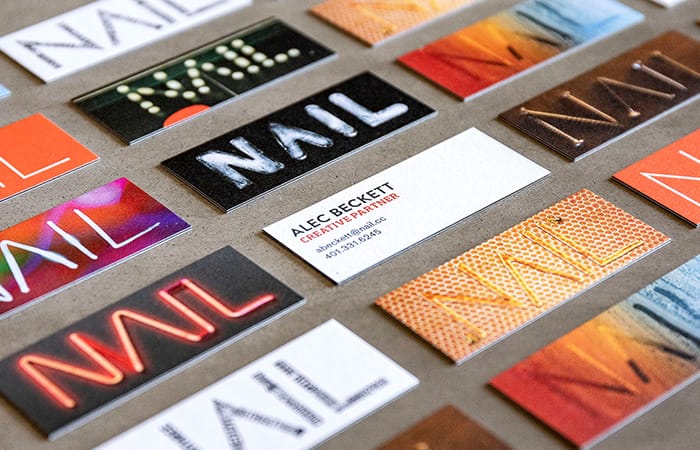
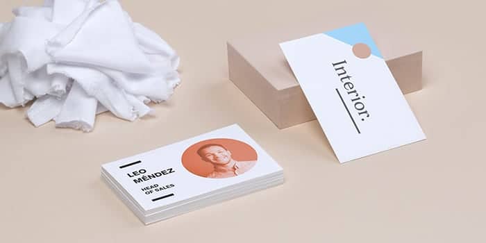
You use MiniCards. How does that fit with the brand?
We picked that path because we’re not good at normal. We’re trying to sell taking risks, being different and standing out from the crowd, and we couldn’t do that with good conscience if we weren’t walking the walk ourselves.
We went with MiniCards because they’re a bit different. Each one has a different design, they look killer, and they’re a good way to start a discussion. Hand over a MiniCard, and you’re guaranteed to start talking about it – it’s a nice way to jump start a conversation with anybody. We dig them. People love them.
Tell your brand story with MOO Business Services
At MOO, we’ve been helping people make their mark in the world with amazing quality print products for over a decade. And as our customers have grown, so has our service offering. MOO Business Services combines dedicated account management with an easy online ordering platform and expert design services. It’s a complete package for businesses to give you more brand control and consistency – while saving you time, stress, and money in the process.
Fill out the form here and a friendly Account Manager will reach out to you.
Originally published on Apr 11, 2019
An eye-catching gilded finish is a sure way to make your Business Cards stand out from the crowd. But if you’re not King Midas, turning your design into gold might not be an easy task. That’s why we developed Gold Foil templates to help you make your brand shine (even without a graphic design degree).
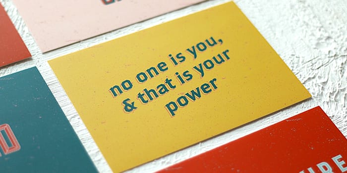
Get inspired with four of our community’s favorite Gold Foil Business Card design templates.
Speckled Stone: make a splash
The clue’s in the name: Speckled Stone is here to make a splash. Splattered with precious drops of gold, this powerful design is all about spontaneity and confidence. Reminiscent of Jackson Pollock’s action paintings, Speckled Stone puts a luxurious twist on audacity. On the front, a thin gold line structures the minimalist design and makes your contact details stand out with a subtle nod to the back’s golden extravaganza.
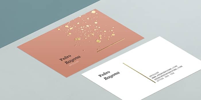
This bold design is perfect for the creative industry, from stylists to makeup artists. You have three back options in this Gold Foil template. You can use one, two or all three in your pack. A great opportunity to try different colors and fonts for even more eye-catching Business Cards.
Turn it Around: come into focus
Three rounded squares. That’s all it takes for Turn it Around to catch the eye and spark a meaningful connection. With a geometric Gold Foil design on a simple, pastel-colored background, this daring template puts your initials in the spotlight – and makes people curious enough to turn your card over. On the front, they’ll find your details framed by two golden lines to bring them into focus.
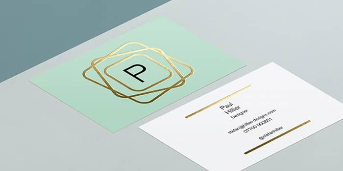
This shimmering Business Card template is great for designers, from jewelry to fashion and interior design. Choose from four back options with a soft color palette. You can use one, a few or all four in your pack to experiment with different hues. Our expert’s tip: pick rounded corners on your Business Cards to mirror the Gold Foil design.
Emperor: break free
The Emperor Business Card template is all about embracing contrast. This audacious design revisits luxury by combining a chain link pattern with the opulence of Gold Foil. Cutting a hole in the luxurious fence to leave space for your text, this bold design gives your brand a look of freedom and adventure. On the other side, a detail from the fence acts as a precious underline to highlight your name and details.
If your brand mixes premium quality with a taste for adventure, this gold Business Card design is the perfect match for you. You have four back options in this template. You can use one, two, three or all four in your pack. Keep the template colors, use your own brand palette or explore bold new color pairings to make the Gold details stand out.
Five! Golden! Rings: put (five) rings on it
It’s impossible to go unnoticed with this opulent design. With its off-centered gold ripples, Five! Golden! Rings! is here to make an impact. Add your company name, logo or image in the bottom right corner. This golden halo is sure to make them shine. Your contact details can go on the other side of the card and you can also include your logo or a QR code.
This simple yet dazzling Business Card design is ideal for the entertainment industry – but it wouldn’t feel out of place for a jewelry brand. Customize it with your brand colors, fonts, logo and more to make it your own, and let it work its magic!
Ready to rise and shine? Explore our free Gold Foil templates and create your very own Business Cards with MOO.
If you’re new to designing with type, or just want to brush up with some helpful tips to elevate your aesthetic, we’ve got you covered.
When it comes to questions on type, who better to ask than graphic designers? We sat down with MOO’s creative team to demystify the jargon and get some helpful tips on making your designs look their best.
What’s the difference between type, typeface and font?
The terminology around fonts is complex, with the words font and typeface often being used interchangeably. In a nutshell, here’s what the main typography terms mean:
Typeface
The typeface is also known as a “font family”. This is the term for the unique design of individual type – e.g Helvetica.
Font
The font is the weight and size of a typeface. For example, Helvetica Light Oblique and Helvetica Bold all belong to the Helvetica typeface as they carry the same inherent design.
Type
Type is the encompassing typography term for all fonts and typefaces.
So, now we’ve covered the basics, what about designing?
Choosing your font size
How big does my font need to be?
“Your brand’s words can appear in any number of places, from the top of a billboard to the back of a business card,” explains Millie, our Head of Design, “so, the size of the canvas that your letters will sit on will have a big influence on how tall they stand. The type of font you use will also dictate how easily it can be read. Lightweight fonts, like Helvetica Neue UltraLight, would need to be printed larger than a heavier font, such as Franklin Gothic to be legible.”
How to choose the right font size for print
According to MOO’s graphic designer Emily Wheeler, “Your Business Card, Flyer or Postcard should have a minimum font size of 7pt, while printed T&Cs should be no smaller than 6pt.”
How do different typefaces affect font size?
The typeface and font you choose can also have a big impact on how large it should be printed. For example, if you’re designing a wedding invitation, you might choose to use an elaborate, script typeface for the names to create an impact. In this case, you would need to print in a much larger size to make sure it’s legible. Smaller details that need to be easily read, like the venue location and time, could be printed in a cleaner font which can afford to be smaller.
Our designers’ quick font tips
- Clean, simple typefaces can often work better for more corporate businesses, whereas creative or craft businesses can afford to use something more expressive.
- You can also use type as a graphic element. On a business card, for example, larger scale initials can be printed as a background, with smaller contrasting text on top. This creates a dynamic, playful effect.
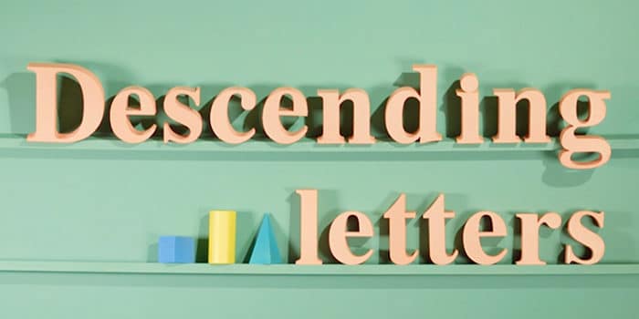
Designing with descending letters
What are descending letters?
The invisible line that your type sits on is called the baseline. Descending letters are any letters that drop below that baseline – ‘g’, ’y’, ’j’ and ‘p’, for example. Ascending letters, on the other hand, are typefaces that extend above what is known as the ‘x height’, like ‘k’, ’l’, and ‘b’. The ‘x-height’ is the height of lowercase letters without any extensions, such as ‘a’, ’c’, and ‘x’.
Why are they important?
“Descending letters are important to watch out for,” explains graphic designer Em Stokes. “If you’re designing a Flyer, for example, you’ll be including lots of text, so you need to make sure that the ascenders and descenders on each line don’t touch. Otherwise, it can look really untidy and illegible.” To give your lines more personal space, you need to adjust the leading.
What is type leading?
Leading is the gap between two baselines in lines of text. When the type leading between baselines is too narrow, the descender (the ‘tail’ of a ‘j’ or a ‘g’) overlaps the letters below.
Can different typefaces affect descending letters?
There’s no standard spacing when it comes to typography. Each typeface has a unique design, with some having longer ascenders and descenders than others. More elongated types will naturally need more breathing room.
Our designers’ quick font tips
- Be mindful of the reader – adjust your leading for different typefaces to keep your words legible and clear.
- Get the perfect fit by adjusting your type leading in the character toolbar on your Illustrator and InDesign programs.
What about tracking and kerning?
What is font tracking?
Tracking is the term for the space between letters in a word. If you adjust the font tracking in your design or illustration program, it will adjust, or, “track” the whole word evenly. The problem with this is that with certain types, some letters can appear too close to one neighbor and distant from the other. This is where kerning comes in.
What is font kerning?
Tracking spaces the letters evenly in a word, whereas font kerning is the technique of manually altering the spacing of individual letters. This is helpful for sometimes tricky letters like ‘r’.
Creating effects with tracking
“Tracking isn’t necessarily just a practical technique,” says Phil, MOO’s senior graphic designer. “It can also be used for stylistic effect. If you were designing the headline for a Flyer, you could use tracking to space out the letters for impact, make it easier to read, and attract attention.” If you have a more modern, clean aesthetic to your branding, naturally narrower typefaces can be spaced out to reflect that.
Our designers’ quick font tips
- Always track first – you can kern if you need to once the letters are spaced.
- Only change the tracking and kerning for a specific purpose, as most typefaces have been optimized on programs such as Adobe Illustrator and InDesign.
- Font tracking is usually only applied when words have been capitalized.
![]()
Ready to start designing with type? Print your new creations on Business Cards, Flyers and Postcards.
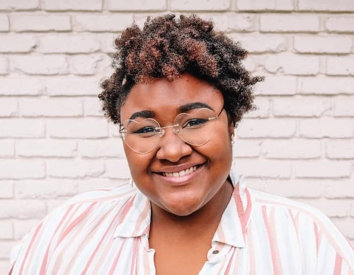
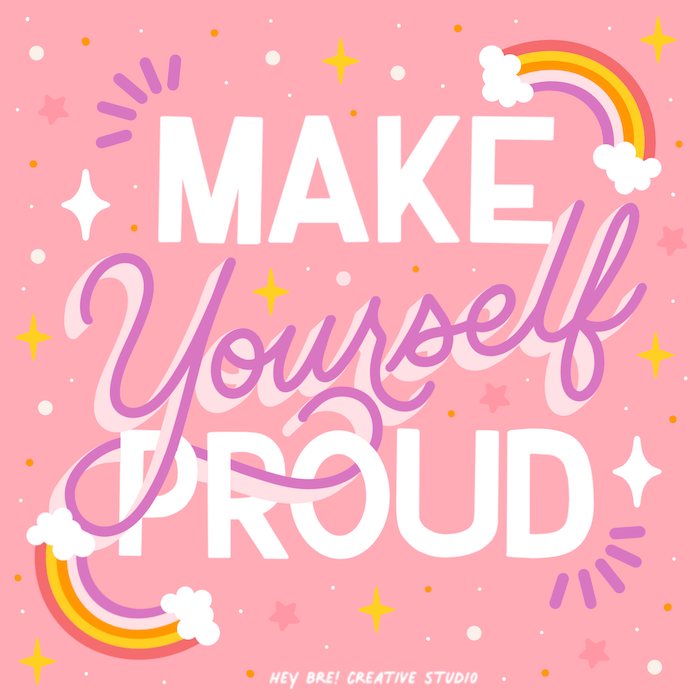
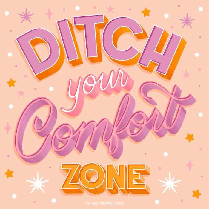
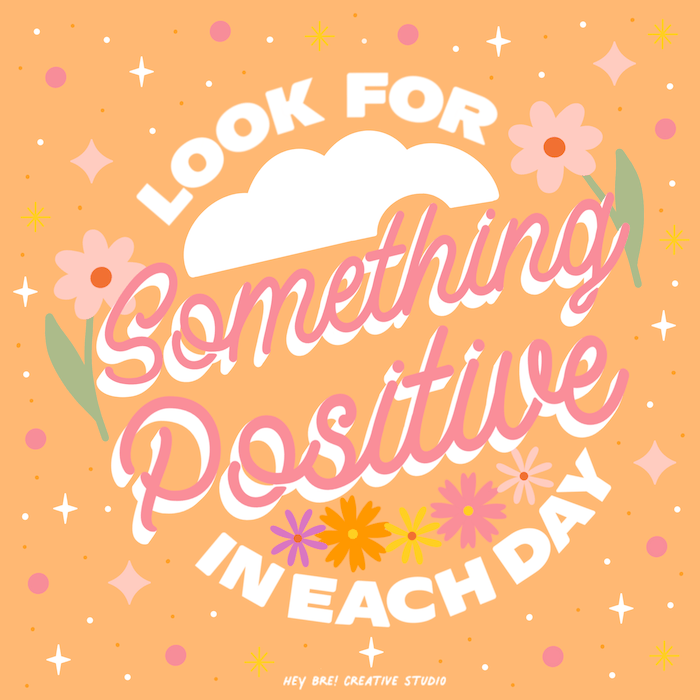
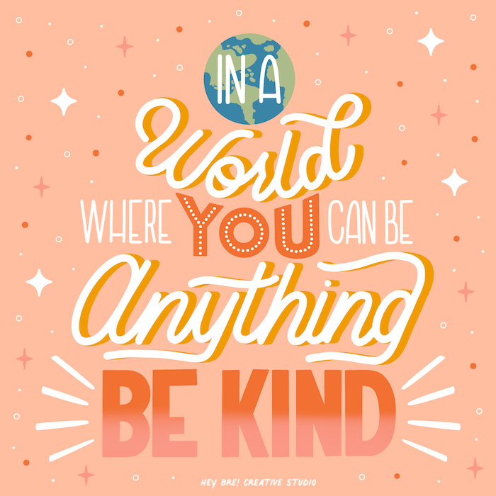
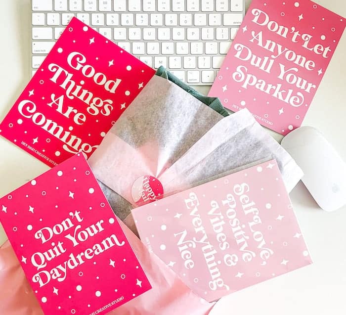
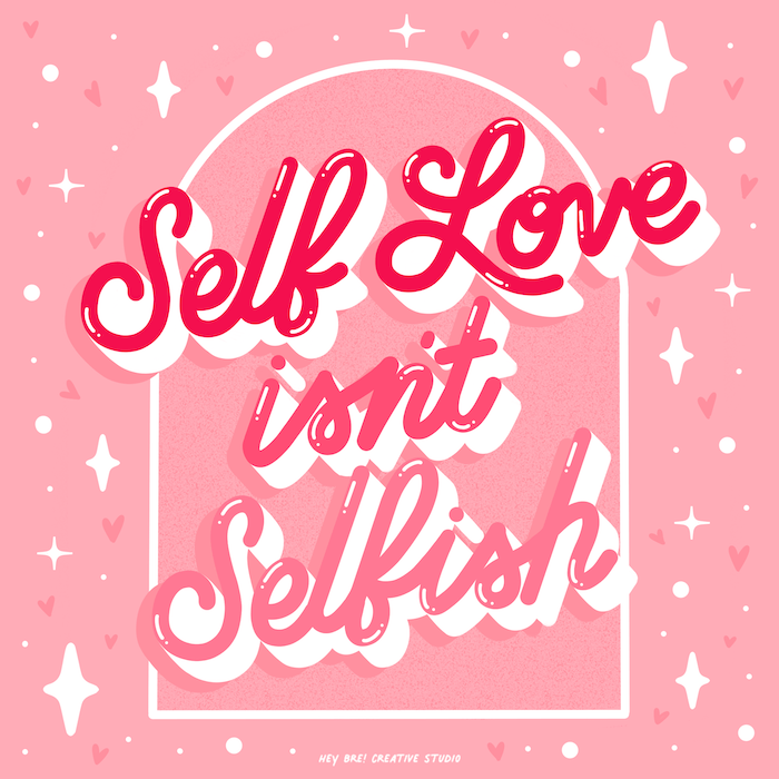
The colorful work of lettering artist Breanna Christie is an ode to optimism. Her motto? Promoting self-love, positive vibes and everything nice. We’re on board. So is her vibrant community of joy-seekers and life-lovers, coming back every day for more positive affirmations and mantras from the Louisiana-based hand letterer.
We met Breanna to talk about her journey to hand lettering, the power of positive affirmations and how she built such an engaged community as an artist.
Tell us a bit more about yourself. Where does your love for hand lettering come from?
I was born and raised in Shreveport, Louisiana and for as long as I can remember, I have loved art. Making art, looking at art, I love it all. My love for hand lettering really started in 2016 when I got the first iPad Pro and downloaded Procreate. As a creative person I’m always looking for ways to change up my style and do different things and with lettering you can really do anything with it. From changing the shapes and size of a letter or word, hand lettering is something that is really truly beautiful.
What inspired you to launch your own business, Hey Bre?
What inspired me to launch Hey Bre! Creative Studio was the fact that I didn’t want to be confined to a specific type of “art business.” I have sold jewelry, shadow boxes, wooden signs and each one had its own name. With Hey Bre! Creative Studio, I felt like I could do, sell or make anything under that name.
What’s your favorite part about being an entrepreneur? What’s the most challenging?
My favorite part about being an entrepreneur is that I get to make or design what I want on my own time. The most challenging part is time management. I work a full time job so juggling that and my business can be hard.
You’re also represented by an art licensing agency. How did that help you grow as a graphic designer and hand lettering artist?
Being a part of Pink Light Studio has pushed my creativity so much farther than it has ever been. I’m illustrating things that I would never do on my own and I think that is so important because it gets me out of my comfort zone.
Your art oozes self-love and positivity. What do you want to convey with your work?
I want to convey to everybody that they’re worthy of love, they’re important and beautiful and to always see the good in things.
What are your main sources of inspiration?
My main sources of inspiration are Pinterest (of course!) and also the people I follow on Instagram. There are so many amazing people and they put out awesome work. It just drives me to put out awesome work too.
Could you walk us through your creative process? How does a Hey Bre piece come to life?
The creative process begins with me scrolling through Pinterest. I love to look up positive quotes. When I find a quote that resonates with me, I then open up Procreate and I get to work. 98% of the time I never sketch, I just start drawing. It’s all in my head!
It’s clear your community means the world to you. How do you make sure you create the best experience for your customers?
I try to create the best experience for my customers through my packaging. I think packaging is so important when you’re buying from a business. I’m one of those people that likes to keep pretty packaging just so I can look at it. I even have a packaging inspo Pinterest board. I also love to hand write all my thank you cards to my customers and leave nice little messages for people.
How do you use MOO for your business?
I’ve actually been using MOO for quite some time for some other things I’ve done in the past but recently I use MOO for my Thank You Cards. I LOVE that you can get multiple designs on a set of marketing materials. It’s my favorite thing about MOO and also they have amazing quality.
Any projects coming up you’d like to share?
I’ve got a lot of things in the works right now, I’ve been doing a lot of freelance jobs and hoping to share with everyone soon!
You cultivated such an engaged Instagram community. Any advice for young artists trying to gain a following there?
My advice is to be sure of what you’re trying to promote and stick with it. My platform has always been about promoting self love and positivity and I think it’s such an important thing and it’s something that most people struggle with. Most important is to be yourself. Don’t try to be anyone else, don’t try to copy anyone else. Just be your authentic self and people will love that about you.
Create your own positive affirmations and spread the love with MOO Postcards.
When it comes to helping their clients find a track to suit their project, Warner Music have developed an innovative way to match them with the perfect melody. It all starts with their Color Cues cards.
Color Cues – what is that?
With around 2 million tracks in the Warner Music catalog, clients can often find themselves unsure where to start when it comes to choosing the right sound for their visual content. To tackle this, Warner are tapping into our emotional relationship with color through the use of their Color Cues cards — a totally original and interactive approach to selecting tracks. Each Color Cues box contains a deck of music cards printed in 9 different colors. Each hue represents a different emotion, and is complete with a list of tracks that suit the individual mood.
So, how did the color cards come to life? We caught up with Liam Klimek, Creative Sync Manager who works on the team behind Color Cues card, to find out how this clever use of print has changed not only the track selection process, but how Warner connect with their clients, too.
Tell us about the role of the Sync team at Warner Music?
Our role as the Sync team here at Warner is all about matching the media our clients are working with to the perfect soundtrack from our artists. We work across industries like film, TV, and gaming, and also run our in-house publishing imprint, W Songs.
What sparked the idea to create Color Cues?
Most of the clients we work with — film editors, directors and advertising professionals — tend to be very visual in their creative approach, so we wanted to design something that would translate their ideas into music in the most natural way possible for them. Using color seemed like the perfect vehicle, as it’s a creative language that everyone can connect with.
I’ve been interested in synaesthesia for a long time, and the Sync world is the perfect place to explore the relationship between what we see, what we hear, and what we feel. We were also really inspired by Brian Enos’ Oblique Strategies and the idea of adding a gamification element to creative decision making.

What are the visual inspirations behind these color cards?
The key inspiration behind the design was a combination of Peter Saville’s work with Factory Records, mixed with the world of Pantone. We wanted something simple, bold and clear.
There’s an online Color Cues platform. Why did you choose to create a physical product too?
As we’re all finding in the digital age, the use of physical creative tools is becoming less and less common. We’re so used to doing everything at our desks and on our computers, so we hope Color Cues music cards can be a fun alternative to scrolling through Spotify all afternoon.
The playlist cards kind of complete the circle in connecting sight to sound and touch – although we don’t recommend eating or sniffing the cards to get all the senses involved!

How do Color Cues change the way you work with clients?
The Color Cues work best as an interactive prompt for creative discussions, which is why it was so important that we designed physical cards for them to pick up and play around with. They create a really useful thought starter when asking clients what they are looking to achieve emotionally from a visual piece, while simultaneously giving them examples of complementary music to that particular mood.
How do clients react when you first introduce them to the Color Cues method?
The response so far has been overwhelming. It’s a great feeling to bring a fresh, creative approach to our peers who we respect so much and have them welcome Color Cues with open eyes and ears. We love watching somebody empty the box for the first time and hearing their “oooh” when they see the playlist cards. It’s a testament to our natural relationship with color, and the strength of our feelings towards different hues — it’s just that we rarely connect with them consciously.

Inspired by Warner’s Color Cues? Design your own creative cards for your next project with our Business Cards and Postcards.
Originally published on Dec 20, 2019
Ever felt unworthy of your success? Like this is all a big mistake and you shouldn’t be in this position? You might be the proud owner of imposter syndrome.
Spoiler alert: you’re worth it. So don’t let self-doubt and unhealthy “perfectionism” bring you down, and learn how to deal with imposter syndrome with our expert tips.
What is imposter syndrome?
Imposter syndrome is the belief that you’re not as skilled or as qualified as others see you. Feeling like a fraud despite your skills, talents and accomplishments is an expression of self-doubt and lack of self-confidence. It’s often linked to an inferiority complex: you think other people are more competent and knowledgeable than you are, so they shouldn’t trust your expertise and abilities.
Own your success: dealing with imposter syndrome
Whether it’s in the first days of a new job or throughout their career, many people will experience it at some point. Feeling like a fraud can have a massive impact on your mental health. It can feel overwhelming but time and believing in yourself can help you overcome imposter syndrome. Here are some of our best tips for dealing with imposter syndrome:
Talk it out
Important reminder: the way you see yourself doesn’t necessarily reflect who you are. That’s why it’s essential to talk about your imposter syndrome with people you trust – friends, family or a therapist. Talking it out will let you see yourself through someone else’s eyes and help change your perception. It’ll also help you put words to what you’re feeling and might help you realize where you’re not giving yourself enough credit.
Take off your envy goggles
It’s easy to feel like you’re underperforming when you’re constantly bombarded with images of overachievement on social media. When you start comparing yourself to someone else, take off your envy goggles and be honest with yourself. Are you comparing what’s comparable? Feeling like a fraud means you often miss what’s behind the scenes to indulge in negativity.
A lot of work, people, money or time might have gone into presenting you with that seemingly picture-perfect result. Question what you’re seeing from people before you use it to feed your imposter syndrome. Everybody is unique. We have different resources and challenges which means our path to success doesn’t look the same – and that’s ok.
Celebrate your successes
A healthy dose of self-doubt can be a great way to challenge yourself and progress, but it’s important to stay objective when criticizing your own achievements. If you’re going to investigate what you’ve done “wrong”, you should also accept what you’ve done right. Constantly chasing an unachievable standard of perfection without acknowledging your successes can also lead to anxiety and burnout.
Feeling like a fraud is a sign you’re having trouble internalizing your achievements. Celebrating your successes can help you overcome imposter syndrome by making you accept those accomplishments as yours. There are lots of ways you can acknowledge your successes: treat yourself to a little something, write it down in your Journal, or share the news with a loved one. You can also pop a party popper if that floats your boat – maybe just not in the office.
Set yourself reminders
Positive affirmations could be the key to improving your self-esteem. This seemingly innocent self-care trend has gotten a lot of attention in recent years, and for a good reason. While they’re not the answer to everything, affirmations can help boost your confidence and help you adopt new, healthier thinking patterns.
Affirmations are positive spoken or written statements you repeat to yourself to challenge negative thoughts. Write them on a Post-It and stick them to your mirror or on your desk as a daily reminder you’re worth it and you deserve your successes. You can also print them on Postcards to decorate your walls (just saying).
Change your perspective
If you think you don’t deserve your success, changing your perspective can help you see things differently. Let’s side with your negative thoughts for a second and consider the situation. Even if you didn’t deserve these achievements, don’t you think it’s a success in itself having reached your position? Think about it: no matter your skills, knowledge or abilities, you’ve successfully managed to get where you are and, if nothing else, made everyone think you’re doing a great job at it. Plus, you do deserve it.
Take your value elsewhere
Success is great, but you shouldn’t let it define you. Your worth doesn’t depend on what you manage to accomplish. The sole fact of being alive is a success in itself. Try to shift your sense of value to this simple truth. You are a unique human being. You don’t need to prove anything else to the world – or yourself.
Start your journey to overcome imposter syndrome by celebrating successes and repeating positive affirmations in your MOO Journal.
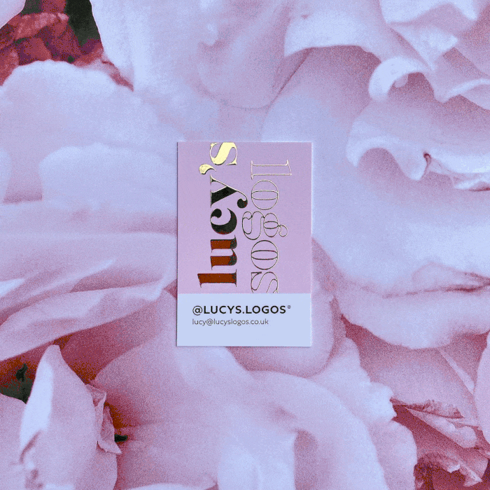
Self-taught UK designer Lucy Barr-Richardson has made a career from understanding brands and creating the perfect logo design to represent them.
We caught up with the creative brain behind Lucy’s Logos to find out exactly what goes into making a great brand mark and how she makes businesses shine with her fiercely feminine palettes and retro typefaces.
Tell us a bit more about yourself and your background. How did you end up launching your own business, Lucy’s Logos?
If I’m completely honest, Lucy’s Logos was never in the plan. And if I’m even more honest, I never really had a plan. I left school, went to college and studied professional cookery. Once I figured out I much preferred to eat the food rather than make it, I got myself an office job and worked as an administrator and marketing assistant for two years.
Lucy’s Logos was never in the plan
Then I landed my first graphic design job and spent every spare minute teaching myself the applications, practicing and creating. Friends then started asking me for logo designs. I moved jobs to an amazing design, print and manufacturing company and really honed my skills. I learnt so much being there, all while my business was blossoming in my spare time and I unintentionally turned my little side-hustle into a fully-fledged business. It got to the point where my business was so busy and I felt ready to take the leap. I’ve never looked back since.
What are the first steps you take to create a logo?
The first step is always to find out what the client wants. That’s visually and verbally. I always get my clients to write me a brief, explaining what their business is about, their target audience, goals, hope and dreams for their business. This gives me the best vision of where they see their new branding taking them. Then, what styles they like visually. As brand design is mainly a visual process, a mood board created by them is often the best indicator and guide for how they envision their branding.
From there, it’s all about chatting and refining ideas until we reach a mutual agreement on the direction we want to go in. Some clients know exactly how they’d like the design to be, others need a little more guidance and advice, but that’s what I’m here for!
Where do you find your inspiration?
When I first started my business, I spent a lot of time looking at similar logos in the industry; gauging what colors, styles, fonts, and illustrations worked and were trending. As I’ve never had any formal training, I was very much just winging it and learning from whatever I could get my eyes on.
Now I have more experience, I find I get a much better outcome from just focusing on my brief rather than filling my head with hundreds of ideas from Pinterest (or other sources). Although, one thing I do always use Pinterest for is color palettes. Not from other logos, but from paint sample pictures and aesthetic photographs. They’re much more muted and soft, which lends itself to the colors I gravitate towards.
What are the most important elements of a brand’s personality you look to capture in their logo?
Lots of my clients are self-employed, so the most important personality to capture is often theirs.
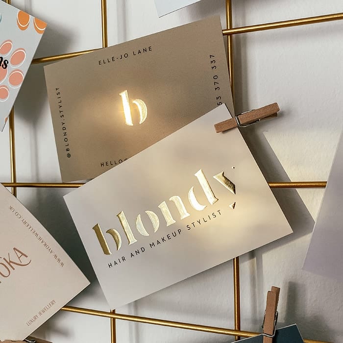
Blondy was designed for a friend of mine, so distilling her personality through branding was easy for me. There was a trust already there, and she was happy to give me full freedom without any brief at all.
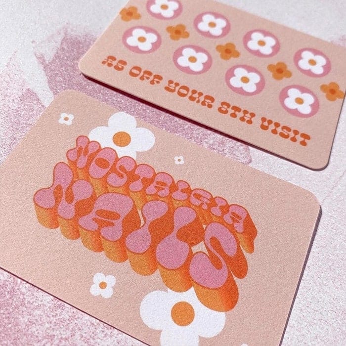
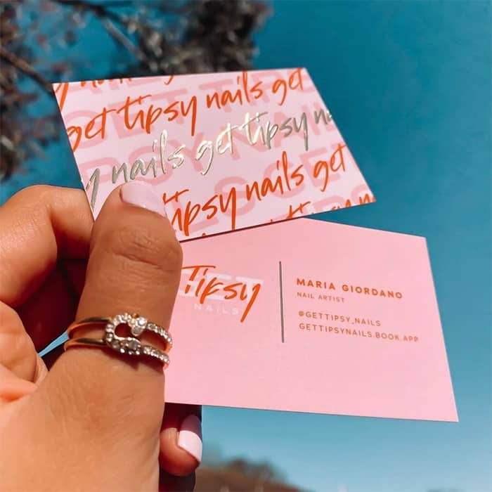
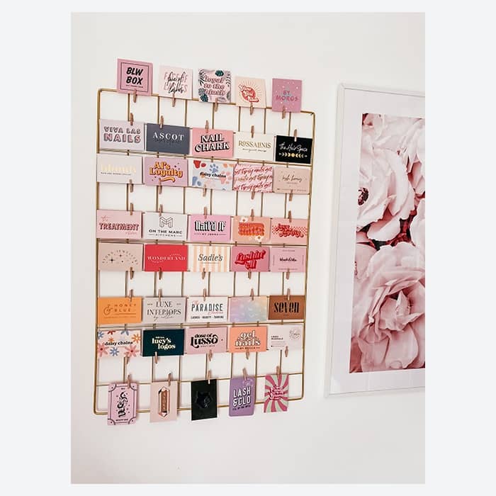
For clients I don’t know, it all comes back to the brief. You can actually tell a lot about someone’s personality by the styles of design they’re drawn to. Everything from the colors to the style of illustrations, interior decor and typography they like gives me a clue to what they want in their own branding. Nail Chark, Get Tipsy Nails and Nostalgia Nails are just a handful of my nail technician clients whose brands are unique to them – I had to reflect their personalities without knowing them personally.
Your lettering has a lovely retro vibe to it. What inspires you to design this way?
I’ve always been described as an “old soul”, but I definitely think my style has developed over time alongside my skills. I’m also a massive fan of Andy Warhol’s pop art paintings, which has probably had an influence.
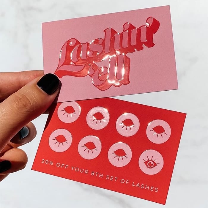
I first discovered a love for 3D retro-style lettering just over a year ago after getting some practice creating my own little quotes and inspirational posts on Instagram. I then convinced my client Lashin’ Ell to have the same style for her logo. Now, people send me her brand all the time as a reference for what they want for their own business.
How does the process of creating an illustrated logo differ from one that’s type-based?
For me, illustrated logos are easier to get right the first time. With typography, I find that because there are so many different typefaces out there, my clients sometimes struggle to explain the style of font they want or I may take a slightly different impression from their brief than they do. I’ve found that sometimes, even when I do get the style they’re after, it unfortunately just doesn’t work for that brand. That then just requires some additional discussion to explain why and suggestions for what will work better to achieve the same goal just in a better way visually.
With illustration, it’s much easier for clients to describe what they want and show you the styles they like. They’re often more consistent too. A unicorn is still a unicorn whether it’s in a logo or not — it just takes a little while to perfect.
How do you ensure a client’s logo works across a range of branding materials?
Make more than one! I live for submark designs. They make life so much easier. As much as I’d love to say I’m perfectly capable of creating one single logo for every client that works on every platform of design they could possibly ever want, I can’t. Sometimes it’s just not doable. And anyway, why would you want one logo when you can have more?
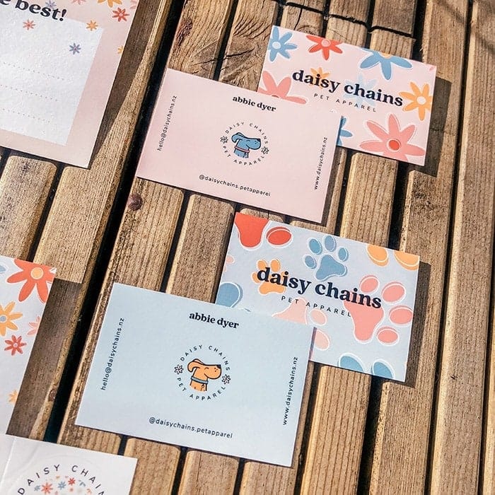
The first client I created lots of branding collateral for was Daisy Chains. We did everything from the logo and submarks, to brand patterns and nearly every piece of promotional print there was — as well as website banners, packaging, swing tags and wallpaper. The fun and friendly nature of her brand made it so easy to add extra design quirks across the board. We even created a mascot dog, Rupert, who features on Business Cards, Stickers and illustrated stamps on Postcards.
Many of your logos use pastel palettes — are these colors you typically like to work in?
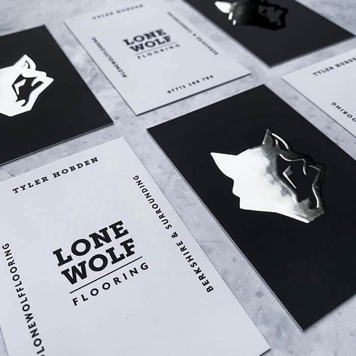
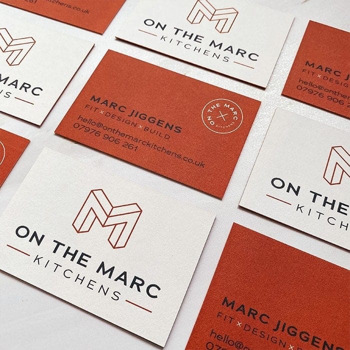
My clients are predominantly women, so I often naturally work in “feminine” palettes. I personally prefer working on this type of branding because I find it much easier to relate to, but it’s equally refreshing when I then get a more “masculine” brief — such as the ones I received for my clients Lone Wolf Flooring and On The Marc Kitchens.
The colors, illustration style and fonts I used for these brands’ aesthetics are different to the ones I usually work with and it was nice to switch up my approach. After all, I didn’t become a designer to do the same thing every day!
What happens when a client has a really clear idea of what they want, but you have a different direction in mind?
If my idea is completely different, I’ll explain the reasoning behind my thought process and try and meet in the middle. If it’s only slightly different, I’ll often design both options and let them choose their favorite. If they don’t like my idea at all, then I just do my best to meet their expectations. After all, it’s their logo, not mine, so they have final say — you can’t win them all.
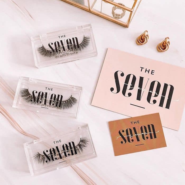
Since becoming more established, I’ve had a lot more people come to me saying “just do what you think. I trust your approach,” which is really rewarding. The lovely ladies at The Seven put so much trust in me to create the perfect brand for them and we hit the nail on the head! I don’t remember making any adjustments to the initial design at all.
I do occasionally get briefs that are completely not my style and so I don’t take them on. The most important thing to me is that my clients are happy at the end of it all, so if I don’t think I’m the right person for the job, I’ll try to refer them to another designer that’s better suited and I have a relationship with via Instagram.
What’s the most challenging brief you’ve ever worked on?
Every brief and client has its own challenges. Of course, some can be more challenging than others. But there’s nothing a good conversation and regrouping can’t solve. I think when I was less experienced, I would panic in situations where I didn’t immediately know what direction to go in if the initial design didn’t work. But seriously, it’s all about talking! A lot of the time you’re working with people you don’t know, so understanding how they communicate their visual ideas is key. Once you’ve mastered that, you’re good to go.
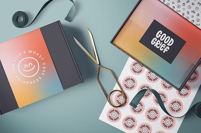
I recently worked with a new start up business called Good Grief – who create care packages for all of life’s twists and turns (the unfortunate ones). The design turned out amazing, but we definitely struggled initially to find that perfect vibe and visual for the main logo. After a bit of back-and-forth we of course found “the one”, combined it with a great color palette and the rest was pretty smooth sailing after that!
How do you think our physical experiences with branding changes how we connect with businesses?
People always feel much more connected to things if they can hold them in their hands. I’m one of those people that walks through clothing stores and touches every single item (pre-covid, obviously). The nicer they feel, the more likely I am to buy them, and I think the same principle applies to how people engage with branded print.
For a long time, I only ever posted Photoshop mockups, which as we all know, is incomparable to a snap of some high-quality print. When I started posting pictures of my clients’ printed work, it boosted my business massively because potential clients got a true picture of what their brand could look like.
When it comes to print, if it feels rubbish and looks rubbish, it will become rubbish. So if you want someone to keep your Business Card in their purse, you better make sure it’s amazing — and that’s why MOO is always my print partner.
You’ve been a freelance designer for over a year now. What do you find the most rewarding and the most challenging about being your own boss?
I’m not sure I could exactly pin-point what is most rewarding about being self-employed. Basically, just being your own boss comes with a whole heap of perks. I’ve never been the best with “authority” as such, so working for myself is definitely better suited to me and my personality.
It’s true what they say; you reap what you sow
There are parts of being employed that I miss, my life was definitely less stressful. You don’t quite realize how much goes into running a business, no matter how small, until you do it. You are literally every job role. Owner, designer, admin, payroll, cleaner, stockist, HR, PR, social media manager… The list is literally endless. But it’s true what they say; you reap what you sow. The 3am working is worth it. I don’t know who I’d be without Lucy’s Logos and I don’t ever intend to find out!
What does your workspace look like and how do you stay productive?
My office is my pink, productive heaven. It’s where I’m most productive and where I feel most inspired. My worst fear about home-working is definitely getting cabin fever, so I’ve tried to make the space as clean and breathable as possible. My desk is right by the window so I get a good amount of daylight and fresh air (plus I can spy on my neighbours too for a little daytime entertainment). I do switch around sometimes though, one of the perks of working from a MacBook and having a decent lap-desk is that you can move around the house. Somedays you just need the comfort of your sofa or your bed – major WFH perks too.
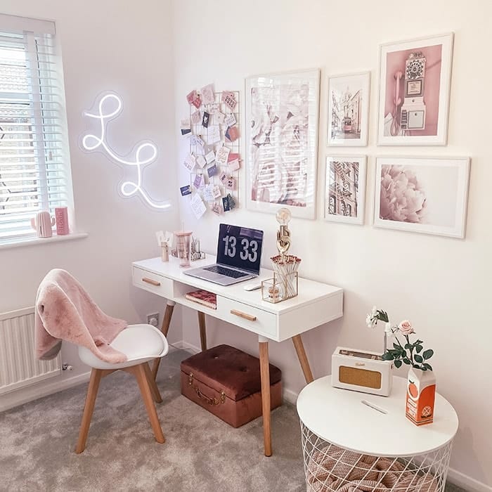
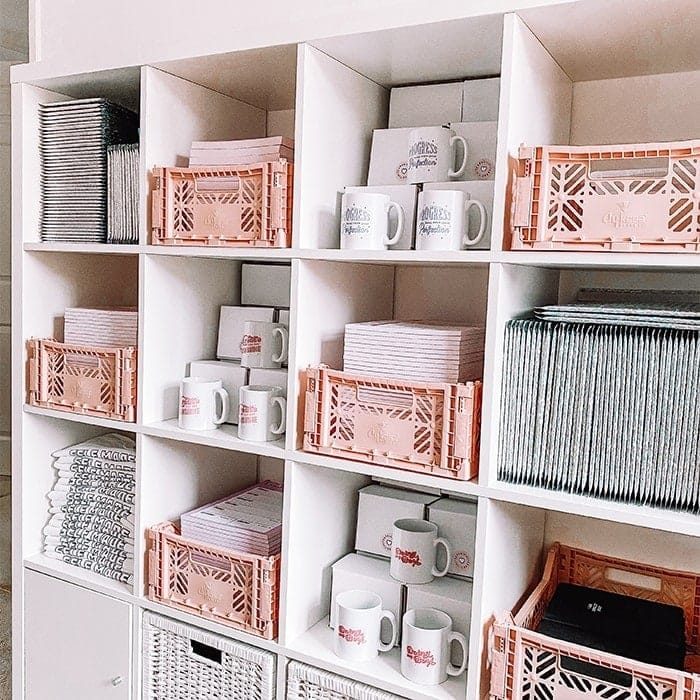
As a designer I’m easily pleased by anything pretty, so most of the things in my office are for display purposes only. I have a custom neon sign of my logo, pictures of pink things, personalized pencils, and the coolest orange juice vase. The main thing I have to make me feel productive is my mesh board with all my Business Card and Loyalty Card designs pinned to it. If I’m honest, it’s basically a MOO shrine, but it makes me feel so incredibly proud and helps keep me motivated when I’m feeling a little bit “meh” about my work. I also have my radio which keeps me sane and stops me talking to my lamp.
Do you have any tips for fellow creatives looking to make the leap?
There are obviously huge financial risks in leaving your secure full-time job to run a business, so make sure you have a backup of savings behind you. Remember, no sick or holiday pay when you’re self-employed! It’s also vital to have a designated space to work, whether that’s in your home or a coworking space, or even a coffee shop.
Take your time and build up your business gradually
I think my main tip would just be not to rush and speak to as many people as you can who’ve done it before. Take your time and build up your business gradually until you feel completely ready in both your business and yourself – the world isn’t going anywhere but being self-employed definitely isn’t for the faint-hearted. You have to really love what you do to convince yourself to get out of bed in the morning when you’ve got no one to answer to but yourself.
Give your logo design the canvas it deserves with MOO Business Cards.
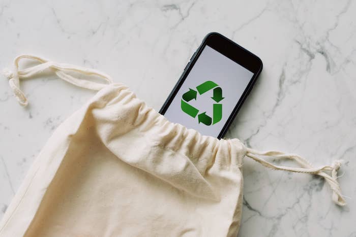
Everyone has a part to play when it comes to protecting the planet – and it comes as no surprise that the most environmentally-friendly companies are not necessarily the biggest ones. Even as a small business, you can help reduce your carbon footprint by introducing a few principles in your day-to-day activities.
Where to start? From sourcing to packaging and communications, check out our tips to make your small business more sustainable.
Source it right
The first step to becoming a more eco-friendly business is choosing the right suppliers. It’s the absolute essential for any company big or small when it comes to sustainability. Here’s what to look for when choosing a supplier for your business:
- Materials. It’s the most obvious one. Make sure your supplier is using sustainable, quality materials that are easy to trace, especially if you’re sourcing a transformed product from them as opposed to raw materials.
- Ethics. Sustainability and ethics go hand in hand. Calling yourself an environmentally conscious company should also mean you’re partnering with suppliers who treat their employees fairly and offer good working conditions.
- Clean energy and recycling. People and materials are key to identify a good supplier, but their workplace is also a big part of their environmental impact. Using clean energy and having a good recycling program both for manufacturing waste and machines is essential.
- Shipping. Is your manufacturer or supplier making any efforts to reduce emissions from transportation? Keep in mind that ordering from all the way across the globe will have a big impact on your carbon footprint, even if your supplier is otherwise an environmentally friendly company.
- Certifications. Look out for certifications to ensure your supplier is being fully compliant and transparent with you about the above points.
Think green energy
Whether you sell your products in a shop or you work from an office, there are many ways becoming more energy efficient can benefit your company. First, it helps you protect the planet. But it’s also a great way to reduce your energy bill, especially as a small business with limited resources. So, what does an eco-friendly company look like, energy-wise? Energy-efficient appliances, for a start. You can also switch to LED lights and use smart solutions like sensor-activated lights and smart thermostats.
Did you know green web hosting services are also a thing? Because websites use a lot of energy, because your data has to be stored somewhere. Many environmentally friendly companies, like Green Geeks, are now offering solutions to offset the carbon footprint of your data usage.
Reduce waste
Packaging is often the main culprit when it comes to waste. Finding recycled and recyclable (or even better, compostable) packaging materials is now much easier than it used to be, from envelopes to clear bags and bubble wrap. Think minimalist. Do you really need that many layers of plastic to protect your product? Is there a smarter way to make sure it reaches its destination safely? Using recycled materials to wrap and protect your products doesn’t mean it will look “cheap”. Not only does it help you become a greener business, it also gives a more personal touch to your products.
If you have that possibility, making products to order is also a great way to reduce waste… and storage needs! It also gives your customers a sense of exclusivity as each product is made just for them. Despite your efforts, if you produced too much of an item and you’re ready to launch a new collection, or if there is any little issue with some of them, think twice before you chuck them away. Try offering them at a reduced price or giving them as freebies in your next orders. Chances are you’ll make some very happy customers!
Discover how Óura Candles reduced waste by selling her not-so-perfect candles at a reduced price as “Ugly Ducklings” range here.
Offset your emissions
As committed to becoming a more eco-friendly company as you might be, some carbon emissions can be difficult to reduce as a small business. Fortunately, this doesn’t mean you’re out of options. You can choose to sell through a marketplace that offsets carbon emissions for you, like Etsy, or choose how you want to offset your emissions yourself.
Some organizations offer the possibility to purchase carbon offsets to make your business more neutral. These “carbon marketplaces” let you calculate your footprint and balance out your emissions with different projects. There are many organizations like this around the world – make sure they are certified before committing to one. Native, MyClimate and 3Degrees are some of the most reputable amongst them.
Manage expectations
As an eco-friendly business, the way you communicate with your customers is very important. First, because eco-conscious customers will be more likely to purchase from you if they recognize your efforts to become greener. But clarity and transparency about the way you conduct business are also essential to retain customers and justify your practices as an environmentally conscious company.
One of the most important elements you should communicate about is your costs. If you’re committed to becoming a greener, more ethical business, chances are this will increase your production costs – and thus your prices. Communicating clearly about your pricing model and the principles that are driving it is essential for customers to understand where the mark-up comes from.
You should also make it clear to your customers that buying from a sustainable small business might mean a slightly different experience from a big retailer’s. It’s all about managing expectations. If you make products to order, next-day delivery is usually not an option as it’s likely to take longer to get them ready to ship. In the same way, if you’re recycling paper to wrap your products, it might be perceived as negligent by a customer who’s used to overpackaging by big high-street retailers. Make sure your customers understand why you’re doing things this way as well as the positive impact they’re having by shopping with you.
Start your journey to sustainability and become a greener business with our tree-free, 100% recycled Cotton Business Cards.
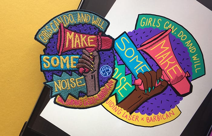
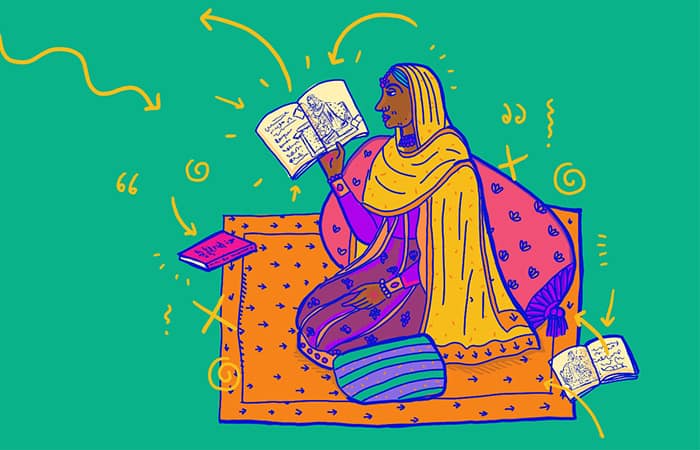
Soofiya is a visual artist based near London, whose bright illustrations, bold installations and educational workshops are designed to trigger conversations on themes of gender, identity and race.
MOO caught up with the artist, educator and Friday Night Sketch host to discuss their colorful explorations of identity, and tips for graduate designers.
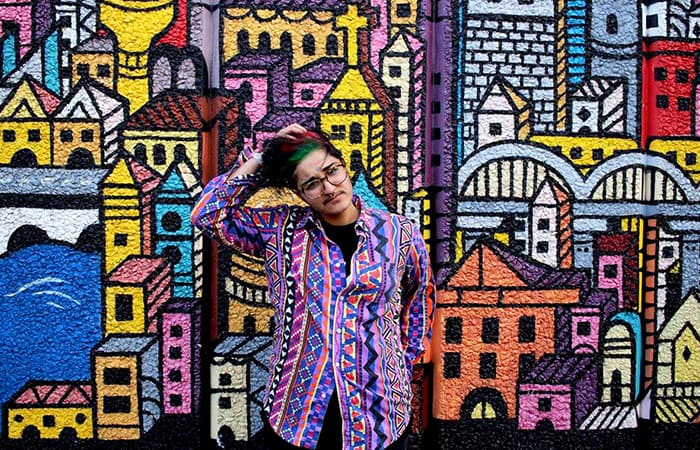
A graphic design graduate from Ravensbourne University in North Greenwich, Soofiya teaches for a foundation course on art and design, and creates work for artistic spaces including the Tate galleries, the V&A museum and the Barbican arts centre.
After hosting Friday Night Sketch at the Design Museum on the subject of Mapping Memories, MOO caught up with Soofiya to talk about visibility, self-acceptance, and the benefits of creating a ‘bedroom empire.’
Tell us a bit about your background, and how you got into design
I live with my parents, who are from Pakistan, in my childhood home. I had a tough time at college and school, but graphic design changed my life in every way. I’d come home, put my headphones on, and draw. The world didn’t exist: it was just me, creating. I could make mountains and move them – I could do anything.
I felt so disempowered in my life, that being empowered by art was a turning point for me, and that’s what I try to do with my teaching. If I can give even a fraction of that feeling to someone else, my job’s done.

How has your sense of identity informed your work?
Growing up, I didn’t see anyone like me out there in the world – someone brown and hairy and very visibly non-conforming – and that can be a very hard space to occupy. If you don’t see yourself in the world, how do you know you exist? How do you know you belong?
If there’s something I don’t understand, or I’m sad about, I’ll build a project around it to help me explore it. In the last couple of years I’ve been using my work to look at ideas around identity, race, gender and immigration.
I was also never taught by anyone like me, which is one of the reasons I teach. By being and teaching, you can be the person you needed, but to everyone else. You can be the person you wanted to see.
The character ‘Soof the Floof’ appears regularly in your work. Can you explain the inspiration behind it?
Soof the Floof is basically a genderless, gelatinous blob. I was doing a summer school at the Tate, and we were given a piece of clay to make something – anything. I was wondering how I could depict myself, and the parts I don’t feel comfortable with: my weight, my hairiness, the way that I am. So I made an object that represented all that – but although it embodied parts of myself I don’t like, it was still lovable. How can you hate Soof the Floof?
One thing I’ve really evolved in my work is design’s therapeutic value, and Soof the Floof has become a way of talking about difficult subjects, like gender and race, in a way that’s playful and accessible. In workshops, I’ll ask people to make their own Floofs – it’s a lovely vehicle for engaging discussion.
Which project have you been most proud of so far?
I did an exhibition last year called Soof in Private. I shared my Google search history on one wall, my private messages on another, and both my public and private Instagram accounts. There was a dialogue between the two that never exists on your phone, and when they’re on the wall side-by-side, you can see that identity can be very compartmentalized.
Identity plays an important role in art, because you can be a mirror to the world. It allows others who have overlaps with you – similar feelings about gender, or someone who’s come from a similar background – to see themselves reflected back. I think it’s good to feel seen and to witness others, too.
What’s your workspace like?
My bedroom is my studio – freelancing can be scary and precarious, but it can also be exciting and empowering, and I love the idea of having a bedroom empire.
It’s a reassuring tether, which has also opened up a lot of opportunities I wouldn’t have had otherwise. I feel quite mobile being able to go into London or travel to Leicester for work, and having that base to come back to. We’re lucky to live in a digital era of mobility, and I’ve found that leaning into it helps. Often, designers assume you need a studio space to have a design career, but you can do things your own way.
My favorite thing right now is having meetings in my pajamas. I feel like I’ve made it in life when I can take a phone call with a bowl of cereal in my hand.
What’s your biggest tip for new designers?
Do what you love, but also make sure you pay the bills. It’s a hard hustle, but you need to hang onto why you’re doing this. For so long, I was doing corporate typography and branding – no illustration at all. I was excited because I was doing graphic design, and that’s what I love, but my aim was to be excited by what I’d made.
It’s not going to be there for every project, but that’s OK. And it’s not all going to be fun – 90% is emails, meetings and invoicing – but that 10%? Well, it makes everything worth it. Your brain is going at 100 miles an hour, and the adrenaline is pumping… It’s brilliant. So find that thing that gets you going, whatever that may be, and run after it as much as you can.
Finally, listen to your gut, because it knows where to go better than anything else. Go with the flow, but be strategic. Plan a few months – not years – ahead, then regularly review and reflect to work out where you are.
You hosted Friday Night Sketch on the subject of Mapping Memories. What does that process mean to you?
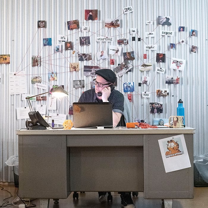
When I think of my life, I imagine pins on a corkboard, connecting everything together on this big map, from work to my social life. I need everything to be physical and visual for me to make sense of things, and I think a memory map is perfect for that.
It’s like putting everything that’s heavy in your brain onto one page – then you can neaten it up and find your routes. As soon as you have a map, the whole world can be home.
Discover more amazing artists and creatives like Soofiya in our Interviews section.
Originally published on Apr 25, 2019