4 amazing holiday card designs with ALL the trimmings
Get your fill of eye candy with our community’s most creative holiday card designs.
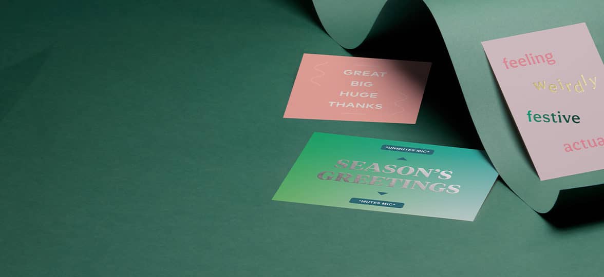
In uncertain times, feeling close to your community is more important than ever. And what’s better than a personalized holiday card design to (re)connect and show you care? From topical greeting cards to miniature pieces of art, get your fill of eye candy with some of our community’s best holiday card designs.
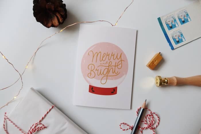
1. Danielle White: feeling close from afar
Designer and lettering artist Danielle White combines her love for pastel colors, typography and graphic design to share positive vibes and spread the cheer. Under the current circumstances, distance from our loved ones can be a challenge. That’s why reminding each other we’re there is so important, especially during the festive season. A simple lettering design and a powerful message: the key to an inspiring holiday card design.
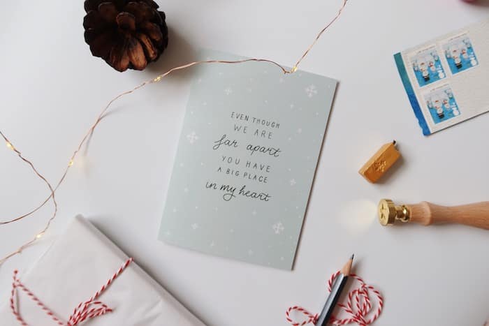
“With this Christmas looking more like a socially distanced one with less in-person celebrations than we’re used to, I really wanted to make a card to let loved ones know that even though you perhaps can’t give them a cuddle by a warm fire, you’re still there for them and they hold a big old place in that heart of yours. I also wanted to create a card with all the nice Christmassy feelings of snow and festive cheer.”
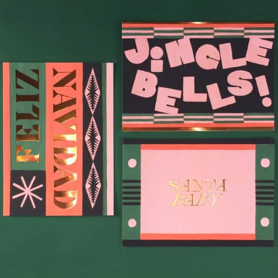
2. Sabine van Vessem: back to better days
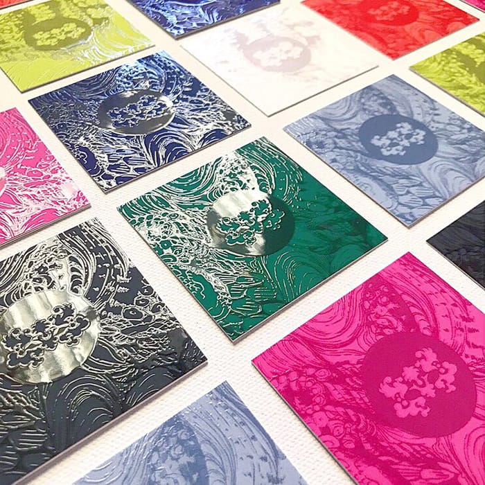
Sabine van Vessem is an Amsterdam-based illustrator and print designer with a passion for combining various disciplines such as illustration, paper cut collages, typography and pattern design. Her colorful, vintage-inspired Christmas card designs skillfully mix these techniques for a dazzling effect. By choosing an unconventional color palette for the festive season and enhancing some details with Gold Foil, Sabine managed to create Christmas card designs that really pop.
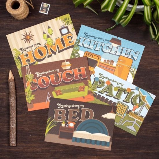
3. Amanda Weedmark: greetings from the great indoors
Amanda Weedmark is a graphic designer, digital illustrator and creative entrepreneur based in Burnaby, Canada. As an outdoor lover and vintage design enthusiast, Amanda created a set of Postcards during lockdown as a cheeky wink to the current context. In a time when traveling is less of an option and many people are still quarantining, funny holiday Postcard designs can help you (metaphorically) move around and reconnect with in a fun, light-hearted way. We are confined, but not our mind.
4. Philip Bailey: less is more with a minimal holiday card
Philip Bailey is an in-house Senior Graphic Designer at MOO HQ and a strong advocate of playful and clever design. For our festive card template collection, he created a simple yet pristine holiday card design. After a complicated year, a minimal holiday card is an invitation to relax and focus on the important things. Make your season greetings a stress-free space with this playful template.

Feeling inspired? Explore our original “happy holiday” card designs or create your very own Postcards and Greeting Cards with MOO.
It’s been a rough year – there’s no denying it. With relationships becoming increasingly digital, feeling close to your clients can become challenging. As a little reminder of the physical world, holiday cards are a more tangible way to thank them for their business in the past year. Expressing your gratitude with a beautiful card and a personalized message is guaranteed to put a smile on their face and make sure you stay on their mind – even if they can’t meet you in real life.
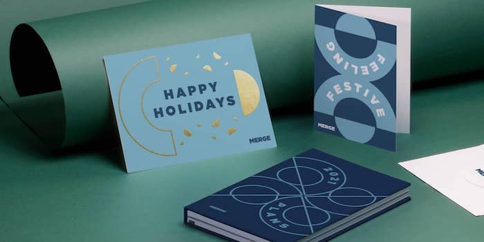
Looking for original holiday card ideas for your business? From Gold Foil details to flat design, create memorable designs with these creative ‘happy holidays’ card ideas.
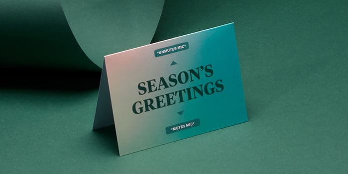
Be topical
Put a positive spin on the new normal with a funny message for your season’s greetings. A remote work-themed holiday card idea is a nice way to remind everyone we’re all in the same boat and bring us closer together – virtually, that is.
Why not go for one of our holiday card templates? Our design team created a range of clever templates to help you spread the cheer – and the cheer only. Creative holiday cards for your business, check.

Download this holiday card template here >
Let it shine
Make your cards more eye-catching and memorable with shimmering accents. A little opulence can make a big impression! Elevate your season’s greetings and make your designs pop with a shiny Gold or Silver Foil finish. Try it on text, photos, your logo – anywhere. And with MOO, you can add foil on both sides of your postcards, for the festiv-est cards ever.
Most of our holiday Postcard templates and Greeting Card designs can come with a Gold or Silver Foil option with MOO Business Services. It’s even easier to add a unique twist to your business greetings.
Give minimalism a go
Keeping it simple has definitely been the order of the day of late. But minimalism doesn’t have to be boring. A clean holiday card template gives your clients a sense of (much needed) simplicity and wellness. Send your good thoughts loud and clear with a beautifully simple color palette, an uncluttered design and a short and catchy message. Pick a premium, tactile paper stock like MOO Luxe to give your holiday card ideas a luxurious canvas to come to life.
Here at MOO, we’re big fans of minimalist design. So, if you need some creative company holiday card ideas, use one of our simple yet pristine “happy holidays” card templates.
Download this holiday card template here >
Think outside the box
If you’re looking for great corporate holiday card ideas, forget (almost) everything you know about holiday cards. Put your own twist on end-of-year clichés and dare to drop the usual color palette for a more original approach. The best company holiday card ideas are the ones that surprise us.
Our creative team put together a range of out-of-the-box holiday card templates to help you celebrate differently. Whether you’re creating festive Postcards or Greeting Cards, we have designs for every canvas.
Download this holiday card template here >
Got your fill of holiday card ideas for your business? Use our unique holiday card templates or design your very own Postcards and Greeting Cards with MOO.
Kelly Abeln is a full-time freelance illustrator and comic artist, working from her home studio in Minneapolis. We caught up with her on how she’s adapted her style to fit the comic format, and how she uses personal experiences to connect to her audiences through art.

Talk us through your illustration technique. How did it evolve over time?
As I’ve developed as an illustrator, my process has shifted from using totally analog materials like gouache, to creating almost everything digitally on an iPad. Even though I’ve moved away from creating with ink and paint, I still like to incorporate painting and printmaking textures into my work to make it feel warm and handmade, even when it’s digital.
How does your style change when you shift from illustration to comic work with Hagsville?
If I’m just working on a stand-alone illustration, I can include more depth, texture and detail, whereas when I’m creating a comic illustration, I try to simplify my style by using limited color palettes and line work. It’s also important to ensure consistency when you’re drawing a character across several panels, and really focus on getting across the emotion of their expressions. My comic work is less about making each panel full and rich, and more about moving the story along.
How did you discover your love for autobiographical comics?
My college roommate used to check out a lot of indie comic books from the library and I started borrowing them. When I read books like Lynda Barry’s ‘The Greatest of Marlys’, Esther Pearl Watson’s ‘Unlovable’ series, and James Kochalka’s ‘American Elf’, I felt a connection that I’d never had with superhero comics. I just immediately fell in love with them. Even though I only took one comics class at school and focused more on illustration as a career, storytelling and humor has always been a part of my work, so it wasn’t too big of a jump to start making my own autobiographical comics with Hagsville.
What’s your comic style? How do you see it developing in the future?
The simplicity that comics demand forces me to strip back and exercise restraint with detail. Storytelling is the main attraction and the art is somewhat secondary, so it’s nice to not have to agonize over every panel.
In the future, I’d like to develop more of a system like traditional comic strips have and create more consistency in the way I draw people and places. That way I won’t have to rely on reference images as much, and it’d speed up some of the more tedious parts of comic making.
How would you describe the sense of humor in your work?
I like to create a mixture of sad and funny moments. Dark comedies are my favorite genre of movies, books, and comics. For me, the laughs are deeper when they are based on truth, so a lot of my comics come from personal experience.
The things that stick in my mind usually have a strong emotion of humor and/or sadness attached to them, so they end up influencing what I create. I also love to find humor in small daily interactions and all those in-between moments in life that often get overlooked.
Where does the character Hagsville come from?
Hagsville comes from my favorite movie, Clueless. It’s not one of the most famous lines – it’s a comment Christian makes in reaction to an outfit Amber’s wearing. I chose it all the way back in 2009 as my instant messenger screen name, and when I got Instagram, I carried it over.
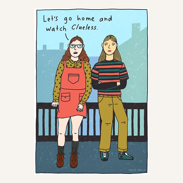
I still like it to this day because it’s kind of girly if you get the Clueless connection, but it’s also kind of freaky because of the witchy, repulsive connotations the word ‘hag’ carries. The combination of cute and weird fits me well, which is why Hagsville is currently a stand-in for myself. In the future, I think I might make her more of a character and have her branch away from being 100% me.
How did your recent printed collection ‘Hagsville Volume One’ come to life?
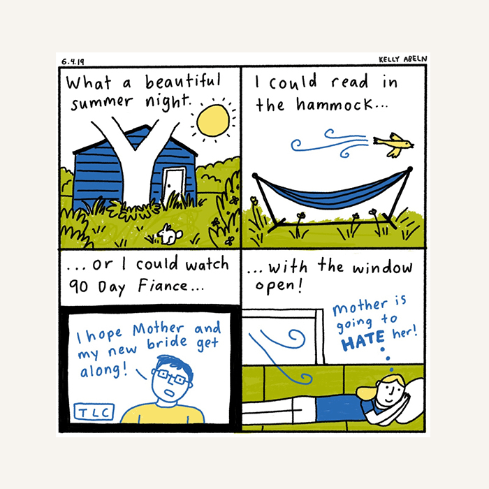
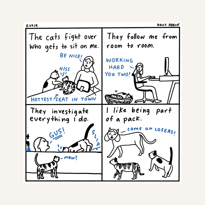
In April 2019, I posted a comic every day on Instagram as part of The 100 Day Project. Having that daily deadline to create something forced me to work through a lot of ideas – even if I didn’t think they were funny or poignant enough. As a result, I ended up making lots of comics I wouldn’t have otherwise – which meant I created enough material to release my printed collection. I also had a few longer comics that I hadn’t shared online and wanted to publish, so I went through them and selected my favorites. They naturally fell into three categories: growing up, anxiety & self-care, and bad times. The whole process of editing my own work really helped me understand what subjects I’m drawn to.

Sharing my work on Instagram as well as creating Hagsville Volume One has helped me grow my audience. People were excited to see what I would come up with each day during the 100 Day Project, and the support helped encourage me that my comics were worth sharing and pursuing.
What do you want people to feel when they read comics about your personal experiences?
My comics are based on what I’m thinking about, and self-care and anxiety come up a lot. Making a comic helps me process what I’m thinking. It’s like when you have to teach someone else how to do something, you’re forced to think about how you do it. So when I make a comic about an experience or thought, it forces me to put words around how I feel about it.
I’m happy when people relate to my comics because it proves the thoughts and experiences I have that often feel lonely aren’t unique to me. That’s the best reaction I can get from readers – a sense of connection over our inner lives.
How have you used print to promote your art?
I often send MOO postcards to art directors. The Printfinity option allows me to really personalize what I send to the recipient because I can choose loads of different images of my work for the front, and have my contact information on the back. Having so many variations means I can send each art director a postcard with the image I think best fits their publication or company.
Have you had lots of positive reactions from sending out print?
I’ve had loads of great responses from my printed mailers. I think they stand out a lot more than an email because It’s such a nice surprise to get something fun in the mail. The enamel lip pin and postcard promo I did got me a lot of emails from art directors. I initially created it as a Valentine’s Day promo, but ended up selling some of them in my Etsy because there was such a demand!
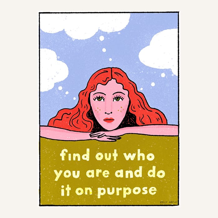
Finally, if you had one piece of advice for fellow creatives, what would it be?
This quote from Dolly Parton pretty much sums it up: “Find out who you are and do it on purpose.” To me, it means experiment, dive deep into your interests, hone your craft, simplify your message, and share it with the world. If you focus on those things, success will come.
Write your own narrative with custom postcards by MOO.
Here’s how our customers used spot UV gloss finishes to add some extra “wow” to their branding.
1) Annie Yang: bright and playful
Born and raised in New York City, graphic designer Annie Yang incorporates wit, colour and playfulness into her work, which she creates for non-profit organisations around the world. Her original spot UV business card designs reflect her bold and creative visual identity.

“To create my personal cards, I scribbled random black lines with strokes and colours – it was fun not knowing what the end result was going to be. Using Printfinity was great because it allowed me to add Spot UV Gloss on different areas of each card. I like how my logo catches the light, mimicking the flash of ink, and drawing people in to take a closer look.”
2) Adèle Leyris: the hidden shine
Adèle is a London-based illustrator, specialising in lifestyle and botanical compositions. Working primarily with watercolour, she creates beautifully naturalistic paintings that are full of stories and surprises – a theme that she has cleverly carried through to her business cards with a clever UV gloss coating.

“I really wanted to play with the idea of layers by adding Spot Gloss to the matte surface of the Super paper stock. It doesn’t just add another dimension to the texture, it adds a surprise element to the story too. In this case, I added glasses and a transparent shirt to my character, and a flame to a match. I love seeing people smile and the excitement in their eyes as they discover the hidden shine!”
3) Phalen Reed: clever highlights
Minneapolis-based designer Phalen Reed mixes classic typography with bright palettes. Her attention-grabbing UV card designs were created as part of a rebrand, and all read: ‘tell me about your project’.

“I used Spot Gloss sparingly on both sides of my cards for a bigger impact on key details such as name, contact information and logo. Outlining my logo in the spot gloss on the back of the cards gave them that beautiful seal-like shine.”
4) Robert Hranitzky: embracing 3D
Designer Robert Hranitzky has an impressive client list, working with big brands, including Apple, Adobe, and BMW. From his Munich-based studio, he works on animated projects spanning film titles, trailers and live action. He created clever 3D business card designs as a nod to his activity.

“Large parts of my work involve 3D animation, so using Spot Gloss was a great way to translate the idea of another dimension into my branding. Adding shiny gloss to the smooth Soft Touch Business Card surface created a really inviting and tactile effect. Everyone rubs their fingers over the card instinctively to check it out!”
5) Ever Atelier: off the wall designs
Ever Atelier is an art studio based in Dallas, founded by friends, neighbours, artists, and now collaborative business partners, Sarah English and Ashley Leftwich. The creative duo have pooled their skills in fine art and interior design to create beautiful wallpapers. Their 3D business card designs give life to their creations with a tactile finish.
“The Raised Spot Gloss has a quality shine that gives a sense of passion and presence to our Square Business Cards. They feel special, and perfectly echo the surface designs we create in our wallcoverings.”
6) Sagrado Studio: bold and shiny
Husband-wife duo Carlos and Janet teamed their skills in brand strategy and graphic design to start their own business. They now run Sagrado Studio together in their home city of Madrid.

The location of their client, a Miami-based video production company, was the starting point for building the Think Twice brand identity and creating their colourful UV card design. “The gradient backgrounds reminded us of the bright colours of South Beach”, Carlos explains. “We chose Super Soft Touch Business Cards with Spot UV Gloss finish. The colour integrity is outstanding, and the result is shiny, bold, and confident.”
7) Lauren Kavanagh: subtle glow
Outside of her career working as a creative designer for a surface design company, Laura works on freelance lettering, illustrations and visual identities for independent local businesses in her home town of Chester, UK. She used the UV gloss coating to make her business card stand out in a subtle way.

“When creating my own visual identity, I wanted something that would stand out, so I made an illustration of myself working away. Spot Gloss was perfect for adding something a little different – it’s subtle, but shows that attention to detail. The texture feels lovely, and they always make people smile!”
8) Frankly: bright and friendly
Led by their ethos of creating “solutions that turn heads and touch hearts,” Frankly work with purpose-driven brands to create visual identities that better connect them with their customers.

“I wanted the 3D business card design to feel simple, bright and friendly,” says founder and creative director, Heather Mackey. “I designed my rounded corner business cards to feature a statement colour and Raised Spot Gloss for a subtly inviting, tactile touch. It’s little details like this that can really lift a design. Although small, they are noticed, and they do matter. A business card speaks for you long after you’ve left the room, so I’m proud to leave behind a design that looks – and feels – like quality.”
9) Vee Design: cards with personality
Vianna Palacios is a Puerto Rico-based graphic designer, specialising in branding for businesses. This passion for visual storytelling is clear from her own branding, where she uses pattern and texture to showcase her personality. Her spot UV designs are a perfect example of her bold and modern style.
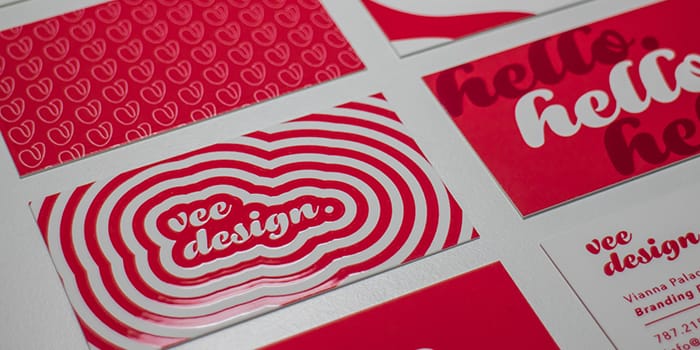
“Business cards act as a direct representation of yourself and your image. As a designer, it was important that my cards show my personality and creativity. Raised Spot Gloss makes any design pop, so you’re walking around with a guaranteed conversation-starter. I think that’s why my clients absolutely love my cards!”
10) Tyler Pate: tactile designs
Tyler Pate is an illustrator and art director based in Charleston, SC. Working with his client, he communicated their initiative to get more people outside in nature through a refreshed brand identity, utilising UV gloss coating in a clever way.

“I combined the rugged textures you get from lino carvings, with the simple, clean badges you find in the Boy Scouts. The Super paper stock is a great weight and I’m a huge fan of spot gloss – it’s a hidden treat that brings the design to a whole new level of awesome!”
11) Azadeh Sahraeian: contemporary textures
Azadeh is an architect living in Maryland. Drawing her inspiration from the natural world, she moved her design medium from bricks and mortar to pen and paper, creating intricate drawings with a ‘living’ quality. Raised spot UV printing helped her give life to her designs.
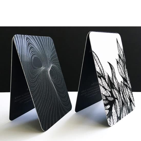
“I chose Rounded Corners with Raised Spot Gloss to show the three dimensional nature of my artwork. I love the matte finish on my cards, and everyone is impressed by the quality and the design.”
12) Magenta&Green: sensorial calligraphy
Graphic designer Jo Drayton runs her own consulting and design studio, Magenta&Green, where she satisfies her passion for typography and print projects through calligraphy, murals, packaging and offset printing. Spot gloss coating helped her give a multisensory quality to her designs.

“As a designer, I want people to trust me with their brand, so my cards have to represent me. The Soft Touch finish gave me the right surface feel, and the Raised Spot Gloss draws attention to my wordmark, making people rub their thumb over the stock. We’ve become so digitally focused that we forget our work is there to be experienced.”
13) Mia Saine: fun, glossy details
Mia works as a freelance graphic designer and illustrator alongside her 9 to 5 graphic design job. Influenced by shapes, nature and colour, she uses her cheerful style to bring brands to life through creating visual identities. She used spot gloss varnish to highlight clever details in her designs.

“I love that my business cards express who I am – a fun, loving individual,” Mia tells us. “The contrast between the Spot Gloss shine and matte finish of the Super Business Card stock communicates excitement, and the soft touch surface changes my business card from being a piece of print, into an enjoyable personal experience. I love quality products – especially when they’re created to last.”
14) Jen Bennett: simple and memorable
Jen Bennett is the creative director of her co-founded agency, providing guidance to smaller businesses and entrepreneurs on how to tell their brand story.

“My cards were designed to look simple, fun and memorable – the spot gloss really adds an extra dimension to the simple colour-on-colour style. I printed on Super paper because the silky texture of the stock feels amazing. Clients always comment on how soft and smooth they are!”
15) Cheryl Oz: sexy business cards
Illustrator Cheryl Oz creates artwork for reproduction on gift wrap, greeting cards and art prints, as well as running her own Etsy shop where she sells her designs. She works across a range of mediums, but mainly paints in watercolour and gouache. She used UV gloss coating to add some extra “wow” to her cards.

“I recently designed a new portfolio website, so I wanted to design my business cards to represent my new look. I chose the Super paper stock for the super soft matte finish. I have a thing about texture, especially soft textures, so it seemed fitting to use this stock for my cards. Since my card design is very clean and simple, I wanted to use Raised Spot Gloss for a beautiful, wow factor on my logo. My initial reaction fresh out of the box was ‘Wow, these are sexy business cards — if cards can be sexy!”
16) Tom Gordon: dark and glossy
Tom is a freelance designer specialising in print and merchandise for the entertainment industry. His eclectic style varies from clean cut designs to dark, abstract artwork. His spot UV design plays with the contrast between the matte Soft Touch finish and the glossy, textured special finish.

“I’ve been using MOO for years, and am always impressed by the thickness and quality of the cards. I printed Super Business Cards with Raised Spot Gloss to create a striking black-on-black look that ties in well with the music-related design work I do. The reaction is always positive. Most people who see them insist on having one for themselves even if we’re already connected!”
17) Rainy Day Prosper: drops of light
After starting her career as an in-house graphic designer and photographer, Angela Prosper decided to open her own boutique design and photography agency in Seattle, where she works with small businesses to fine-tune their online aesthetic.

“When you’re a design consultant competing against so many others in a city, how do you stand out? I knew I needed a bit of magic and surprise to go along with any first impression, so I created Spot Gloss rain drops that only reveal themselves when they catch the light. That tactile difference of using gloss is like tasting an amazing dessert for the first time and just adds to the effect when I hand my card out.”
18) The Silent P: turning up the volume
The Silent P are a design and illustration studio, working mainly in the music industry. From album artwork, to business cards and band merchandise, they created a fresh new look for their musician clients, Bob Sinclair & The Big Deals.

“We designed the band logo for album releases and merch, but the band wanted a good clean business card to hand out at events. The Raised Spot UV Gloss effect was a perfect match to highlight the band logo and name.”
Print your spot UV designs to life on Spot Gloss or Raised Spot Gloss Business Cards.