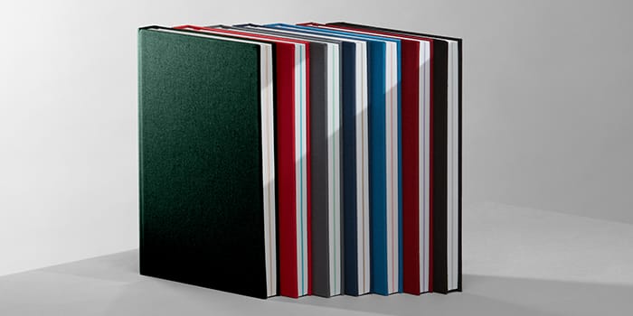
Rest your thoughts in a MOO Notebook
From the premium details to the practical design – we’ve looked at every angle to create our most noteworthy Notebook range yet.

From the premium details to the practical design – we’ve looked at every angle to create our most noteworthy Notebook range yet.
Whichever of the seven color combinations you go for (Alpine Green or Jet Black? Hmm), we’ve designed the MOO Notebook in a way that turns getting your ideas down into a pleasure.

See the Notebook range here.
Designed by (two very fussy) designers
MOO’s Toby and Felix are the people behind the Notebook’s design. They spent months obsessing over every tiny detail before arriving at the final version. Everything about the Hardcover Notebook has been carefully designed to make it a joy to use. Yes, even the ribbon.


Every. Single. Detail.
You know how most books don’t stay open properly? Well, thanks to the Swiss binding, the MOO Notebook doesn’t do that. It lays nice and flat so you’re not wrestling with the pages.
As you’d expect, we went through many different paper choices before settling on a non-glare, uncoated stock from Sweden’s Munken Kristall. It makes for very smooth scribbling. And it won’t yellow with age, so last year’s ideas still look pretty fresh (even the ones that now make you cringe a little).
Because Notebooks aren’t just for… notes, you’ll find 16 pages of GF Smith color paper, smack bang in the center. It’s thick, tactile and unlined – so you can literally draw up plans and picture the scene.
No one wants to “kid glove” their Notebook. So the MOO Hardcover Notebook is bound in proper, sturdy book cloth. It’s ready to stand up the toughest backpack treatment – and be just as robust as the ideas soon to fill its pages. For extra, extra protection, it even comes in its own slipcase.
Do we have a favorite color? Well, first it was Midnight Blue, then it was Alpine Green… But really, it’s all about the ideas you put inside it.
Get your ideas on paper with MOO Hardcover Notebooks.
Turn your work notebook from a collection of pages to a full-blown personal planning hub using these easy notebook organization ideas and techniques.
Our Hardcover Notebooks are at home in just about any setting, from bedside journal to field sketchbook. But using a notebook for work can really help you keep on top of things, especially if you have a lot on your plate.
What makes a simple notebook a savior for your job?
Because it’s an offline system, a notebook planner helps you to clear mental space away from your digital world while you’re using it. It’s 100% free from interruptions – there’s no risk of an email notification derailing your train of thought, and no temptation to switch your attention over to social media for a moment. You can also use it anywhere, regardless of Wi-Fi signal or battery power.
It doesn’t have to be an either-or situation, though. For many people, the best way to use a work notebook is alongside digital tools that also help maximize productivity. Maybe that means setting an alarm on your phone to create a new page layout for the week ahead or using cross-referencing to link up information in your notes app to the index of your planner.
If you maximize the opportunity to use your notebook for work, it can add real satisfaction to your working day. After all, there’s nothing like a clean white page to inspire and focus you on the task ahead.
Here’s a handy collection of tips for how to organize your notebook for ultimate productivity:

1. Know what you need from your work notebook
Every successful project starts with a planning stage, and creating a proper notebook organization system is no exception. Think about how to organize your notebook before you uncap that pen. (Planning your planner might sound a bit weird, but bear with us.)
Knowing how to organize a journal or notebook for work requires some introspection. Start by asking yourself some questions to help figure out how your planner can be most useful to you.
- What regular tasks does your job involve?
- What do you need to know and when?
- How often will you be able to write down notes or review them?
- Who else (if anyone) needs to understand the system?
Visualize how you’ll be using your notebook in your daily routine. Will you sit down and update it each morning, or at the end of the day? Will you be bringing it to meetings, keeping it in your bag, or will it live on your desktop or in a drawer?
Thinking about these factors will help you choose the right size and format of notebook. If your planner is going to live in your backpack or purse, you may look for a smaller-sized journal with a hardwearing cover, for example.
2. Review your notebook organization options
Paper planning is having a real renaissance at the moment, and there’s a big community out there using notebooks and journals for productivity and organization. Getting organized with a notebook involves finding the right option for you. That means there’s a range of notebook organization systems to pick and choose from, such as the Bullet Journal – arguably the daddy of them all – or the weekly spread, the Eisenhower Matrix or the Strikethru method.
Spend some time researching the systems others have developed to see if any of them suit you. Especially if you want to learn how to organize your life on paper. If no existing notebook organization ideas quite fit the bill, you can always pick and choose the elements that work for you and create your own hybrid system, or come up with a method of your own from scratch.
It’s important to make sure the kind of organizational system you choose works for you, rather than becoming a task that costs you more effort than it saves. If your notebook system isn’t suited to your needs, there’s a good chance it will end up lying in a drawer rather than contributing to your productivity.

3. Number your pages
This step will make using your planner much easier, whatever layout method you use. As soon as you unwrap your new notebook, the first job is to write in page numbers. It’s particularly helpful if you’re wondering how to keep your notes organized at work. You can add numbers to every page or leaf, depending on the size of the pages and what you’ll be using them for.
4. Add an index
One thing nearly all notebook planner aficionados agree on is the importance of an index page. Whether you’re a BuJo beginner or a back-to-basics to-do-list fan, an index could be the secret sauce your notebook needs.
The index is usually one of the first pages or spreads in a notebook, and it lists out the contents of the rest of the book. This is where your page numbers come in. You’ll be referencing them in the index and noting briefly what each one contains.
For example:
- 13. January round-up
- 42. Books to read
- 54. Secret Santa gift list
5. Make it colorful
Probably one of our favorite organized notebook ideas. If you’re wondering how to organize a notebook effectively, color is a great tool for making your planner more functional and adding another layer of information to the written word. It’s also an excuse to get out your favorite colored pens and inks, or to invest in some new ones.
You could use colored highlighters to identify different categories or topics in your weekly spreads or to-do lists, or write in different colored fineliners or inks to help more urgent or time-consuming tasks stand out from the rest.
If you use more than a couple of colors, add a color key somewhere in your journal, maybe after the index, to remind you at a glance of what each one means.
6. Get accessorizing
You can add functionality and make your notebook more uniquely personal by using additional stationery.
Post-it notes can be a handy way to re-organize tasks multiple times when you need to. Instead of writing directly on the page, write tasks or timeblocks onto post-its and place them in your weekly or daily spread. If priorities change, it’s easy to switch them around, add or remove them. Post its also make handy section dividers when you place them at the edge of your pages.
Stickers, clips and washi tape are also popular and convenient ways to customize your journal. Use them to color code or highlight text, or decorate different months or sections distinctively in your own personal style.
7. Section out your work notebook
If you have several big projects on the go at once, or your job role involves a few separate areas of responsibility, your notebook planner should reflect that. For example, if you run a blog and two social media accounts and also have responsibility for email marketing, you’ll need 4 separate sections.
It can also be helpful to chunk out your notebook according to the different ways you use it. For example, you might dedicate one section to to-do lists, another to note-taking during meetings, and another for goals and objectives you need to meet on a monthly or quarterly basis.
Use bookmark ribbons or dividers to section your notebook into different areas so you can flip between them easily. It’s a massive time-saver if you’re using an organizational notebook for work.

8. Use multiple volumes
Sometimes, one notebook is not enough. If you find that using a notebook to organize your work life suits you, why not expand your system into multiple volumes?
Alongside your main planner, you could have a meetings notebook that gives you space for pre-meeting prep as well as minute-taking and follow-up tasks list. Or a brainstorming journal with blank or dotted pages for capturing related ideas and sketching out systems and processes for your projects.
For some people, it’s helpful to have an on-the-go pocket journal, which can be used for rough notes and ad hoc tasks, and also a desktop planner which has a more intentional structure and formal layout.
If you use multiple notebooks of the same type, consider buying different colors or labeling the spines so you can tell them apart easily when you’re grabbing one from your desk or packing your bag for work in the morning.
9. Stow your stuff
Notebooks can help you keep track of physical items as well as notional ones. The best notebooks for organization are those that go the extra mile to help you stay focused.
Use the stick-on pocket included with your MOO Hardcover journal to stash any notes you’ve taken on the fly, along with things like receipts for your business expenses, postage stamps and travel tickets, so you’ll have them handy when you’re ready to file or digitize them. You can also use it to keep a business card handy at all times!
If your journal doesn’t come with a pocket already included, you can create one by attaching a rectangular piece of card or stiff paper to the inside cover on three sides using tape or staples.
Ready to start your paper productivity journey? Become the ultimate work organizer with notebooks. Browse our beautiful Hardcover Notebooks and Softcover Journals.
In a mostly digital world, premium business stationery is like a breath of fresh air. Wondering how to design a letterhead? Weighty, vivid, and a tactile treat, here’s everything you need to start crafting a business letterhead to take pride in.
When only paper will do
You may use emails and phone calls to do 90% of your business communication, but sometimes, a letter on headed paper is the only appropriate medium. That’s why designing a company letterhead that reflects your brand and values is key.
Maybe it’s a formal letter of appointment or an agreement in writing with a new supplier. Maybe you’re writing to confirm an employee bonus (and including a life-changing check). Or maybe you have been asked to supply a statement, reference or other formal document on company-headed paper.
Whatever the use case for your company letterhead, there’s no doubt that it takes your message to a higher level than an everyday channel like email, and that it’s worth spending a little time and effort making something that’s worthy of your brand.
Need some letterhead design tips? Here are seven steps to designing a company letterhead you’ll be happy to use for years to come.

1. Decide on the content
Before you worry about how to design a letterhead, you have to think about what goes on it. What information should your letterhead include? You need enough information to make your identity clear, but not so much letterhead content that you risk making the page look cluttered.
In some regions, there are legal requirements for what should go on letterheads. For example, in the UK you need to include the registered office address, company number and which part of the country you operate in in the letterhead body text, whereas the USA has no such requirements. It’s worth checking if there are any minimum standards in your part of the world.
It’s also worth considering how specific you need to be. For example, will more than one business location use the design? Or is there a chance you’ll be moving offices in the foreseeable future?
If so, including your head office address as part of the letterhead design may not be the best course of action. Similarly, email addresses and websites need to be included only if you know they’ll apply in every use case of the letterhead and will be valid for some time to come.
Consider using a generic company email address like ‘hello@yourbusinessname.com’ or ‘info@yourbusinessname.com’ so the address will work no matter who uses the stationery in the future.
2. Go back to your brand
Your company brand guidelines can help you set some design parameters for your letterhead to make sure it’s in line with the rest of your business. It will help you save some time in picking out the right colors and the best fonts for your business letterhead, too.
As well as looking at the practical guidelines like color, font and sizing, review your brand values and company tone of voice. This will help make sure you’re expressing the complete brand personality rather than just a consistent visual impression.
If you don’t have brand guidelines in place, your previous brand building can still help. Revisit your branding process, looking at your notebooks, early designs, email trails within the company and more, to help you refresh your ideas about who you are and how you want to be seen.
It’s also a good idea to gather together the key assets that best represent your current brand – this could include your email templates, website, printed marketing materials like Business Cards, social profile pages and product packaging. Seeing them all in one place will help you to picture your letterhead design and think of it as part of a wider brand ecosystem.

3. Find a font
What’s the best font for your company’s letterhead? The font you use on your letterhead may be one you’ve already picked as part of your whole-company branding exercise, or you may be starting from scratch.
If it’s the latter, think about some of the basics first before you jump headlong into font websites and lists, as these kinds of resources can quickly become overwhelming if you don’t know what you’re looking for.
Consider:
- Serif or sans serif?
Serif fonts have a more traditional feel, while sans serif creates a more modern impression and may be easier to read when printed small. For that reason, the latter is often considered the best font for letterhead. - Font family
Fonts come in families, variations that share a visual resemblance. If you choose a font with a large family, like Arial or Verdana, you’ll have lots of ‘relatives’ to choose from. This can make branding easier as you can use several related fonts and get a consistent look and feel. - Font size
Consider the letterhead text size. Think about how big the pre-printed wording on your letterhead will be. The same font can look surprisingly different at different sizes, and will also look smaller when printed out than it does on screen. Remember too that the wording will sit alongside the content of a letter, which may be differently styled, larger or smaller than the font you choose. Print out a few ‘trial runs’ to make sure your chosen letterhead font looks great in all these situations.
Once you know roughly what you’re looking for, you’re free to explore the wonderful world of fonts to find the one or two that will grace your company’s letterhead. Dafont, Typedepot and Google Fonts are all places worth exploring during your search. Once you’ve found the best font for your professional letterhead, you’ll be ready to move on to one of the most exciting steps: the layout.

4. Choose your layout
There are lots of different ways to set out a letterhead. As with other elements of your branding, you’re free to push the limits of convention and create your own approach. But if you’re comfortable sticking to the basics, there are a few tried and tested ways to lay out your letterhead that are worth knowing about. We’ll explore these here.
With MOO’s Printfinity service, you can have up to 50 different designs within a single order, so there’s no requirement to limit yourself to a single layout. You could have a variety of letterheads for different purposes, or create bespoke ones for different people in the company.
Whatever you choose, remember that the goal is to create a canvas for a future letter, not a finished piece of artwork. Your branding and design should play a supporting role in the content of the finished letter and should never compete with or overwhelm the wording. If in doubt, keep your letterhead layout minimal. As with the font, try mocking up and printing a few variations to see what looks best.
Here are a few basic layouts and letterhead best practices you can use as a starting point for your design.
- Full border
Color and design is placed all around the outside of the paper in a consistent square shape. - Graphic border
Shape and color is used around the edge of the body text in a creative way. - Header and footer
Design is restricted to the top and bottom of the page. Keep it relatively small compared to the letterhead size. - Background graphics
Watermark-style graphics in a low-contrast shade across the body of the letter.
Worried about your letterhead’s format? If you don’t have time to worry about design, another option is to use a pre-set business letterhead template. MOO’s online design tools include a large selection of business letterhead templates you can use as they are or customize to suit your own logo and colors. They range from minimalist text-only layouts to more creative designs with graphical elements and color on the back and front of the page.

5. Pick your paper stock
As a general rule, the heavier-weight your paper is, the more premium and professional the end result will be. Beyond that, however, you have a few more options such as the paper finish – smooth or textured – and the color tone of the paper itself. White is the best choice for many businesses, but you may go for a warmer white, a cream or pale blue if it fits your brand.
MOO Letterheads can be printed on either the Original paperstock, which is a classic smooth 120 GSM finish that plays well with most styles and designs, or the Luxe, which is Mohawk Superfine 118 GSM with a unique and award-winning finish and texture.

6. Consider color
Your brand colors should be reflected in your letterhead design, but that doesn’t mean they all need to make an appearance, especially if your logo or company font is ornate or detailed. Remember, the letterhead is a supporting actor, not the star of the show.
If you have a brand color palette, this is a great place to start from when choosing your colors. If not, revisit your logo design and choose two or three contrasting hues from it to act as your palette.
If you choose a letterhead from MOO, you can print on both sides of the paper and add color or additional designs to the reverse, giving you more space to play with color and express your brand without compromising the letter’s content.
7. Get the set – add other stationery
To get an even more ‘put together’ feel for your finished letter, think about creating other bespoke stationery to go with your letterhead, such as an envelope or note cards
A letter that arrives with a hand-written compliments slip can create a more personal, thoughtful feel than a letter on its own, and is a handy way of adding some personal regards that aren’t suitable for the main text.
Now you know how to design a company letterhead. Creating more branded materials? Check out our guide to creating a logo for your business.
We’ve compiled a list of 10 top fonts for business cards to help you get your brand looking its best.
Fonts are a tool that can communicate the voice of your brand. From serif fonts that communicate a classic look and feel to script fonts that give your brand a proprietary identity, font selection can solidify your brand in the minds of your audience.
When choosing your business card font, it’s important to consider how the fonts you choose will appear when printed in all colors and sizes so your information comes across loud and clear. And while some more playful fonts may look good on your screen, they may print in a way that doesn’t capture the fine-pixel details. So, what are the best business card fonts out there?
Types of fonts
First things first. What exactly are the three main types of fonts to consider for your Business Card?
-
Serif Fonts
A serif is a mark (or in type lingo, a “stroke”) added to a letter or character to give fonts more structure. These fonts have a classic feel, and are most commonly attributed to old typesetting techniques used in letterpress printing.
https://www.instagram.com/p/CCob1QiF6a3/
-
Sans Serif Fonts
Literally meaning “without serif,” sans serif fonts are simplistic, modern fonts typically used in web design. The clean and simple nature of sans serif typefaces makes them ideal for pairing with more ornate typography and logos. A great font for business card details as it tends to be more legible.
-
Script Fonts
Script fonts are fonts where the letters are connected, as if handwritten in cursive. These fonts have a dynamic feel that naturally carry the eye through the words with their connectedness.

Things to consider when choosing a business card font
Before asking yourself which font is best for your business cards, there are some elements you should take into account. When selecting a font for a business card design, here are a few factors to keep in mind:
-
Font sizes
When searching for the best font for your business cards, you’ll most likely be looking on a computer screen. When you choose your font, make sure that the text works at smaller point sizes. When you’re finished with your design, be sure to zoom out to the actual business card font size to ensure your information text is clear.
-
Font weights
Bold, medium, thin—these are terms describing a font weight, or relative size options of each font letter and character. Most fonts come in a variety of weights and treatments—often referred to as a font family. Some, like Book and Roman weights, are more scannable when printed versus on a digital screen. But remember, thinner and lighter fonts may not print as clearly as bolder fonts—especially at smaller point sizes.
-
Legibility
When looking for the best font for your business cards, legibility should come as a priority. We all want our brand to get noticed, but be sure to choose fonts that are entirely legible at all sizes, so that no detail gets lost. Sure, that fancy script might look good, but what does it actually say?
-
Compatibility
Pairing two fonts together is a science. But unlike science, you only know a font choice is right when you feel it. Play around with sans serif and serif pairings—or even script pairings—and the results may surprise you. It’s also a good idea to choose fonts with similar, or compatible, strokes and shapes as your logo design.
With those key factors in mind, we’ve put together some ace examples of fonts in all shapes and sizes to inspire you to think beyond Arial. Here’s our list of 10 inspirational business card fonts to get you going:
Serif Fonts for business cards
Here’s a selection of good fonts for business cards if you’re partial to serif.
1. Plantin

Why it works: Developed in 1913, Plantin is a classic serif typeface that has remained relevant for over a century. Its solid design and elegant spacing made way for countless modern fonts—it was even the inspiration behind the now-ubiquitous Times New Roman typeface. That makes it one of the best fonts for a business card.
Why it works for print: Most famously seen in the Monocle Magazine header font, Plantin is a true workhorse font for print of all sizes. Plantin comes in a variety of weights and styles, including light, regular, semibold, bold as well as italics. These weights allow you to call-out certain information, such as job titles, emails, or phone numbers while keeping a cohesive look for your business cards.
2. Lapture
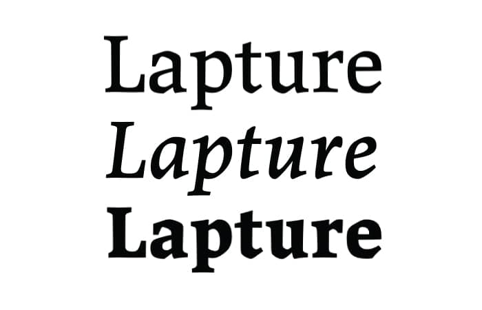
Why it works: Designed by Just Another Foundry, Lapture offers a quirky take on a modern serif font. Subtle geometric strokes give the rounded parts of each letter a unique look and feel. Classic yet upgraded, Lapture can communicate exactly that feeling for your personal brand.
Why it works for print: Your business card font should stand out. Lapture has a naturally bold type structure, which makes it suitable for printing small point sizes. It is also a legible option no matter what kerning and tracking space you apply to the text, which makes it a very good font for business cards.
3. Clarendon
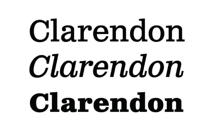
Why it works: An industry classic, Clarendon is an often-mimicked slab-serif font originally designed in 1845. The serifs in this font are bracketed, giving each letter a strong geometric presence. Clarendon is also known for its decorative letters, such as the capital Q and capital R, which all end with curved, elaborate strokes.
Why it works for print: The geometric nature of this slab-serif font makes it ideal for standing out on the printed page. Using Clarendon on your business cards will surely command attention upon first glance.
4. Rockwell
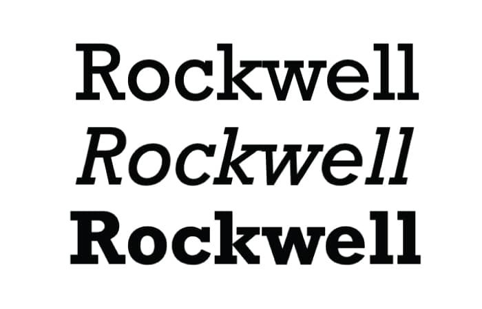
Why it works: Initially released by Monotype in 1934, Rockwell is an iconic and approachable slab-serif font. Coming in a variety of weights and stylings, from bold italic to condensed, Rockwell maintains its distinct personality no matter how it’s used in designs.
Why it works for print: Like most slab-serif fonts, the strong square and rectangular serifs in Rockwell anchor the text when laid out in designs. The circular strokes on letters like ‘o’, ‘q’, and ‘p’ have a neatly circular and symmetrical quality to them that will compliment geometric designs.
Sans Serif Fonts for business cards
5. Akkurat
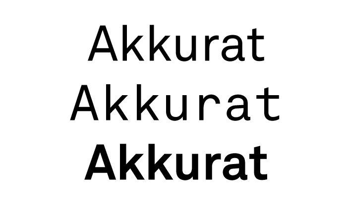
Why it works: In its relatively short existence, Akkurat has made a considerable impact in the design world—being adopted on websites and print alike. It has a simple yet expressive quality to it and is able to clearly communicate messaging in the design world without alienating, which makes it one of the best fonts for business cards.
Why it works for print: Akkurat is a clean sans serif font that is the perfect partner to more elaborate typefaces. If your logo or branding treatment has loud and impressionistic notes, then Akkurat can be the clean and trustworthy counterbalance for your contact information.
6. Helvetica Neue
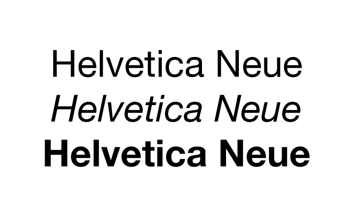
Why it works: Helvetica is one of the most ubiquitous and recognizable fonts in the world—but Helvetica Neue is having its own moment in the spotlight. Having the same clean and modern characteristics of its namesake, Helvetica Neue can communicate a familiar-yet-different appeal—an upgrade on something that already has universal appeal.
Why it works for print: If you’re looking for business card font ideas, the diversity of the font family should be an important factor. With a whopping total of 51 different character weights, Helvetica Neue is an extremely versatile font for those in need of a few options while maintaining a sense of consistency. While the bolder weights will appear loud and clear on a printed page, counterbalancing with a light or oblique type treatment will bring a sense of harmony to your business card layouts.
7. Avenir
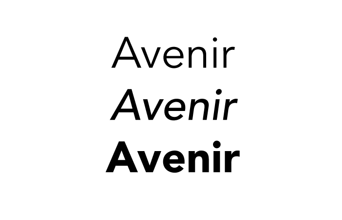
Why it works: Modeled after the iconic Futura font, Avenir is a welcome evolution of the clean, modern appeal of its predecessor. Avenir is a crowd-pleaser, with refined curves and inviting, yet sophisticated nature—perfect for font and logo pairings.
Why it works for print: A true labor of love, Avenir was designed with multiple font weights, including Book and Roman versions, giving it an advantage when used for print.
Script Fonts for business cards
8. Cortado Script
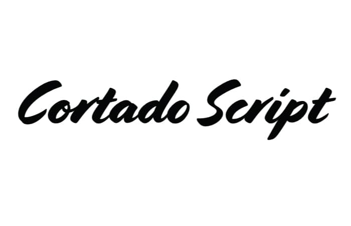
Why it works: This energetic brush script has a natural handwritten feel, thanks in part to the alternate glyph options to avoid repetition within words. The angles of this script guide the eye from left to right and provide an evocative handwritten feel, while still maintaining legibility.
Why it works for print: It would be labor-intensive to handwrite your details and names on each business card you hand out. But Cortado is an inspirational font that can provide an easy alternative to giving a handwritten and human touch to your brand.
9. Manus
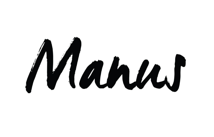
Why it works: A true alternative to handwriting, this script typeface will make even the seasoned designer do a double-take to check for wet ink. With plenty of flourishes and organic strokes, Manus creates a sense of brush writing without all the paint.
Why it works for print: As a bold brush typeface, Manus works well when printed in larger point sizes, making it ideal for names and logos that you want to broadcast. As the point size shrinks, some of the nuances start to disappear, so think of Manus as a counterweight to more modern sans serif fonts.
10. Fabfelt Script
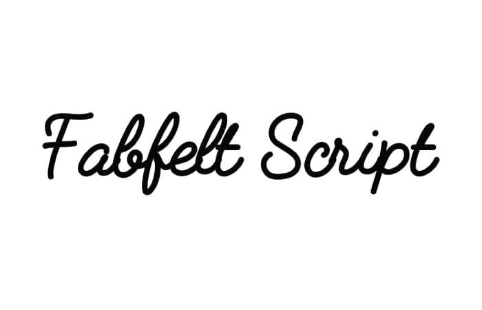
Why it works: A true retro script, Fabfelt provides a welcoming feel without the brushmark and grain effect common with brush strokes. But don’t let that deter you—Fabfelt is the perfect modern adaptation of classic signage we know and love.
Why it works for print: Another inspirational font for creatives. Fabfelt’s script weight is ideal for printing at all sizes, with a satisfyingly even width throughout the glyphs. There are enough script flourishes in the strokes to keep the eye engaged and will provide a recognizable and memorable appeal for your information.
So there you have it—an array of fonts and type families from the 1800s to the present day. No matter how your brand evolves, there will always be a rich type heritage to draw inspiration from to match your brand voice.
Found the best font for your business cards? Put your font choice to the test and print some brand-new Business Cards.
Here’s why these 3 digital experience designers appreciate the value of a physical business card.
With so many companies operating online, some good old-fashioned face time can be a key strategy to grow your business. That’s why these digital designers created their business cards for real, in-person interactions.
Judith Jaroslavsky

Judith Jaroslavsky, a digital experience designer based in Israel, is on a mission to help startups bring their ideas to life in the online space. She believes that the combination of great ideas with digital design will always make people’s lives easier. Judith sees design in everything—“It’s a language and a summary of ideas. What works is beautiful, and what is beautiful works.”


This mentality, combined with her design skills, helps Judith give clean, visual solutions to complicated problems. “I want to make the user experience intuitive and comfortable,” she said. “They shouldn’t have to break their brain to understand it. With great design, explanations are not necessary.”
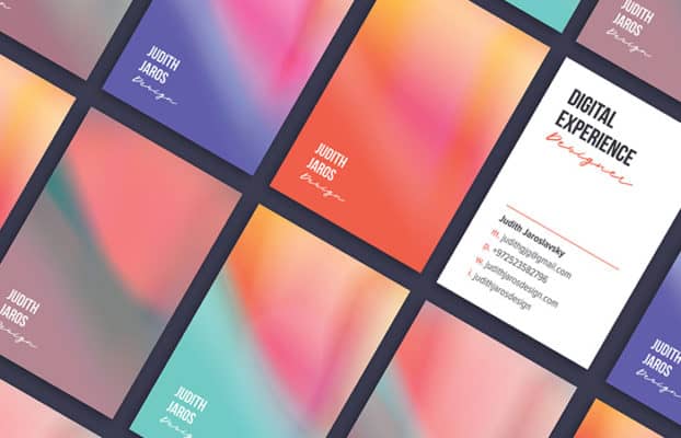
Judith’s designer business cards are a perfect example of her dedication to beauty, simplicity, and delight. “I wanted to have delicate and eye-catching business cards that represent the mixture of the digital and physical world”, Judith said. “The fusion of my design with MOO’s high-end printing delivers my message perfectly. It’s who I am in a soft, colorful square.”
Put your brand on print with Business Cards.
Train918

Train918 is a video production studio based in Indianapolis. Founded by Tim Valentine and Josh Gaal, the studio specializes in branded content for colleges and universities, public safety departments, and companies in the medical and construction industries. Train918’s mission is to provide work that differentiates its customers in the saturated field of tech and digital design.


Train918’s branding is simple and refined for a reason. “We want to help tell our client’s stories”, Josh tells us, “so we didn’t want our own aesthetic to get in the way of the brands we represent.” But working in oversaturated markets puts more emphasis on strong partnerships. For Train918, meeting with clients is the best opportunity to build great working relationships—and that begins with handing out their business cards.


Train918’s Luxe Business Cards help create those memorable interactions. ”Our cards are an extension of our business”, Josh said. “If they fall into the hands of someone who we’ve never met, we know they can trust us just by holding our card.”
Be your best brand with Luxe Business Cards.
Aeronave Visual

Aeronave Visual turns ideas into design. In business speak, that means they’re a visual communication studio. This Amsterdam-based team has mastered multiple aspects of branding and visual identity, from print design to digital platforms. Overall, their goal is to help clients find efficient and beautiful ways to tell their stories.
The company recently moved their home office away from Argentina. As a result, they had a lot of networking to do. “Business cards are our first design statement when presenting ourselves”, the Aeronave team said. “They deliver a big impact.” The team especially loves that they can print each card with a unique design. “It’s the perfect metaphor for what we want to communicate: Aeronave Visual offers unique experiences.”


The company created each design individually using Printfinity, and the effort was worth it. Now, every time someone on their team takes out their cards, they get to have a playful moment with the person they’re interacting with. “That instance of picking one from the pile is unforgettable”, their team said. “What more could we ask for?”
Ready to create your digital designer business cards? From gold foil to spot UV and Letterpress, print cards with extra eye-catching papers, color print that pops and oh-so-customizable templates.