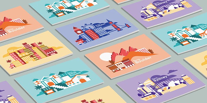
Creative ways brands have used Printfinity
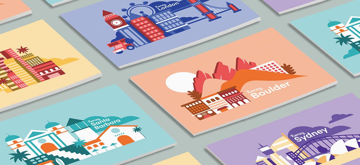
Creativity knows no bounds, and thanks to our exclusive Printfinity technology, neither does MOO!
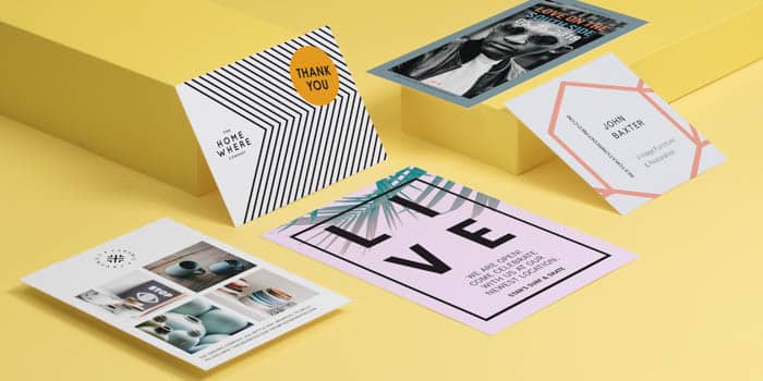
Variety is the spice of life, and why should Business Cards be any different? MOO’s Printfinity feature gives you a whole new way to design for your brand. From creative Business Cards to Letterheads, we’ve removed the limitations between your brand’s multi-faceted character and truly amazing marketing materials for your business.
What is Printfinity?
It’s freedom, it’s fun, it’s an endless showcase of your talent, your services, your office locations, your total brand. Printfinity is the option to have a unique design on the back of every custom Business Card, all within the same pack. Whether your company is a creative agency, tech startup, healthcare conglomerate or anything in between, Printfinity is MOO’s exclusive technology to let your Business Card designs feature up to 50 variations. Say goodbye to identical Business Cards front and back – Printfinity will make your pack fresh, exciting and new from card one to card 50.
Custom Stickers, Letterheads, Postcards and more can all be given this premium treatment using our unique technology. Your creative team and marketing team no longer need to worry about endless back and forth to ruthlessly cut down your Business Card design ideas to a single image – Printfinity gives the green light to your brand’s fullest creative potential.
Just look at some of the stunning Printfinity creations our Business service customers have come up with.
Honey
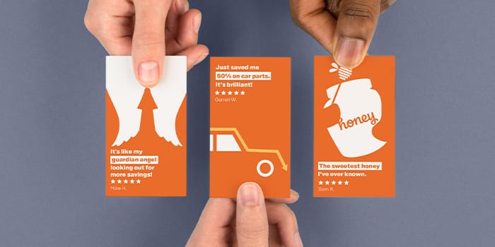
Honey, the browser extension that has taken the world by storm, and done so very much by word of mouth marketing, has incorporated that glowing feedback into its fun Business Cards. Showcasing our Printfinity possibilities, each card displays a different positive user review.
The versatility of Printfinity perfectly matches Honey. Its deals cover everything from clothing to coffee. The chosen reviews highlight this, from generally showing love to the handy tool to talking about precisely which purchase they saved money on, including vacations and food delivery.
There’s more than just glowing reviews and customer endorsements to these corporate Business Cards, though, there’s also clever design. Check out the three deer silhouettes on the review card that celebrates saving ‘3 or 4 bucks’ with every purchase, a haloed cow design for the review starting ‘holy cow!’ and an actual bottle of ‘awesome sauce’. These fun Business Cards don’t just explicitly state why they have been propelled to success by their customers, but offer intriguing imagery for a touch of real artistry and playfulness.
Not only did Printfinity help Honey realize there’s no limit on their design options, MOO’s design support made it a reality. Honey’s Business Cards have also proven there really is no limit on design inspiration – who would have thought that creativity lay in something as utilitarian your customer reviews?
Sir Kensington’s
Delectable design is served up by Sir Kensington’s fun Business Cards, which showcase a range of quirky foodie characters, in keeping with the spirt of their brand. Charm and integrity is at the heart of the business, and what can be more charming than bringing their fine ingredients to life in colorful illustration?

The condiment brand has re-imagined ordinary table sauces by taking a careful look at the ingredients that go into them. It’s passionate about defending the ‘dignity of food’ and how better to show this than by giving their premium ingredients their very own cartoon portraits on the back of each Business Card? Printfinity lets them show off multiple characters in every pack, because every ingredient counts.
These very same foodie mascots make it onto Sir Kensington’s packaging too. The anthropomorphic avocado appears on the packaging of its mayonnaise, while the pretzel appears on the sticker of its mustard bottles. The brand has created a seamless, uniform theme that covers all of its products – from personal staff Business Cards in its SoHo HQ to the jars and bottles customers can pick up off the shelf in their local store.

Always striving for “integrity and charm in balance”, Sir Kensington’s delightful Business Cards are the perfect match for its belief that food should be treated with dignity.
To Printfinity and beyond
Ready to up your design game? Printfinity will let you add fun variation to all your printed goods, here are just some of the ways to use this clever technology beyond just creative Business Cards.
Letterheads
The addition of a unique design that switches with each new correspondence subtly positions your business in your client’s mind as one that doesn’t settle for the boring and mundane. If your public-facing materials like Business Cards and Flyers are bold, bright and beautiful, don’t let the fun stop at your client-facing materials. Show that your branding is genuine at every touchpoint, whether it’s reaching out to first-time customers or long-term clients.
Stickers
Stickers are a fantastically versatile way (think instant branding!) to show off some of your best designs, and thanks to Printfinity, you can have multiple on one sheet. Perfect for handing out whole sheets to customers with multiple snapshots of your creativity, or simply having a variety of designs to choose from when you’re adding a touch more fun to outgoing mail and packages.
Flyers
No brand can be embodied by a single image, so it’s great that Printfinity will let you show off different aspects of your business. Even if you’re only changing the background color, the overall effect is a rainbow of playful design that doesn’t shy away from bold shades. When it comes to things like Flyers, where they’re quickly thrown away if they don’t make a big enough impact, the intrigue of different designs is sure to be a great boost to your outreach.
Show off all your brand’s best sides with MOO Printfinity and our Business Services. Click here to request a call from one of our Account Managers.
These days, business success means creating an all-round positive customer experience. Technology is everywhere, and it’s now more important than ever to integrate it into our daily lives, where customers will remember the brand you worked hard to grow. Here’s how to elevate your brand to appeal to customers and create a positive omnichannel experience that lasts.
What is an omnichannel experience?
The term ‘omnichannel’ may sound intimidating, but it’s not as complex as it may seem. Simply put, it means your brand is represented on as many channels as possible. Omnichannel means that as well as having a store, or an e-store, you make sure customers can connect with you in other ways. You may have a beautifully-designed storefront, complete with a sleek window display, but don’t miss a trick – you want to keep that interaction going even if they’re at home, and that’s where your omnichannel marketing strategy comes in.
How to create an omnichannel marketing strategy
An omnichannel experience can be achieved through social media, through email marketing or through a perfect blend of technology and your brick-and-mortar location, like ‘click and collect’ services. Essentially, it means you’re equipped to let customers engage with you in almost any way they want to, so even after the purchase is complete, they’re still connected to you via social media, email and more.
1. Create a positive customer experience instore
If you have a physical location, make sure you’re making it more than just a room filled with products – really push your brand’s character into the space. If you sell beauty products, make sure the store is always beautifully scented with the same body sprays you offer. If you sell chocolate, keep those free samples topped up.
Even if you’re a bit more of a utilitarian business, like a key cutting service, make sure your space is bright, airy and welcoming, so customers (who may not really know the process very well) aren’t intimidated. In fact, these ‘scary’ sorts of services are the perfect example of businesses that can benefit from an omnichannel marketing strategy. Customers are likely to timidly Google what to ask for and what prices to expect, so make sure your website is ready to answer all their questions and welcome them instore!
Make sure your staff are fully up to date with your products and services and don’t sleep on continuous professional training – no customer wants to hear their server defer to a manager for a simple task.
The growing flash sales events trend is the perfect way to bring other channels into play too. Maybe it’s your brand’s birthday, maybe you’re celebrating the arrival of summer or maybe the festive season is drawing in – announce your sale on your social feeds and hand out some flyers with suitably eye-catching graphics and invite customers back to your location.
As the saying goes, you can only make one first impression, and if you can appeal to a customer in a way that other stores can’t quite achieve, you may win not just a first-time customer but a loyal return shopper (add a loyalty card to the equation and you’re onto a winner).

2. Create a positive customer experience online
It may seem much harder to create a positive customer experience online when you don’t get the opportunity to see anyone face-to-face, but there are ways to make sure your website is an effective extension of your storefront – and that means you’re nailing omnichannel marketing.
Alternatively, if you’re exclusively online, then that’s all the more reason to really nail your digital presence. Here are some tips for creating a positive customer experience online:
- Opt for clean, modern and easy-to-use design
It’s worth spending some time looking at UX best practice and the sites of your competitors. A successful business doesn’t always have to smash its way out of the mold – customers have an expectation of how online shopping works and veering away from the norm may not always be worth the risk.
- Be easy to reach
In stores, a customer can simply approach a staff member. Go omnichannel and try to replicate this online with live chat boxes, a dedicated helpline or a social media manager who is always ready to reply to queries via Facebook, Twitter or email in a timely manner. On that note: get on social media, that’s 100% non-negotiable for omnichannel business.
- Use high-quality images
Online shopping substitutes the luxury of physically seeing and inspecting products with the convenience of being able to order anytime, anywhere. Make up for this lost hands-on time by using high-quality, well-edited images that show items from different angles or list the key ingredients, fabrics or care instructions – anything the customer would be able to learn from the item if they were physically holding it.
Make sure all your images have a uniform background. White is usually the best way to go, and avoid any gimmicky additions like Christmas borders, as Murphy’s law is sure to see a renegade item or two still sporting them well into March.
- Perfect deliveries
This is the vital bridge between digital and physical for your omnichannel marketing – and a key touch point during the business experience – so make sure your deliveries are flawlessly presented. It’s not just about the item itself, but the way it’s packaged.
Personalized brand stickers and compliment slips can add some sleek character and a personal touch with a handwritten ‘thank you’. Even a standard business card included in the package will keep your contact details top of mind and can also add a professional edge. Fun additions like a packet of candy or a free sample of upcoming products will help your deliveries stand out from chain store names.
Create an omnichannel marketing strategy experience that appeals to customers on multiple levels with MOO.
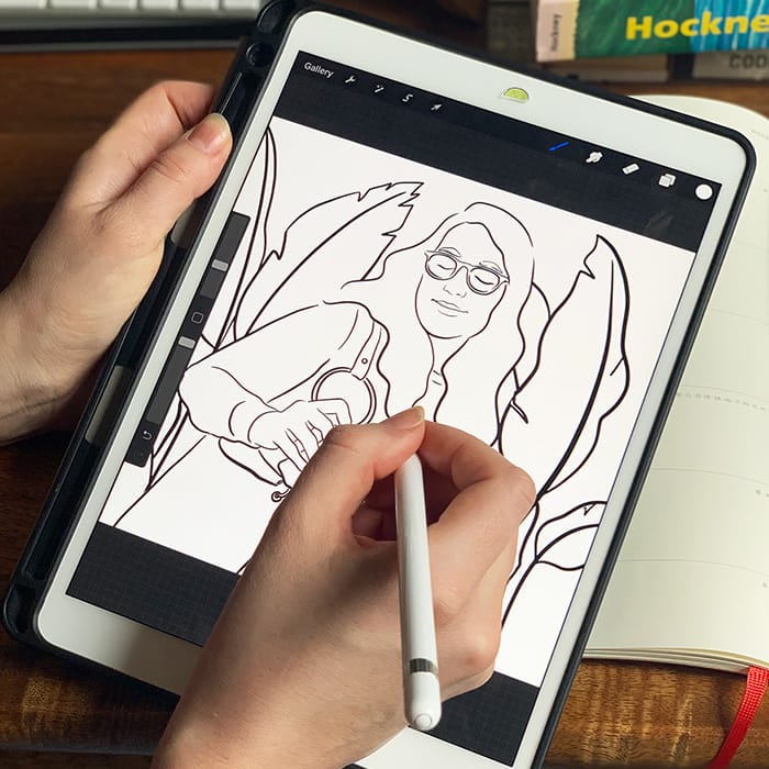
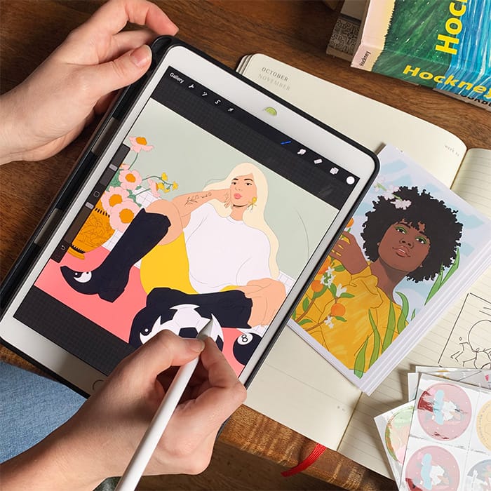
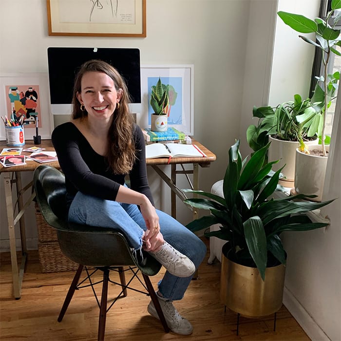
In just two years, Louisa Cannell has made her mark on the design landscape. MOO speaks to her about the power of illustration.
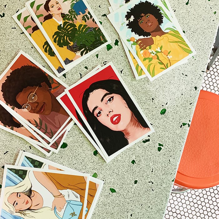
Brooklyn, NY-based designer Louisa Cannell’s bold and colorful illustrations offer social and political commentary, often featuring strong women holding the viewer firmly in their gaze.
The artist’s vibrant style is under constant evolution, from detailed portraiture, to still lifes featuring block colors and simple, fluid lines.
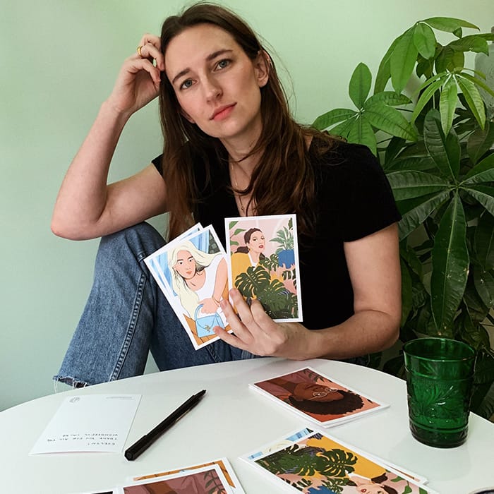
Although she has only been illustrating full-time for two years, Louisa’s clients include Condé Nast Traveler, National Geographic, Google and Samsung. Today, she’s a staff designer at Refinery29.
“My style is still evolving, so I love to try new things and work out the kinks in previous illustrations,” she says.
MOO spoke with Louisa to discuss her artistic development, how new designers can get their work noticed, and the power of illustration as a force for change.
Tell us about yourself and your background. How did you start out in design?
I grew up in Washington, DC. I had a hard time learning to read when I was a kid, so my parents gave me comic books as a way of making practicing more fun. In the end, I had something like 200 Betty & Veronica comic books, and that got me interested in visual storytelling.
My career path has been a bit of a rollercoaster. I majored in Art History and Visual Arts, and had this bizarre vision of moving to New York and suddenly becoming Andy from The Devil Wears Prada.
Instead, I got an unpaid internship in a prop shop’s graphics department, making things like fake food packaging and concert tickets while applying for paid roles.
A series of roles followed, including in the art department at Brides Magazine and in marketing at VICE’s TV channel, VICELAND. Each job introduced me to amazing people, and were unique in their own ways. Then each evening, I’d come home and teach myself how to illustrate.
Eventually, I decided to try being an illustrator for real. I got a freelance job at Refinery29, which turned into a full-time role – and two years later, I’m still here.
When did you start using your art to promote social issues?
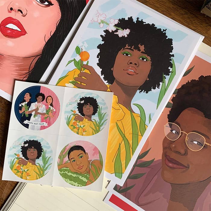
When I started at Refinery29, one of the first projects I worked on was an illustration for the Women’s March. It was my first time approaching a project with such complex emotions, and where my own feelings were so invested.
I wanted the illustration I did – called Hope Not Fear – to represent those emotions, and to put forth the bravery that’s grounded in so many women. It was amazing to see the effect my illustration had on other people – I received messages from all over the world telling me how much it meant to them. It was a very powerful moment, and I’ll be forever grateful for those messages.
Illustrations and graphics are so important for uniting people, communicating the severity of social issues and shedding light on those in need.
What’s the biggest tool you’ve used in getting your work noticed?
I’m pretty shameless about reaching out to people, so now, when someone reaches out to me, I try to take the time to give my advice, connect them with someone else I know or recommend them for a role.
So many people helped me get to where I am, responded to my random LinkedIn messages or DMs, or met me for a coffee. I want to make sure I pay the favor back to others.
When you receive a brief, what are the stages you move through from concept to finished piece?
I show new clients moodboards of my different illustration styles and ask if there’s one they prefer. From there, I brainstorm a few poses and take reference photos (my phone is full of awkward photos of myself posing in different ways).
I also have a Pinterest board of color references that I build upon for inspiration – if I see color combos I love when I’m out and about, I try to snap a photo so I can add it to my swatches.
Next, I do a line sketch and send it to the client for approval. Once that’s done, I work on the final piece – for the most part, there are usually only minor tweaks after that.
How do you juggle multiple briefs from different clients?
That’s one of the most challenging things – it’s so important to get enough headspace to think creatively. I try to only accept what I can handle, and carve out non-screen time to get my creative energy flowing: working out, cooking, or going for a walk.
I don’t have much time for personal work, but when I do, I like to draw women lounging. It’s so relaxing to draw with no reason in mind.
What’s your advice to aspiring illustrators hoping get their work noticed?
Reach out to illustrators you like on Instagram, and make friends rather than seeing them as competitors. Make Instagram your portfolio, and make sure your website is up to date.
Write thank-you messages when someone helps you out. Be patient, be nice and give yourself the type of projects you want your clients to see.
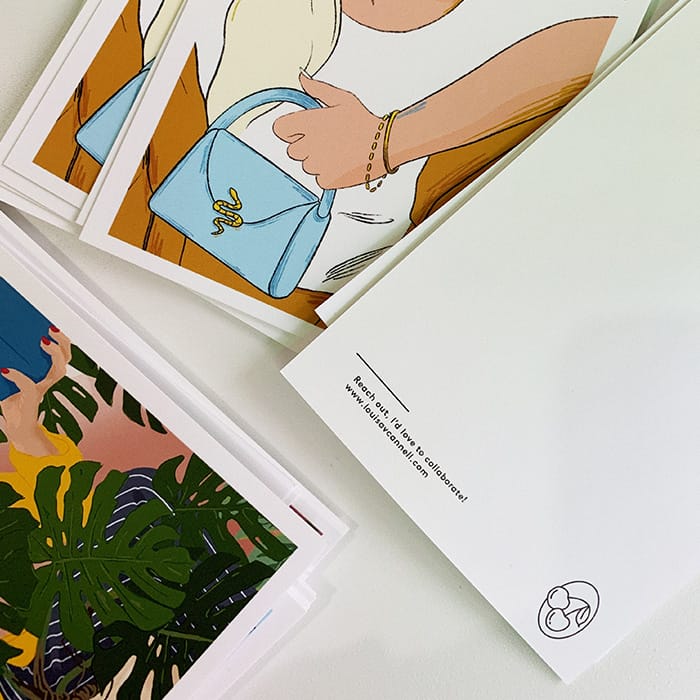
Do you think it’s important to have a well-designed print to promote yourself properly?
So important! If you design it well, your Postcard or Business Card could end up on someone’s mood board, or passed to another potential client. It’s a simple way to show you’re professional, confident, and excited about your work. You’re worth it!
Looking for more inspiration? Check out our interview with artist and designer Rocio Egio.
MOO Designer Jon Misarski takes us through his approach to creating a brand identity for a fictional restaurant, from initial approach to knowing when it’s time to share a first draft with a client.
The client brief
“Design a logo and visual identity for (fictional) seafood taco restaurant, Octo Taco. Using a suite of MOO print products, show us how you would bring the brand to life.”
The approach
Looking at the brief, my first instinct is to make note of what the parameters are and the must-haves. This brief had just enough detail to give me constraints to work in, while not being so open that I would be lost in the ether. Once I saw what the fictional brand should be (a casual restaurant that served local food), I then started brainstorming a restaurant that I would actually want to go to that didn’t seem to exist.
The ideas process
Once I had the name down, I started just scouring the internet for cool and interesting branding to take as inspiration. There were a few restaurants that I had in mind, and I tried to find the designers behind those brands. After pulling so many inspiration images, I had to narrow down to a few looks and feels for Octo Taco. Then I took out the sketchbook. I just start writing the name over and over in different ways: is it just a wordmark? is it handwritten text or a san serif font? Is there some sort of mark to go with it? Does the text fit into some sort of shape? I just want to try as many possibilities as possible, and drawing in a sketchbook helps me do that fast. I’m able to then start going through what I have down and start circling the ones that really work.

When to stop and share your work
This is really a hard distinction to make. I usually end up trying to build out as many assets of the branding as I can to see all the ways I can use the mark. If I have a good looking option but I’m not able to build it out that easy, I’ll usually table it for that round. I want to be able to make a few variations of the logo to be used for different applications. I then take a look at each direction and try to make sure that they each feel very different – to make the Client’s decision making as easy as possible. Since the first round is just the beginning of the process, I don’t want to get too far into building out brand until the Client agrees on the direction. The last thing I would do before showing a client would be to show a peer what I have and see what they think. I always get so deep in concentration when I’m designing that it really helps to get someone else’s opinion – they may like options that you don’t like or give reasons why one is better than the other. Once I’ve gotten through all of this, it’s usually ready to go in front of the Client.
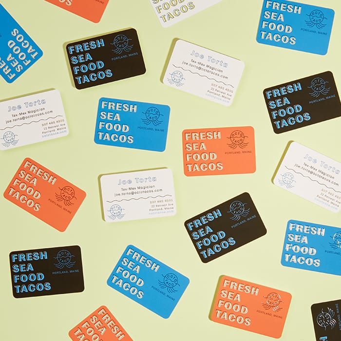
Original Business Cards With Rounded Corners
The inspiration
My main inspiration for this project was a bagel shop in Portland, Maine called Rose Foods. I was blown away by the branding and design when I went into Rose Foods, and I had to know who was behind such great design direction. With my mouth still full of bagels and lox, I googled “Rose Foods branding” and quickly found out that Office of Brothers (an agency out of Atlanta, Georgia) were the brains behind that brand. They do such an amazing job putting that Americana feel into their designs – each brand that comes out of that studio looks like it could have been around for 100 years.
The color palette
Since my brand was a taco restaurant, I went straight for a South Western palette of yellow, orange, and tan. But then I needed to pull in a bit of an ocean feel (you know….Portland, Maine….seafood tacos…), and that’s how the bright cerulean blue was brought in. I’m a big fan of bright colors! It really helps brands to stand out.
The font
I wanted a really simple sans-serif font that also looked pretty classic – so I chose Moriston by the Lost Type Co. It has that classic 1950’s quirk, while still feeling bold and readable.


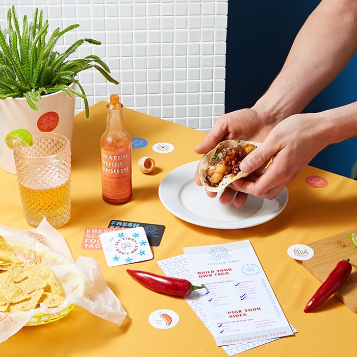
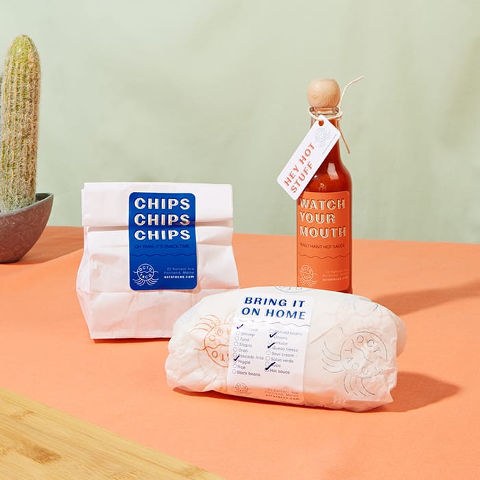
MOO Products
My favorite products that I designed for the Octo Taco suite are the Rectangle Stickers as labels, it was such a different use case for them so it was fun to innovate on ways of using the stickers.
Branding advice
I would say, that you can totally give your client what they want while also innovating and doing something that you are proud of. A lot of designers get disheartened when clients have a specific vision for their brand or project – but remember that you should just see their vision as a spring board rather than a brick wall. I’ve found it’s really nice to have parameters when you start out a project, but as you go those parameters might stretch a little as you continue to build out the design – and that’s a good thing. And the last thing I would say – keep it simple! Brands that stand the test of time have always kept it simple, and by doing that you will be able to stand out in this overwhelming world.
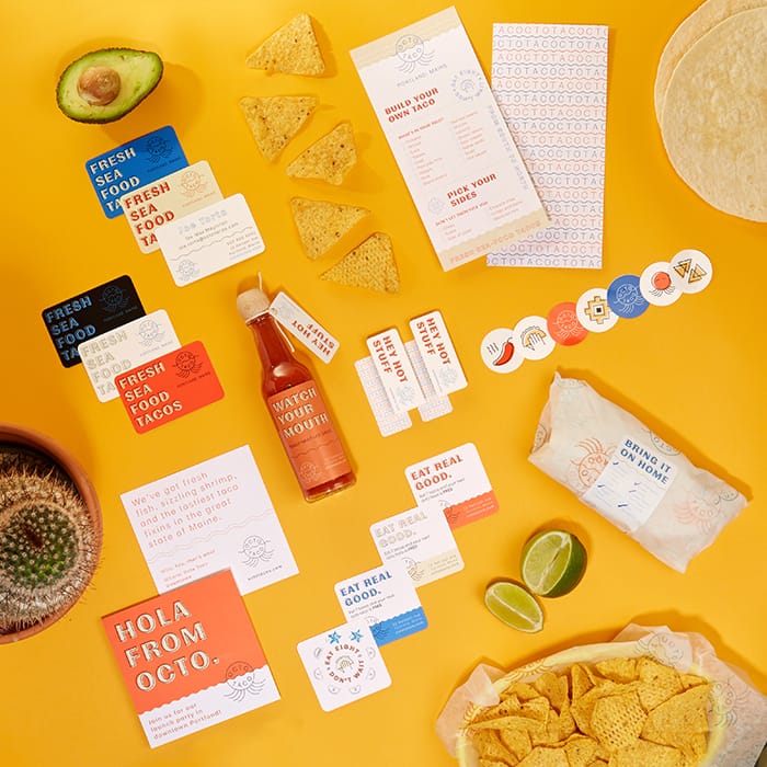
Products used
- Square Postcards as brand info cards to take away
- Rectangular Stickers as hot sauce bottle labels + ingredients labels
- Business Cards w/ Rounded Corners
- DL/Long Flyers as menus
- Round Stickers for packaging details
- Mini Cards as hot sauce tags
- Square Business Cards as Loyalty Cards
To mark International Women’s Day 2020, we’re celebrating seven female designers, artists and creative heroes changing the way we think about the world through their use of visual media.
There’s no shortage of inspirational women in the fields of illustration, graphic design and art, although sometimes they’re under-represented. In line with International Women’s Day, we’re showcasing some of the women who have helped to redefine female roles, shape how we see things and pave the way for female designers of the future.

1. Yayoi Kusama
Specialism: installations, sculpture, painting (and many more)
Career highlights: After training as an artist in Japan, Yayoi Kusama moved to New York and became part of the avant-garde and pop-art scenes in the 1960s. There she made waves with a before-its-time flashmob featuring naked people painted with polka dots. The dots are an all-consuming theme in her work. She is also known for ‘infinity installations’ which use mirrors to create a perception of never-ending colored spaces.
Why we love her: Yayoi Kusama is fearless, prolific, bold and brave, never afraid to challenge norms either in her native Japan or in the more permissive culture of the USA. She is also a powerful example of someone working and living with mental health issues. Her style is linked to visual and auditory hallucinations and she uses art as a means to express and understand her experiences.

2. Paula Scher
Specialism: Graphic design
Career highlights: After starting out in children’s publishing and designing album covers, Paula Scher became the first female principal at design consultancy Pentagram in 1991. She is responsible for iconic branding and visual identity work for companies like Microsoft, Coca-Cola and the Museum of Modern Art in New York, which reflect her love for typography and its potential for expression. She is now a lecturer and educator in graphic design.
Why we love her: Paula Scher is one of the most influential designers of any gender. As well as producing an impressive body of commercial and fine art, she is committed to educating and paving the way for the next wave of creative talent and setting a shining example of what can be achieved for female illustrators and designers.

3. Jessica Walsh
Specialism: graphic design, art direction
Career highlights: Jessica Walsh is already a titanic talent in the graphic design world despite being not yet 35. After studying graphic design she interned at design consultancy Pentagram under Paula Scher, and honed her illustration style working for Print Magazine. Teaming up with Stefan Sagmeister, she became principal partner at Sagmeister & Walsh in 2012, before founding her own agency &Walsh in 2019.
Why we love her: Jessica Walsh’s work blends the craft of design with a strong cultural thread that comments astutely on the world we live in. Projects like ‘40 days of dating’, for example, play with expectations of modern romance while showcasing talented illustrators. We especially love Jessica’s initiative ‘Ladies Wine & Design” which encourages women in design to collaborate rather than compete.

4. Bridget Riley
Specialism: Painting
Career highlights: Bridget Riley is one of the best-known practitioners of op-art – works which expand and manipulate the limits of optical perception. Trained as an artist, she graduated from a career as an educator to a full-time artistic practice beginning in the mid 1960s. Her work has been exhibited worldwide and she has won numerous awards for her visionary use of color, light and line.
Why we love her: Hypnotic, precise, pure and vivid, Riley’s work speaks for itself. As well as bending the brains and eyeballs of innumerable viewers, Riley has made an impact by carving out a space for art in her native London. She founded the SPACE artists collective which has been running since the 1960s, and was influential in creating the Sainsbury Wing of the National Gallery by fending off government plans to sell off the land where it now stands.

5. Laetitia Ky
Specialism: Human hair
Career highlights: Ky hails from the Ivory Coast, and via Instagram has quickly become world-renowned for her playful yet political use of her hair as a sculpting medium. Ky uses a system of wires, wool and weave to turn her dreadlocks into images that augment, reflect or comment on the world around her.
Why we love her: Laetitia Ky is a fresh voice with a completely original approach to visual art and design. She uses her platform to comment on issues that matter to her including inclusivity and gender, with a special focus on uplifting other women. She recently launched her own clothing line and has signed a 2-year contract as part of the Elite Models World Digital Creator Award.

6. Margaret Calvert
Specialism: Typography, design
Career highlights: While she may not be a household name, South African designer Margaret Calvert’s work is deeply familiar to anyone who has lived or travelled within the UK. Along with her colleague Jock Kinneir, she is responsible for the design style used on road and rail information signs, as well as the ‘Transport’ font found across the nation’s motorways.
Why we love her: When Margaret Calvert started out, female graphic designers were unheard of. Fortunately, she is steadfast and driven, even when working against the prevailing expectations of the times. Her approach, based on clarity and ease of reading at high speed, met with resistance from traditionalists but has been upheld as the official style for the UK transport system as well as the gov.uk website.

7. Camille Walala
Specialism: Graphic design, murals
Career highlights: Calling to mind artists like Lichtenstein and Warhol, Camille Walala’s work is a riot of powerful lines and pure tones that set them startlingly apart from the street settings where they typically appear. After starting out as a textile artist, she began taking the UK capital by storm with distinctive murals, interior design projects and store frontage.
Why we love her: Camille Walala paints the world in bold blocks of color. Her ‘tribal pop’ style is fresh, directional and fun, and is rapidly gathering momentum. In January 2020 she launched ‘House of Dots’ a walk-in installation in collaboration with LEGO. We expect to see much more of her in the future.
Explore more stories from female designers. Louisa Cannell talks to us about celebrating strong women through illustration.
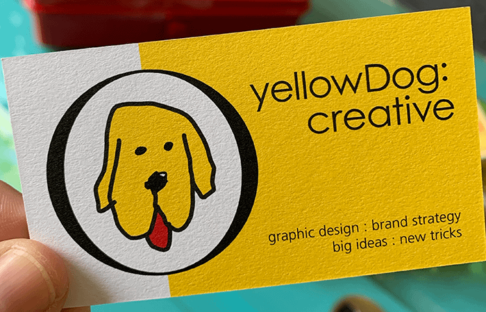
This International Women’s Day we’re celebrating the female and non-binary creatives that are driving inspiring work throughout the industry. In this interview, we caught up with founder and Creative Director, Julie Schmidt, of yellowDog : creative, to find out how she builds standout identities for both her branding agency and her clients.
What inspired you to start your own business?
I started yellowDog : creative ten years ago after working as a graphic designer for fifteen years. My design career gave me experience working in lots of different environments, and when I moved into working freelance, I was lucky enough to find clients that allowed me to work on projects I loved.
As time went on, I decided to take that love to the next level and fully strike out on my own, and my last full-time employer ended up turning into my first client!
How would you describe your style and approach to your projects?
My favorite type of work is helping clients to grow their brand, and I love the experience of working with them as part of their team. It’s really collaborative, but they also allow me to take the reins and be the design expert on a project. When we are all doing what we do best, we create lasting work that resonates with audiences.
What kind of challenges have you faced as a small business?
In the early years I was convinced that someone was going to come through the door and say I wasn’t really doing my job. I was, of course, but there was still this feeling of being an imposter that hung around for a long time. Thankfully, after ten years of experience with clients, a big portfolio of work – and the data to back it all up – has shown me that it all is real.
I suppose being a small business also means that cash flow will pop up from time to time as an issue, but it’s not a reason to be scared to go for it.
As a branding agency, clients would expect you to have a strong visual identity. How do you show them what yellowDog : creative is all about?
I think the way I dig into my brand is one of the ways I show off our personality and delight my clients. All the proposals I send come with dog bone paper clips, I wear yellow clothes to meetings, and I even drive a yellow Beetle! My reputation and the way I present our brand is how yellowDog gets more work, so it’s important to set a high level of excellence – both in work and in my working relationships.
But despite all this hard work, I’ll bet my clients mainly remember our agency dog! Sadie (the #brownyellowdog) is always at the office and ready to give clients a warm welcome. She’s an absolute delight!
What kind of considerations go into translating a brand’s visual identity in print?
For me, quality of product is the most important consideration you need to look at. Many of my clients are small businesses or nonprofits, so I also need to be mindful of budgets. Printing our designs with MOO means I can offer my clients a great product at a great price! And because I can order small quantities, we can test different design options and variations before we make that final big print order.

How do clients react when they first receive a business card with their new branding?
Clients always say how much they love the feel of the cards when they get them. That first experience with branded print is so important.
When I first discovered MOO, I was given a really cool, tiny business card by an artist after purchasing some of her work. I loved that she’d printed the backs of her cards in all different designs using MOO’s Printfinity option, and that inspired me to start ordering my own for clients.
How do you use print to help your clients’ branding stand out from the crowd?
As technology has developed we can now do so much more with print. I can wow clients with Gold and Silver Foil, and add some extra shine and texture with Spot Gloss and Raised Spot Gloss effects. These special finishes really help elevate the brand, and add an element of uniqueness to their materials.
Printfinity has also been really a really useful tool when we’re designing for our clients. For example, if we’re working with a photographer, we can show off her work by putting a variety of her images on the backs of the cards. We also have clients that work across different markets, so it’s great that we can tailor the backs of cards for this too.
After printing a few of these branding projects with MOO, they approached me about having a dedicated platform for my clients. I signed up immediately and have been ordering cards ever since!
How has MOO’s platform helped you as a small business?
I love that I have a platform that has all of my history for orders and company templates. This makes reordering and editing so much easier. As a business owner, I like to have trusted partners for all of the services and products we offer clients. When it comes to printing, MOO is our preferred partner. If we ever have any issues with an order, the team lets us know and we can work through the issues. Working together like this helps us give the client the best possible end product.

What is your vision for the future of yellowDog : creative?
I hope I continue having the good fortune of working with amazing clients (who often become friends), and I’m also really looking forward to doing more design work that affects my community in a positive way.
I’ve loved this work since the day I started, and I’m hopeful that will continue for many more years. It’s always changing and evolving, and I love how that pushes me to do the same. I’m grateful for the many wonderful opportunities and design projects headed my way in the future!
Ready to harness the power of print for your clients? Well, we’d love to help you. Click here to get started.