Keeping it personal: Chris Rogge on working beyond the 9 to 5
Graphic designer Chris Rogge chats to MOO about why mono-line illustration means so much to him, and how he balances personal projects with a 9-5.
To celebrate our partnership with AIGA at SXSW in Austin, Texas, MOO asked three artists to design a postcard that reflects their unique interpretation of the city. We spoke with graphic designer Chris Rogge about finding his niche, balancing personal projects with a 9-5, and why he really loves print.
Designer Chris Rogge was drawn to illustration from a young age and spent years working on his style before hitting on a distinctive, mono-line look.
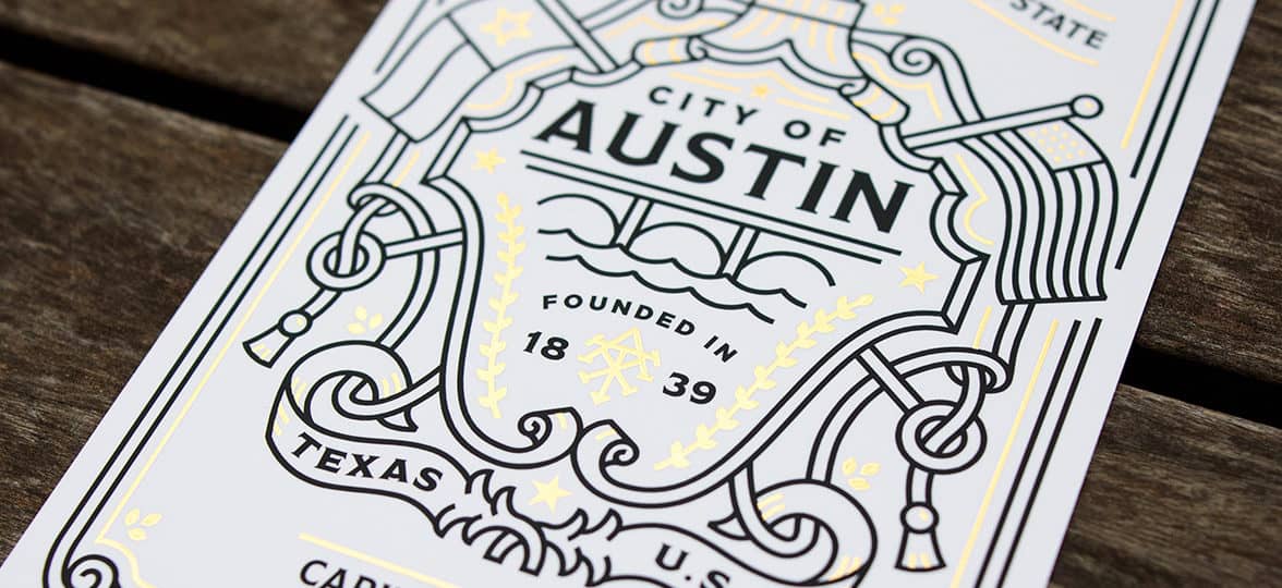
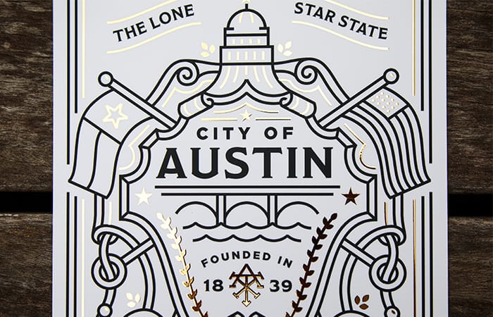
Describing himself as ‘a southern, pixel-slinging graphic designer who hangs his hat in Austin,’ Chris’s striking black-ink and gold-tinted Postcard draws from a wide range of inspirations, from European crests to his home city’s architecture.
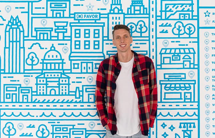
Currently an art director at Favor Delivery, we spoke to Chris about the influences on his work, his approach to using gold foil in his Postcard design, and his number-one piece of advice for art students.
Tell us about how you got into design, and how your style has evolved.
I studied art in high school, and wasn’t very good at it. But I still wanted to do something creative, and stumbled upon a communications design program at Texas State University, which really jumped out at me.
When I graduated, I had a passion for design, but no idea what to do with it. It was hard being a creative with images in my head that I couldn’t get down on paper. I had to put aside the notion that if I couldn’t draw a chair realistically, I couldn’t be a good artist.
I started doing odd jobs, developing my illustration style late at night. I explored hand-drawn lettering and package design, just trying things on. That’s when I hit upon mono-line illustration – it felt like I’d found a way of drawing that allowed me to convey my message at last.
Now, I’m working on pushing my boundaries instead of blending in. I want people to look at a piece without knowing it’s mine and be able to say, ‘That’s a Chris Rogge.’

Where do you find inspiration for your work?
My inspiration comes from three main areas. On a traditional art program, you learn a lot about artists such as Monet and Picasso, and the foundations of where art and design came from, which is a huge inspiration for me.
The second is looking at Dribbble, Instagram and Pinterest to keep up-to-date with new designers. I surround myself with them, and use what they create to fuel me. If an artist posts something amazing, it makes me want to keep going.
The third is the world around me, whether that’s a great billboard or the way flowers wrap around a tree. It’s important to be inspired by things outside your computer, to round yourself out.
What’s your best piece of advice for design students?
I told my mentor I’d always wanted to work for a clothing line, and she looked at my portfolio and asked, ‘Then why doesn’t any of your work reflect that?’ She pointed out that no-one’s going to commission me to do that kind of work if my portfolio doesn’t show it.
So for me, the most important thing is to do the projects you want to do yourself. It’s hard to give yourself a creative brief, boundaries and deadlines, but that’s what will help you develop your style.


What’s your process when working on a client brief?
I always do a lot of work upfront, getting to know the client, asking questions and going through a review before starting to design on Illustrator. I’ll decide what I think they want, go back with a pitch, and put rules in place – for example, I’ll specify three rounds of reviews. Even the best clients will ask for just one more change.
The illustrating itself takes a lot of time – the mural I created for CBRE’s offices in Houston took about five months, two of which were spent working on Illustrator. That’s the fun part, but I also knew those months wouldn’t be wasted, because the client and I were already 100% on the same page.
How did you approach the brief to design your Austin-inspired Postcards?
Just before starting my design, I went to Europe with my wife, and was inspired by the old city crests we saw. I started wondering, what if Austin and Texas were around at that time? What would an Austin crest look like?
There are plenty of things traditionally associated with Austin – tacos, food trucks, live music and cowboy boots – but I didn’t want to do something too obvious. I wrote down all things that reminded me of Austin and Texas, crossed out the ones that felt too stereotypical, and worked some of the rest into my crest.
I’ve included the bridge that goes through downtown, and a handful of stars to represent the lone-star state on my Postcard. The laurels are a traditional part of old-school crests, and I just liked the rope hanging down on each side.
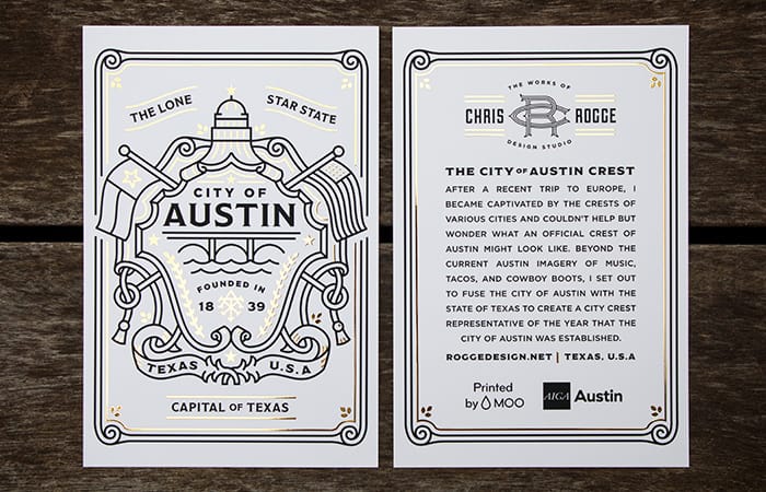
Why did you choose to use gold foil in your design?
Printing has kind of gone to the wayside – a lot of designers don’t do much print, but I love having something tangible you can look at and touch after you’ve spent so long drawing.
I love elements such as gold foil, which make print stand out, and it’s also perfect for a crest. It makes it pop, giving it a look and feel that sets it apart.
How do you balance a 9 to 5 with your personal projects?
In the past, I did work on the side out of necessity, because I wasn’t happy in my job. I’d leave on the dot of 5pm to work on freelance projects, because I wasn’t fulfilled.
Now, I love my job – but still feel I’m a better designer when I’m working on passion projects, because I can pull the things I learn in my own time into my 9-5. I’ll wake up couple of hours early to spend time on my own stuff – I sleep a little less, but overall I’m a lot happier.
Find out how artist and ecologist Natalie Luz approached the Postcard challenge.
To celebrate our partnership with AIGA at SXSW in Austin, Texas, MOO asked three artists to design a postcard that reflects their unique interpretation of the city. We spoke with graphic designer Natalie Luz about her approach to our challenge and how Texan culture has influenced her style.
With a background in ecology, graphic designer, artist and educator Natalie Luz’s work is firmly rooted in nature. Her colorful and flowing designs are filled with flora and fauna, often with a surreal edge.
Natalie’s eclectic client list features socially aware businesses working in areas such as education, conservation and the arts, allowing her to pour her personal passions into each commission.
Originally from Florida, Natalie’s work has been inspired and energized by the people of Texas, and by Austin’s natural spaces and waterways. We caught up with her to find out how she chose to depict the city in her Postcards, and how she stays connected with nature.
Tells us about your background in conservation and ecology, and how you eventually moved into design.
It’s difficult for me to remember a time in my life when I wasn’t getting outside and observing the natural world – watching a spider constructing a web or the emergence of new buds in spring. This keen attention to detail led to an interest in art and design.
In 2008, I got my degree in Wildlife Ecology and Conservation, after which I spent some time teaching about the environment, and taking up opportunities to create illustrations and designs for events.
That motivated me to create a path between the two disciplines, and I pushed myself to learn the skills that would allow me to advocate for the things I feel passionately towards. It’s been uplifting to learn what I’m capable of.
What have been your key influences and inspirations?
I feel most inspired when I’m engaged in something enriching. I create art as a way of telling stories and giving myself an outlet to reflect on the complexities of human emotions. I enjoy studying science, understanding the natural world, reading, music, dancing, culture and community – and I try to harness the creativity those influences bring out in me.


How important is it to you that your work reflects your personal beliefs?
It’s very significant that my work tells a narrative of who I am. Not every project I work on will fall within this niche, but I think I’ve created an identity for myself as an artist, and will continue to attract those kinds of opportunities.
I currently work on a range of projects that aim to empower communities, educate, and provide meaningful experiences. Creativity, whether art, music, writing or dance, is all about personal discovery. Immersing myself in these things has helped me learn a lot about who I am and what I believe.


What advice would you give to designers keen to remain authentic as they grow as artists?
Art is a reflection of one’s essence, and authenticity should be the driving force of this self-expression. Growing in any art form requires a great deal of ambition and focus, and when you commit yourself to your art, you’ll naturally stay in tune with your authentic self as you grow.
It’s also important to cultivate joy in your life and allow yourself the experiences that bring you connection and inspiration. A passionate existence will never cease to fuel authentic expression.
How has Texan culture influenced your style?
I’m a native Floridian, so my experience of living in Texas has broadened the scope of what’s inspired me. It’s exposed me to an immersive culture of arts and music, diverse communities of people, beautiful landscapes and exceptional food.
The most notable influence on me has been through the people I’ve met – many of my closest friends are native Texans who embody the kindness, warmth and hospitality of Texan culture. It will always hold a special place in my heart.
How did you approach the brief to design your Austin-inspired Postcards?
I created a mind map of words, themes and symbols to help me explore my ideas, then narrowed them down and started to conduct visual research. I spent time sketching and exploring color themes, textures and treatments.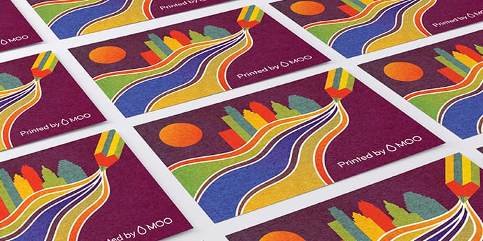
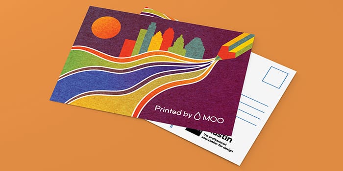
I wanted to deviate from the typical Austin themes in my Postcard, and highlight the parallel between the flow of nature and expression. I tried to think about how I could represent that conceptually, while also creating a simple, bold design. That’s when I thought of the river representing the flow of ideas out of the tip of a pencil, with the Austin skyline in the background.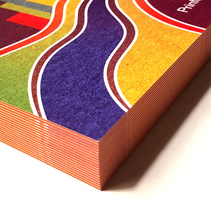
What does this design represent for you?
The primary inspiration comes from Austin’s waterways and natural areas, which are symbolic of replenishing inspiration and rejuvenation.
I feel there’s a parallel between the flow of water and the ‘flow’ of passion and ideas – a state of high cognition where you feel fully present and deeply focused. I wanted to encourage people to embrace their own creative flow.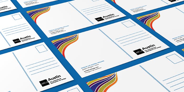
What are the benefits to artists of attending SXSW?
Being able to immerse yourself in the full experience opens you up to amazing opportunities to learn, explore and network. You meet people with diverse backgrounds and life stories, which leave me feeling motivated.
Being part of the MOO experience at SXSW this year has also been an inspiring opportunity that’s encouraged me to keep pushing forward.
What do you have coming up that you’re excited about?
I’ve been working so hard in recent years to get to this point, I’m just excited to keep working and growing. I hope to open an online store to sell prints of my art this year – if I keep focused and continue working hard, I know I’ll eventually reap what I sow.
Find out how album cover and poster designer, Jordan Braithwaite approached the postcard challenge
To celebrate our partnership with AIGA at SXSW in Austin, Texas, MOO asked three artists to design a postcard that reflects their unique interpretation of the city. We spoke with graphic designer Jordan Braithwaite about his approach to our challenge, how to evolve an internship into a full-time role, and the music that inspires him.
Graphic designer Jordan Braithwaite works for design agency Studio Dzo alongside his personal projects, producing colorful work that layers elements such as photography, typography and maps to produce his distinctive album and festival artwork and posters.
Also known as Cosech, Jordan used the MOO challenge to produce a dreamlike Austin landscape that incorporates his signature style and love of the outdoors.
MOO spoke to Jordan about the artists who inspire him, the physical process behind his striking style, and his hands-on approach to the Austin-inspired Postcard brief.

Tell us how you got into design.
I was introduced to Photoshop in middle school, and instantly became hooked. I spent a lot of time playing around and seeing what you could do with it, discovering techniques that created interesting textures and colors, and essentially stumbling upon my current style.
From there, I became fascinated with the possibilities of art and design, which made it an easy career choice. I found my stride in Austin Community College’s design program, and it’s been a whirlwind ever since.
What was your career path from graduation to your current role?
I wanted to cut my teeth in the industry, so I applied for as many internships as I could – even if you’re unsuccessful, interviews are great learning opportunities. My first internship was at Margin Walker – a local music booking company – and my main task was to grind out gig posters as fast as possible, which I excelled at.
I gained skills and tools to take to my next internship at Mohawk, a music venue in downtown Austin, and at the same time was given the opportunity to intern at Studio Dzo. The grind continued through these two internships (and my day job as a pizza-shop manager) until Studio Dzo offered me a full-time job.
Where have you found inspiration?
My biggest influence is Scott Hansen, who’s known as Tycho as a musician and songwriter, and as ISO50 for his photographic and design work. Both are near-perfect to me.
Design-wise, Leif Podhajsky, Michael Cina, and Andy Gilmore are some of my main inspirations, and musicians and bands such as Boards of Canada, Bonobo and Four Tet have all affected my design aesthetic to some degree.
Listening to music is a key part of my process – when I’m working on posters or album covers for bands, I tend to loop their music so I can get their vibe into my head, and hopefully be able to translate that visually.
What’s the process behind approaching a brief?
When a client comes to me, I’ll send back a creative brief asking for the scope of the project, the budget, examples of things they like and don’t like. I ask questions that help narrow down exactly what they’re asking for.
I usually have an end goal in mind, but through my method of layering photography and blending modes and effects, I usually end up taking a multitude of paths before I settle on a final result. It ends up being quite messy, but I’ve been able to create some really cool effects that I haven’t been able to recreate with any other process.


What’s been your favorite project to date?
The cover design for Blushing’s single, The Truth/Sunshine. My process lends itself perfectly to their lush vibe, so it’s easy for me to match their aesthetic.
I’m currently creating the artwork for their next full-length LP, and I’m really excited about how it’s coming together. I get to dive into a dreamy world of pinks, blues and lush textures, and it’s hard to leave once I’m there. They’re all great human beings, so I love making cool stuff for them.


What does Texas mean to you?
There’s a certain quality to Texas that makes you feel at home – more so than I’ve felt in other states. It’s not afraid of being proud.
Austin’s vibe in particular is one of the biggest contributing factors to my style – the creative atmosphere allows a lot of freedom to express yourself.
How did you approach the brief to design your Austin-inspired Postcards?
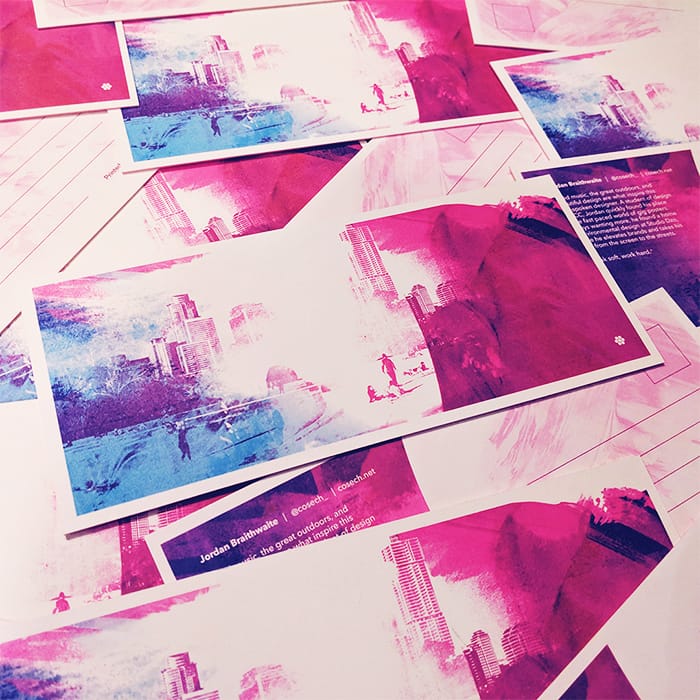
I knew from the beginning that I wanted to use one of my favorite elements of Austin in my Postcard: the outdoors. I wanted to include either the skyline or Zilker Park, and combine them with other elements to create a dreamy landscape scene. The colors are representative of the general vibe I feel in Austin – vibrant and exciting, but also very soothing and welcoming.
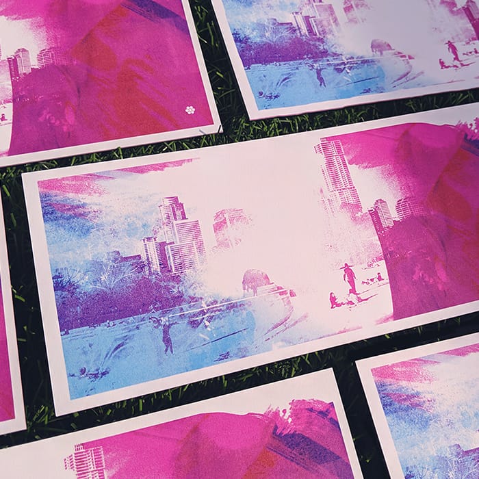
The background is a combination of a few images – one being the dance floor of a concert venue, which I’ve used for texture, and another being a photo I took of people enjoying the weather at Zilker Park. I snagged a few great photos, and brought them into Photoshop, then focused on creating the right balance of color and texture to complement them.
It took a while, but I’m thrilled with how it came out. I hope to evoke a sense of wonderment and hopefulness with my Postcard, as I get that feeling every day riding the train through Austin.
Do you think SXSW is a good place for designers to network?
There are a ton of opportunities for designers to get work and find new connections, and it also allows you to gather inspiration from the various events going on. Plus there are so many shows happening, and they all need posters!
Find out how graphic designer, Natalie Luz chose to depict Austin in her Postcards, and how she stays connected with nature.
The illustrator and host of Friday Night Sketch at The Design Museum talks to MOO about the female characters who have shaped her work.
Born in Stockholm, Sweden, and now based in London, illustrator Alva Skog manipulates perspectives to give her female and non-binary subjects small heads, strong arms and large hands and feet. Often depicted from above or below, she also plays with the power balance between viewer and subject in her bright, bold designs.


A year after graduating, Alva’s client list includes Apple, Refinery29 and The Guardian. As she steps up to host Friday Night Sketch on the subject of Monumental Women, MOO caught up with Alva to talk about skewing stereotypes, her top tips for successful freelancing, and how science fiction novels have helped to shape her style.
Tell us about your background, and how you got into illustration.
I always loved drawing – my aunt was a set designer and used to paint a lot, while my dad directs TV adverts. I loved going into his work, and the idea of working with clients, and visualising and communicating someone else’s message, was very appealing to me.
I completed a foundation course in fine art, then applied to study at Central Saint Martins University, where I learned illustration. I graduated in 2018, which is when I went freelance.
What skills did you develop at Saint Martins?
Because I’d done a two-year fine-art course, I was slightly older than my classmates – it meant I was very driven, and had a better understanding of what I wanted. We were also left to run our own projects, which gave me time-management skills and confidence that I could get things done.
I learned a lot from my classmates, too – some were great at typography, others at illustrations – and one of the most important things I took away with me was skill-sharing, and to be open-minded. I still sometimes work with people I met during my time there.

What have been your key creative influences?
I’m inspired by my little sister and her views on life as she grows up, and by my mom, who’s an associate professor in ethnology and taught me a lot about feminism and gender. I’m very inspired by women and non-binary people, and hearing about their experiences. They’ve shown me there aren’t just two ways of being – there are so many different ways you can be.
I’m also inspired by the painter Marlene Dumas, and by feminist science-fiction literature, such as Marge Piercy’s Woman on the Edge of Time, and The Left Hand of Darkness, by Ursula K Le Guin. They explore gender identity and what gender could look like in the future. It’s given me an interesting perspective that’s definitely influenced my work.
How did you develop your distinctive style?
Before my second year of studies, I tried lots of different styles using ink, watercolor and digital drawing. Then in 2017, I entered the D&AD New Blood Awards. The brief was to make three posters giving advice to someone, and I decided to speak to my younger sister about not conforming to society’s rigid ideas of how she should look or behave.
I was very aware of not sexualizing the women in my posters in any way, and of moving away from the stereotypical ways they’re portrayed in media. I wanted to do something new, so I drew them with big hands and feet, strong arms and hairy legs.
My entry was awarded a Yellow Pencil prize, which made me confident that my work was good enough for the industry, and that I could effectively combine feminism with my illustrations. That was one of the key starting points to my style.
Has your style of illustration evolved over time?
Definitely – and it will keep evolving, which is really exciting. When I was first told, ‘If you want to be an illustrator you need to have a style,’ I was frustrated – I wanted to do it all. But having a style means you can develop and change over time.
My heads are getting smaller and smaller, my hands are getting bigger and bigger, and I’m playing more and more with perspective. I’m finding it exciting to see how far I can push my work.
What’s your favorite type of project, and how do you approach a brief?
I did a cover for the Guardian’s G2 supplement, to illustrate an an article about child sex abuse. It was a challenge because it was such a heavy subject, but those kinds of briefs feel important, and I was very pleased with the outcome.
When I’m given an editorial brief, I’ll read the article, write down key words, and do more research if I feel I need to. Next, I’ll draw thumbnail sketches in black and white, then move onto sketching on my iPad, using the Procreate app. I’ll do my first sketches, send them to the client, then move forward with color roughs. Editorial is quite fast-paced, with a one or two-day turnaround, which I enjoy.

You recently hosted a Friday Night Sketch on the subject of New Monuments for Women. How did you approach the topic?
I think it works really well with how I approach illustration – drawing someone in a monumental way is very exciting. I asked participants to use exaggerated perspectives, which can empower or disempower the viewer, to create a monumental drawing of a female or non-binary identity.
Everyone really made an effort to skew the perspective in their drawings. It can be quite hard to do, but some were really clever, drawing an initial sketch where they pushed the perspective, then a second sketch that pushed that perspective even further. To have a lot of people sitting in the same room, all drawing, is wonderful – it’s a great event.
What advice would you give to students hoping to freelance after graduation?
Be very active in getting your work out there. One of the reasons I had such a good start to my freelance career is that I entered lots of competitions, and wrote to a lot of online design magazines asking if they wanted to feature me. You should be confident about your work, because if you’re worried you could do better, you won’t convince other people to hire you.
It’s also important to be kind to other illustrators – if I can’t take on a brief, I’ll recommend someone else, because it’s good not to be too competitive. Being nice is what will make people want to work with you or offer you a job – it’ll take you very far.
Looking for more women drawing women? Meet Erin Aniker, the Friday Night Sketch host tackling diverse narratives in her designs
No matter how many realtors there are in town, one always shines brighter – and you want to make sure it’s you. Here’s how to create a strong brand in a crowded market.
So, what gives great realtors star quality? There are lots of realtors out there, each one looking to make a lasting impression on their customers. So if you want to be the best in the business, it takes more than just doing a competent job.
It’s all about networking
You need to build fantastic professional relationships. No realtor is an island, and word of mouth is a big driver in developing new client connections and growing your reputation. As well as dealing with customers in person, it’s a great idea to make yourself available on social media to make it even easier for potential customers to connect with you
Networks like Facebook and Instagram are powerful tools for realtors who are hoping to get referrals from past customers. By having a profile set up and being available to answer messages promptly, you’re making it simple for your clients to send their friends your way. After all, they don’t need to be a realtor to refer someone to you, provided there’s no referral fee changing hands.
Provide amazing service
Thoughtful touches and attention to detail can make all the difference when it comes to creating a memorable name for yourself. even just making sure your clients and potential buyers feel listened to and cared for when they come to a meeting or join you for a walkthrough will put you front of mind when it comes to your clients giving recommendations to others.
Thinking about what your client wants and needs will come naturally if you’re able to make an emotional connection with potential buyers, so be willing to take your time and talk to them at their leisure. By getting to know them as people, you’ll understand exactly what they’re looking for in a new home, and what their challenges and stressors are. You can then make it your mission to clear the way and make the buying process as comfortable as possible for them.
Make your branding stick
Even when you’re not personally in contact with potential clients, your real estate marketing and branding can work wonders in making you stand out positively.
Are all of your competitors using a similar approach with their design and imagery? If so, you have a chance to shake things up by choosing a distinctive font or color palette. Opt for a look that’s fresh and new, not the same old cursive script and headshots. Why not try taking inspiration from interior design blogs or Pinterest pins, and build your brand around beautiful home design?
How to market yourself as a realtor
You’re right at home with selling houses, but what about selling yourself? Great realtors know that their unique personality can have as much power in making someone feel at home as the gorgeous condo they happen to be showing off.
For that reason, it’s important to think strategically about your personal brand, especially if you’re a new realtor just starting out. What are you known for, and what would you like people to remember about you?
Think about your personal strengths and how they play into your professional role. For example, do you have a bubbly personality that helps people get excited about new possibilities? Are you reassuring and calm, helping nervous first-time buyers and sellers through their sales? Or maybe you’re highly practical and good at helping clients think their plans through logically, even when things are complex.

Create a marketing master-plan
A marketing plan is a must-have for any realtor. You need to decide on your messaging – the ideas and facts you want to communicate about your business that showcase your personal brand and help you stand out. These might include things like your years of experience and your reliability, or the number of satisfied clients you have, and their testimonials – you’ll find more details about testimonials at the end of this post.
Another consideration is the channels you’re going to use to spread the word about your services. That could include advertising, social media, email, your website, or offline options like Flyers and Business Cards
The best marketing channels for real estate businesses are generally those with a local feel. You’re looking to tap into opportunities in a geographical community, so check out local and regional groups on Facebook, or use and follow Instagram hashtags that are specific to an area or state. Of course, offline marketing is perfect for this, since you can hand out Flyers or distribute Postcards locally.
You also need to be clear about the goal of your marketing activities. Are you trying to drive brand awareness, i.e. make sure people know you’re out there? Or will you measure success in numerical terms, looking at number of new clients or successful sales? Putting goals and measurements in place will help you keep track of your efforts and see how the rewards of your hard work mount up over time.
Build a referral network
Throughout the process of your clients moving out of their old home and into the new one, your customers will need a few things that you can’t deliver. You may not be able to do these jobs yourself, but what you can do is partner with local suppliers — like a locksmith or moving service — and negotiate a discount for your clients when they use those services. This is a great extra step in making their experience with your service memorably positive.
After the home-buying process is done and your hard work is rewarded, it’s still just the beginning of the story for your clients. Once they’re moved in and enjoying their new home, they’ll want to get everything perfectly attuned to their tastes.
As well as helping them get great deals with suppliers, you can create a list of local businesses and service providers that you recommend once they move in — for example, on a nicely-designed Postcard (then you can even write a personal note on the other side of it!). A few ideas for businesses to include in your referral network are:
- Interior designers and decorators
- Gardeners and landscaping crews
- Painters and construction professionals
- Cleaning and maid services
- Local restaurants that do take-out and delivery
You can also reach out to these businesses and let them know you’re sending clients their way. Sometimes, the same people who need these services after a move also need them when they’re preparing to sell their house, ,so you might find yourself getting referrals from them, too. Networking is a skill that brings all kinds of unexpected benefits.
Follow up and stay in touch after the sale
Across all industries, one thing that businesses can almost always do better is client follow-up — real estate is no exception. In addition to making sure that your clients have the support they need after the purchase by referring them to local businesses, you can:
- Send thank you gifts and cards once the deal is closed (you can even combine this with the above tip and have, for example, a $25 gift card for a local food delivery service)
- Stay in touch with your clients and see how the process is going
- Send small gifts or cards at later times, as you stay in touch (for example, to congratulate them on a new baby or a wedding)
By doing this, you’re not only making it more likely for your clients to refer you to their friends, but you’re also making them more likely to come back to you in the future when they outgrow their current home.
Use tech to keep things in order
Buying a house is often stressful — it’s your job to make the process as smooth as possible. And that means you need to stay organized. The best ways to do that are:
- Having a step-by-step system or checklist for the home-buying process, to make sure nothing gets overlooked. You can easily create task or project templates using free tools like Asana or Trello.
- Keeping an up-to-date list of your properties with all the important details. The RPR app and ShowingTime can help with this.
- Keeping up with a CRM system that has notes on what your clients are looking for and where they’re at in the process. Streak and Contactually would both work for this.
- Having document templates on hand and making it easy for clients to e-sign them – assuming this is legal in your state. If so, DotLoop, created specifically for realtors, can help.
The power of testimonials
When you do the work of standing out from the crowd, you’re going to have very happy customers. Make sure you’re getting testimonials from these customers after their purchase is complete and when your glowing service is still fresh in their minds.
Then, you can work those testimonials into your social media presence, quote them on your website, and even include them on your Business Cards and other physical marketing materials. For more ideas on how to effectively use testimonials, head here.
Make a wow-worthy first impression with your business branding. Create your referral Postcards now
Here at MOO, we have a really talented team. Want to know what it’s like to work with us? Take a look at a typical day in the life of a MOOster…
Robert Serban
Hey I’m Robert, I work in IT Support and I’ve been at MOO for nearly 3 years in total, but in my current role for a year and a half.

At MOO, I’m responsible for…
Monitoring and maintaining the computer systems and networks of the organization.
I got my role at MOO by…
Making a career move from the Dagenham printing warehouse office to our Farringdon HQ by joining the IT team.
My morning routine is…
Quite simple. I usually wake up between 7:30 and 8 am. I read the morning news, make a cup of coffee and put on some deep house music.
A typical working day is…
Spending the majority of my time with my colleagues helping them with different technical issues. I am also responsible for training new starters or our internal systems and platforms.
Something people don’t know about my role is…
That I am handling the licenses renewals accounts too. That means if an employee needs a new license or to purchase a new system, they need to come and speak to me.
My proudest moment at MOO is…
I have lots of proud moments at MOO, what makes me most proud is the recognition I get from helping everyone.

The thing I like most about working at MOO is…
The friendly atmosphere and the opportunities to grow and learn new things.
On the weekend, you’ll find me…
Spending time with my friends, going out for a drink or attending house music festivals. Clubs like Fabric and Studio 338 in London are my favourite places to go, so you’ll find me there very often!
If I wasn’t doing this as a career, I’d be…
Working with Ferrari team at Formula One.
The best career advice I’ve ever been given…
Keep developing yourself, never stop learning and never give up your dreams.
Keep your eyes peeled on our interviews page; we’ll be hosting guest blogs from our MOOcrew members every week. Up next, we’ve got Kathryn, our global director of product marketing.