4 creatives share their design predictions for 2019
With every year comes new design styles, techniques and trends, but what do the creatives themselves think will be on the horizon for 2019?
We checked in with some of the awesome designers we’ve worked with in 2018, to hear what their 2019 predictions are for fonts and design, what new technologies and techniques are on the horizon, and how they see future trends shaping the design landscape in the coming year.
What design trends do you think 2019 will bring?
Bridgit Kreutzer, BK + Co.
I’m hoping to see more hand-drawn types and patterns in futuristic, bright colors, paired with minimal design. I’ve always been an advocate of the “less is more” approach, but in 2019, I would love to experiment with production by combining my minimal design aesthetic with unique printing techniques, like creating clean typography in a holographic foil. I don’t see myself going too crazy, just making little experiments here and there.
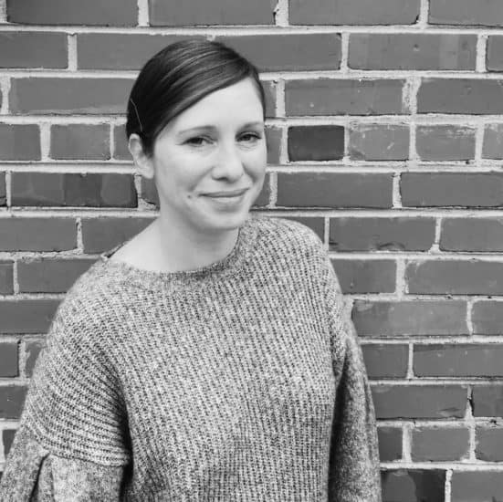
Tim Easley
I’d love to see a move away from wavy distorted type in favour of more hand lettering. It’s never my intention to create work that’s specifically on-trend, but inevitably somewhere along the way you see more work you like in a particular style and it grows on you. I think you have to make what you find interesting, even if that means incorporating trends into your work. In the end, it helps you develop as a creative, and I think a big part of being successful is having the ability to develop and adapt.
Eric Kass, Funnel

Recently, I’ve seen a lot of a vintage inspired hand-drawn work that I believe will continue to evolve into a more sophisticated, minimal style. I think the older handmade aesthetic is a nice opposition to work made digitally, which can sometimes be a little cold and impersonal. I think trends are a great source of inspiration, but it’s important not to get trapped in a cycle of simply mirroring one another. Sometimes it is difficult to resist emulating beloved work rather than being inspired and creating our own personal expression.
Lana Hughes

For next year, I imagine styles developing from typefaces like Helvetica and Bebas – which are very cool right now – but with an an illustrative twist. Perhaps reimagined with a more sketchy, rough aesthetic – like brush or hand-lettering. Personally, I’m trying to stay open-minded and experiment with my lettering; adding layers, warping, erasing parts and playing with lines, so I’d quite like to try out some different dimensions and depth on script lettering in future.
How do you see your style evolving in the New Year?
Bridgit Kreutzer, BK + Co.

My style stays pretty consistent, but gets more refined as I grow as a designer. In terms of experimenting with new formats, this year I was fortunate to work on several packaging design projects, so now I’m itching to create some of my own products to package in 2019.
Tim Easley
![]()
One of my absolute dreams is to work on a massive scale. I’m a huge fan of big versions of small things, so I’d love to have the opportunity to create large artworks or installations at some point. I think it gives an entirely different dimension to your work, like being able to step inside it rather than just look at it.
Eric Kass, Funnel

I can absolutely see my style evolving in 2019. I strive to always be aware; observing, learning and developing as a person and designer. There is so much wonderful work being produced and shared that we all have easy access to, it’s just a matter of sifting through what resonates most and letting it inspire you. I’m really excited to get more involved with architectural, interior and environmental design, as it lends itself well to brands I’m working with, but anything I can do to shape interactive brand experiences through sounds, smells, temperatures, textures would be amazing to explore.
Lana Hughes

Lately I’ve been experimenting a lot with neon sign lettering styles. I love the shadows and colors that are formed by natural light against a beautiful blue sky – and I love drawing them even more! I’d like to have these illustrations printed, then play with adding a hand painted customised element.
Are there any design technologies or techniques you could see becoming popular in 2019?
Bridgit Kreutzer, BK + Co.

I think this year will be about staying authentic in a sea of visual overload, so using technology to create website animations and moving typography will be a really big focus for designers. We may be headed back to the days of David Carson’s experimental typography, which would be fun to see!
Tim Easley

I’d absolutely love to see more stuff done with augmented reality and VR. It’d be amazing to see artist designed experiences that you could walk around and interact with, or new ways to create 3D content using phones – it might even open the 3D modelling world up to more creatives.
Eric Kass, Funnel

It’s awesome that people are utilizing everything from old handmade technologies to the newest cutting edge options. I think that sense of variety will continue as people explore and become more creatively diverse. It’s so exciting to experiment with different processes and see how each affects the production, message and aesthetic of designs.
Lana Hughes

For me, the Procreate app for iPad has been an amazing tool! It’s changed the way I work and saved me a lot of time on projects. Since using that, I’ve opened up so many options and lettering possibilities that I doubt I would have discovered with paper and scanning to Illustrator. Having the ability to clean, test and adjust my designs on a tablet is pretty handy – especially on the go when making changes for clients. I notice more and more people are using this for illustration and painting and I totally get why – it’s the only thing I use my iPad for!
Loved hearing stories from our design community? Take a peek at their plans for 2019 in our interview, New Year’s resolutions from the designers.
48 hours. 3 designers. 1 color. How will these creatives incorporate Pantone Color of the Year 2019 into their designs?
The Pantone Color of the Year announcement is a serious save the date in any designer’s calendar. To celebrate the big reveal, we decided to set some awesome designers a unique challenge…
What is Pantone Color of the year 2019?
Every year, the color connoisseurs over at Pantone Color Institute choose a shade that they feel will best reflect the year ahead. This is based on various factors, from fashion design and interior trends, to current affairs and world news. The chosen hue is intended to represent a snapshot of the world.

This year, the Pantone Color Institute have selected Living Coral. A bold, invigorating pink that exudes warmth.
Here’s Executive Director at the Pantone Color Institute, Leatrice Eiseman on why Living Coral made the top spot:
“With consumers craving human interaction and social connection, the humanizing and heartening qualities displayed by the convivial Pantone Living Coral hit a responsive chord.”
Find out more about Living Coral, the new color of the year
What is the MOO Color Challenge?
Following the announcement, we set 3 designers – all renowned for their use of color – a unique 48 hour challenge to create their own Business Card or Postcard designs, inspired by the peachy Living Coral shade.
So, ready to meet the designers? Drum roll, please…
Timothy Goodman
After collaborating on a brand new limited edition Notebook last year, we just had to invite New York based illustrator and designer, Timothy Goodman back for another challenge.
Timothy’s bold graphic work has landed him some amazing projects with big brands like Uber and Uniqlo. His work has adorned everything from large scale murals to magazine covers (even the bonnet of a Ford Focus on one occasion). Whatever his canvas, Timothy’s playful typography is human, storytelling, and always made with passion.


When Pantone revealed their Color of the Year, Timothy immediately had a strong vision for his designs. “I absolutely love this color!” he says, “When I first heard the announcement, I instantly knew how I wanted my work to look – big white quotes on a sea of Living Coral. I don’t usually use a ton of color in my work, but my black and white style pairs perfectly with warm colors like this. I’ll definitely be using it again.”
Inspired by Timothy’s Postcards? Start designing your own now
Hattie Stewart
When we first saw Hattie’s work, we were immediately hooked on her colorful, tongue-in-cheek style. She’s got that classic-meets-contemporary balance spot on – all while having subversive commercial appeal.

Hattie works with a bold, irreverent aesthetic, and her signature “doodle-bomb” on high-profile magazines has hit the covers of titles such as Vogue, Dazed and V Magazine.
As soon as the new Color of the Year was announced, Hattie knew she could use Living Coral to make her designs pop. Her aesthetic welcomes a bright palette so Hattie was “thrilled that this color was chosen.” The coral “complements the black line-work and the sentiment behind the ‘Hello Cheeky’ tagline perfectly” she told us. The result? “Designs that are simple, but really visually engaging.” We couldn’t agree more!
Make your Business Card designs ‘pop’ with Living Coral
Zipeng Zhu
New York City based art director and designer Zipeng creates visually arresting animations and graphics. His bright designs and bold statements are fun, playful and bursting with color and aim to make everyday feel like “a razzle dazzle musical.”

Zipeng’s versatile style has attracted some exciting projects too, like reimagining the branding for the Jewish Museum in New York.


Although he was surprised by Pantone’s choice, Zipeng used his natural eye for color to bring his Living Coral designs to life. “I was so shocked it wasn’t yellow, but I think it’s a very accurate shade for 2019.” he says. “Choosing which colors to use in my design was instinctive for me. When I’m working on a set color scheme, I try to complement or create contrast in my choices.”
Stand out from the crowd. Use Living Coral in your Business Card designs
Where can you check out the designs?
Not only have Timothy, Hattie and Zipeng created completely original designs, they’ve also photographed and documented their creative process. We’ll be sharing all of this – plus the juicy behind the scenes work – with you over on Instagram.
Stay up to date with the MOO Color Challenge. Follow us on Instagram and check out #MOOcolorchallenge.
The New Year is a time for reflecting on the past and planning for the future. Here’s how our design community are already forming plans to make 2019 their best year yet.
Resolutions don’t have to be about eating healthy or hitting the gym. We caught up with our design community to find out how they want to evolve their businesses in the new year; from developing new skills, to growing their client list.
Exploring new mediums, formats and colors
Bridgit Kreutzer, BK + Co
I plan on working with some new printing techniques; foils, various paper colors and textures, along with some new folding and die cutting processes. I definitely want to bring in more pops of color this year, combining them with my minimal design aesthetic.

Pouvelle Studio
We tend to work digitally, so it’d be great to see our designs brought to life in physical mediums such as sculpture or textiles. We’d love to design a pair of socks – Blanca (co-owner of Pouvelle) always tries to match her outfit to her socks, so it would be amazing if they were Pouvelle branded. We’ve also been really interested and inspired by installation art lately. The thought of extending our work beyond the walls and the screen is a really exciting thought – it’d be like creating our own “universe” full of patterns and colors.

Kia Cannons, Sticks and Ink
I usually work with vibrant, bold colors, but I’m looking forward to exploring my recent love of working with dark muted palettes of inky indigo and black, as well as playing with the combination of high gloss acrylics and matte buttery oil paint.

Developing your social media presence
Tim Easley
Social media is such a big part of every creative business these days that it’s super important to look at it regularly, especially when the new year comes around. I’ll be doing what I usually do, which is looking at my content, seeing what gets the most engagement, and creating a plan to replicate my successes.

Ampersand Studio
We’re really good at focusing on creating art and really bad at focusing on social media. So for 2019, we hope to implement a better social media plan to keep our supporters up to date with what we’re creating and where to find our latest and greatest creations. We also want to make sure we give back to our community. This might be with some tips, tutorials or just pure inspiration! We’re adding some social media podcasts and classes to our reading and listening list for 2019, too.
Eric Kass, Funnel
I plan to do a better, more consistent job of engaging with my 170k Pinterest followers and leveraging the exposure. I’d also really like to make more time to share finished work, and the journey of my work in progress, with my Instagram community.. Starting to interact more with the accounts my followers engage with would also be a good experiment to help grow my networks – that’s something I’d like to test out, too.
Fixing up your workspace
Giada Tamborrino
In 2019, I plan to update my studio’s layout and add new plants and decoration. I love doing it every once in a while – it feels like I’m in a new place and it helps me to stay inspired. Working from home can be challenging and although it’s important to have a routine, renovation and changes are a must for me.

Matthew Frame
We recently had a massive re-arrange in my shared studio space. It’s been so helpful to declutter my desk and really think about the things I actually need on a day-to-day basis. So much of the stuff I had around me was superfluous, and the process of organizing my physical space has allowed me to focus more on my art as opposed to all the things I’d convinced myself I needed in order to be creative. I want to slim everything down further in the new year – soon it will just be me in empty room clutching a pen.

Nikki Farquharson
I’m planning on moving early in the new year, and as I work from home, it’s really important for me to find a space that feels conducive and comfortable to both personal and work life. I would like to find a space that allows enough room for a desk (or two) for my drawings and future jewelry-making venture. I’ll need maximum storage space for both my art equipment and online store stock, and of course, a lot of natural light is a must.

Excited for what the year ahead holds for design? Check out the design, font and color trends our designers are predicting for 2019.
Want to create a standout color palette but new to the branding game? Or perhaps you’re looking to shake up your visual identity with a brand refresh?
We caught up with MOO’s Head of Brand Design, Anna Ebubedike, on how to build an identity that best suits your brand – from finding brand color inspiration, to choosing and testing colors.

Why is it important to choose the right colors for your brand?
Choosing the right colors for your brand is like putting the right clothes on in the morning. It all says something about what you stand for and represent.
Your personality does a large amount of that through what you say and how you act, but what you choose to dress yourself in will also have a bearing on how people perceive you. It’s another opportunity to strengthen your brand proposition. For instance, if your brand has a fun, vibrant and playful outlook, you probably wouldn’t choose to support it with a palette of entirely muted, dark colors.
Not sure what colors are right for you? Check out our beginner’s guide to choosing your brand colors.
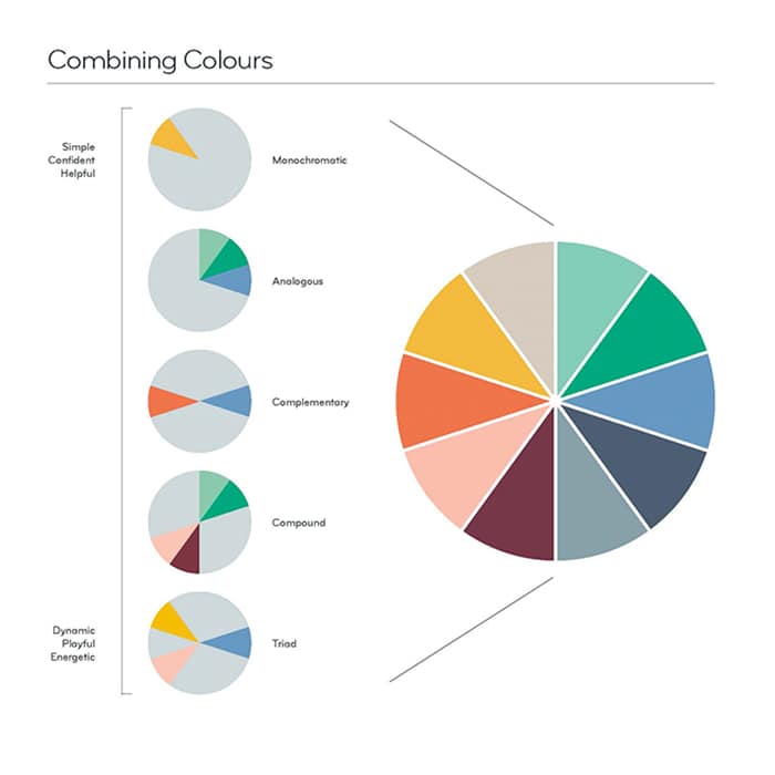
How did the creative team decide on our MOO palette and logo colors?
We did an extensive amount of research into how we were using our old color palette, and how the UX team used color online, versus how it was used in print.
From that, we could identify roughly how broad we needed the spectrum of colors in our palette to be. We wanted to ensure there was enough flex to use the palette across a range of touchpoints, while not being so vast that we couldn’t have a sense of consistency across our brand.
We also identified that beyond the core palette, there would also be a need for both tints and shades of each of those colors – mainly for use online. This also allowed us to slightly shift our color choice in photography to give a sense of seasonality. The neutral colors in our palette may not be as memorable, but they’re an important inclusion to allow the brighter colors, or product to shine through.
Our logo is predominantly used in our MOO Green – and in instances where people may not have seen the brand before – to build brand recognition. This specific shade was selected because in the competitive field, it stood out. Greens also tend to have quite a positive emotional response, so we spent time identifying a green that would ‘pop’, read well on a white and be distinctive to us. When people are familiar with the brand, we then use the logo in other colors from our palette.

Building a palette seems like a big job. Where do you start?
Yes, it can take a lot of testing to build out a color palette which is flexible enough for all your needs and touchpoints, which prints well and is accessible online.
I would always start any color exploration by undertaking an ‘audit’ of how you presently use color, to identify what is working and perhaps what your new requirements are. For instance, you may think you need a much larger palette, but upon doing this research, you may actually find you don’t need more, you just need a harder working selection that works better cross-platform.
Where do you go for color inspiration?
Color inspiration can come from literally anywhere – a florist’s window, a print of a painting on a postcard, your socks. Sourcing inspiration in this way is more likely to ensure that what you end up with is personal to you or your brand.
That said, if you feel you need a steer, then fashion is always a great cue for exciting and modern color palettes, via fashion blogs, magazines or Instagram accounts. You may want to be careful not to pick anything too ‘of the moment’ though as it will possibly date quickly. It could also become popular for many other brands too, making it hard for you to stand out. So for a more timeless palette, and greater brand differentiation, always add your own twist.

What are the signs your business needs a color rebrand?
If your color palette is noticeably dating your brand, then it’s probably time for a rethink. This could take the form of a complete shift, or just a ‘freshening up’ of your existing colors.
The other thing to watch out for is if your brand is getting lost amongst any competitors who have opted for a similar color range. If you want people to notice you, then you need to be doing something different from everyone else, and color is one way to achieve that.
If you want people to notice you, then you need to be doing something different from everyone else, and color is one way to achieve that.
How can you ensure your color palette is consistent across your brand?
If you are a relatively young brand, it’s essential to use every touchpoint as an opportunity to gain more recognition – and the consistency of how you use all your brand elements, including color will be key to this. Try to ensure when you select your color palette that everything works equally well for print as for online use. You want your Business Cards, Postcards and any other printed material to look consistent with the digital versions. Your Business Card’s color palette should be simple and striking. Try and keep your color selection to the bare minimum for your requirements. Color swatch books are a great tool for this, as they will always give you a hex breakdown for online too. But be prepared at times to choose a slightly different color reference to get the best match.
As your brand gains more notoriety, you can afford to take greater risks with how you use your color palette, and have a more free and playful approach.
Ready to get your brand colors out in the world? Use your brand new color palette for Business Cards and more with MOO.
Nothing turns heads like a burst of vibrant color or a beautifully harmonious palette. Meet three designers who pumped up the pigment on their print to create stand-out branding.
Dozy Rose
Founded by Roza Hamta during the third year of her Graphic and Media Design degree, Dozy Rose is a UK-based illustrative design company that spans a range of creative disciplines. From branding to animation, Roza melds her passion for illustration with traditional graphic design principles to create a bold, playfully millennial aesthetic that is popping with color.

“I use color to portray personality and drive the narrative within my work. Every illustration has a story behind it, and the colors I use are carefully considered,” says Roza. “My palette is part of my brand identity. It developed over time through a combination of gravitating towards colors I like to use and inspiration from creatives I follow on social media. I never thought I’d claim pink is my favorite color, but gone are the days of Barbie and fuchsia—we’re now living in an age where millennial pink is everywhere, and I’m not complaining.”

When it came to designing her print materials, Roza chose Cotton Square Business Cards to perfectly match the square format of her illustrations. “The reaction to my cards on social media has been wonderful. They’ve often been described as ‘pocket size works of art’,” she says. “They’re one of my most shared pieces of work and have attracted a lot of new followers. I also love having the eco-conscious choice to use MOO’s Cotton Business Cards made from recycled t shirt off-cuts.”
Add texture to your colors with Cotton Business Cards.
Sareka Unique
From wall hangings to prints and stationery, surface designer and illustrator Sareka Unique brings a splash of pattern and color to everything her art touches. With a background in graphic design, Sareka is building her freelance career while juggling her day job in trade compliance, picking up freelance work to help her transition to full-time designer.

Drawn to vibrant colors, Sareka has infused her passion for loud palettes throughout her work. “Playing with color is my favorite part of the creative process. It has the ability to invoke a range feelings and emotions. When you add color to a design or an illustration you are automatically saying, ‘this is how I want people to feel when they see my work’. I want my artwork to lift people and make them feel love and happiness.”

Sereka chose Luxe Business Cards made with Printfinity not only to display her extensive patterned portfolio, but to also demonstrate the care and attention she brings to her projects. “My Luxe Business Cards are my absolute favorite. I really love the premium quality and how the colored seam pulls all the designs of my cards together. It shows I care about the small details – something I want all my potential clients to know when I hand out my card. Plus with Printfinity, it’s fun watching them pick their favorite design to take away.”
Create a premium pocket portfolio with Luxe Business Cards.
Pauline Ferrand
French graphic designer and illustrator, Pauline Ferrand approaches her design work experimentally, playing with brushes, storytelling, color and paper, to produce work that focuses on themes of communication and culture. After completing design school, Pauline started an art course to help shape her drawing and conceptualization skills. She now works as a full-time freelancer.

True to her experimental ethos, Pauline explores contrast through her choice of hues. “Color is a big part of my work. I always try to create something dynamic by mixing together opposing tones. I want to make people curious when they see my work, and showcase my versatility through a range of formats and mediums – and color!”
As many of her designs were created for the Instagram square format, Pauline chose to print her creations on Square Business Cards to mirror the images on her feed. “The shape is also really fun and eye catching – people have often said to me they’re like playing cards!”
Get your ‘gram grid in print with Square Business Cards.
Three artists, chosen for their distinctive approach to using color, were given 48 hours to incorporate Living Coral, the Pantone Color of the Year 2019, into eye-catching designs. We spoke with illustrator and artist, Hattie Stewart, about how she took on our challenge to use the color in her work.
Illustrator and artist Hattie Stewart’s portfolio is a riot of color: a lively cartoon world with an edgy undercurrent, filled with winking daisies, bulging typography and wide-eyed love hearts.
Merging her work with music, contemporary art and fashion, Hattie’s work has adorned shop windows, sweatshirts, magazines and protest placards. But she’s perhaps best known for her ‘doodlebomb’ project – taking iconic magazine covers, from Vogue to Playboy, and disrupting them with her distinctive designs.
The project has helped her to gain 75k Instagram followers, as well as solo exhibitions of her work and commissions from global clients including Apple and MAC Cosmetics. She’s also created a sticker book to aid aspiring doodlebombers.
We caught up with Hattie to find out how she approached using Living Coral in her dynamic Postcards and Business Cards, and why she thinks keeping art personal is the key to success.

Tell us about your background – how did you get into the art world?
I grew up in Essex, England, and have drawn ever since I was little. I was lucky to be able to continue to do so – although I think my obsessive nature wouldn’t have had it any other way. My career grew over time, with a lot of hard work and a few lucky breaks.
I started out making ‘zines, and doing little jobs here and there for friends. While I was studying, my sister was working at Luella as a designer, and she brought me on board to do a few illustrations for some t-shirts.
That opportunity enabled me to build a number of working relationships with other designers through word of mouth, including Henry Holland.

How did you develop your distinctive style?
I’m constantly changing my ideas, although the visual core of my work is more or less the same. Illustrating has always been the thing that gives me my sense of calm and purpose.
Over the years, I’ve experimented with many different creative avenues, including photography and fashion. But I’ve always come back to doodling and drawing – they’ve always underpinned my creativity.
As my work’s developed and my confidence has grown, I’ve been able to take my drawing style into new territory – it’s been applied to photography, and I’ve worked within fashion.
I never set out to create a style – it happened organically, over time. Whenever I look back at old sketchbooks, you can see the development. I’m intrigued to see what my work will look like in 20 or 30 years – I hope it’s completely different, and that’s what makes it exciting for me. You just have to keep drawing.

How did you get your work noticed by bigger audiences and brands?
Things really blossomed when I began the doodlebomb project, which came about when photobombing became a phenomenon. People seem to really enjoy it – I think if you love or hate the person on the cover of a magazine, or the magazine itself, the project can be appreciated in some form, as it alters reality.
Being on the cusp of the social media boom, it was the perfect way to create more opportunities. Brands needed additional content, and my work played perfectly into that.
It’s these explorations – these personal projects – that bring in the work you want to make. If it’s not out there already, you can create something to fill a space and make your own little corner of the world.
“Creating work that’s your own, alongside commercial work, keeps you sane.”
What advice do you have for new artists trying to define their style?
Every failure teaches you how get better next time. It might take a while to get over the pain to see the strength, but that’s OK. I try to repeat this mantra to myself: ‘Don’t get mad, get drawing.’ It’s a reminder that even when things aren’t working in your favor, all you have to do is carry on.
Keep drawing. Keep painting. Keep writing. Keep practicing. That way, when an opportunity comes along, you’ll be able to not just get your foot in the door, but kick it down. Don’t worry about defining your style. It’ll happen, and you won’t even know it.

How did you approach the MOO color challenge?
I tend to stick mostly with primary colors and red tones, which is why the MOO Color Challenge was such a pleasure to work on!
I love Living Coral, so I was thrilled this color was chosen. I knew I wanted to create something involving my characters, along with the comic book/grid style I’ve been focused on recently. Plus my ‘Hello Cheeky’ tagline works perfectly with the color theme.
I don’t brainstorm as a rule – I tend to know what I want to do once I’ve read the brief. I kept the use of the color very much in line with the work I create personally, so it was a fairly fluid process.
I love the coral with black, and as my work involves a lot of black linework, they went together perfectly. I kept it really simple – I just wanted to create a visually engaging illustration.

Do you have any tips for working with a set color scheme?
It really depends on what type of artist you are. You can look at the historical, political, psychological or anthropological background of a color to link its characteristics to what the project itself entails.
Alternatively, it could just work with current themes in your personal work. Experiment with color in your own time and in your sketchbook. The more you play, the more questions you’ll be able to answer.
Get inspired by the diverse approaches of the artists taking on the MOO Color Challenge.
Philadelphia-based designer Ronnie Alley gave his personal branding an overhaul. Here’s how the refresh built a totally new client base and attracted the projects he always wanted.
No matter what industry you’re in, there are other solopreneurs who work within the same field. That’s why understanding your personal brand – and being able to communicate it successfully – can be key to standing out as a designer.

Of course, nailing your niche is easier said than done. We chatted to graphic designer Ronnie Alley, about why he decided to rebrand his business to attract his ideal client.
Back to the drawing board
Ronnie’s old brand was filled with bright pops of color. While this aesthetic matched his personality, he felt that it was stylistically limiting when bringing in new work. “Your visual identity has to be both representative of who you are as a designer and the type of projects you’re willing to work towards,” Ronnie told MOO. “I knew that I wanted my new design system to be a large departure from my previous one,” Ronnie explains. “It didn’t speak to who I am as a designer today.”

With that in mind, Ronnie began his quest for a new look. For him, the process begins with pencil sketches of logos for a more organic discovery process. “I always start with the logo because it allows for the rest of the story of the system to be built off it,” Ronnie said.
Over the course of five months, he brainstormed seven different versions of his business card. “I knew that I was finally finished once I had exhausted all of the possible combinations I could think of for type, color, and layout,” Ronnie tells us. “I’m the kind of designer who throws it all out there and sees which pieces resonate most with the brand.”

Eye-grabbing patterns and bold typography
Ronnie wanted his new branding to be bold and attention-grabbing – or in Ronnie’s words – “ almost abrasive.” He paired heavy patterns with no-nonsense typography to create head-turning contrast.


Ronnie’s bold new look plays to his strategy of expanding his client base. “That’s important to my business because I see my identity as an advertisement for the type of work that I would like to be hired for,” Ronnie said.
So far, Ronnie has had a really positive response to his new branding. “Even though it gives off a significantly different vibe from my last design, people are still very receptive to it,” Ronnie explains. Folks often comment on its visual pop, which he loves. After all, any way to stand out as a freelancer in the design field is more than welcome.

It’s all in the details
Ever the designer, Ronnie paid attention to every detail of his paper products—from brand consistency down to the paper stock. First of all, he made sure that his Business Cards had a tactile quality. “Business Cards are meant to be handed out,” Ronnie said. “I wanted something that had a nice feel. That’s why I chose MOO’s Cotton cards made from 100% recycled t-shirts.”

For cover letters and invoices, Ronnie designed some branded Letterheads to create a more personal connection with his clients. “I feel like there’s so much more impact on receiving something in the mail as opposed to text or email,” Ronnie explains. “It shows that the person went through the effort of putting something together for you—and the Letterheads allow me to do that.”
All of these print materials work together to give new clients a sense of what Ronnie Alley Designs is all about. “My visual identity has to be representative of who I am as a designer,” Ronnie said. “And I think that my new stationery–– with their variety and patterns–– help me stand out.”
Thinking about doing some rebranding yourself? Start with Business Cards and Letterheads
We’re barking for dogs here at MOO, which is why we invited some of our furry pals and their MOOcrew humans to enjoy Christmas sweater day at HQ.
We were lucky enough to bag an exclusive interview with 5 of our favorite MOOdogs. Find out what they get up to over the holidays, who loves a foie gras breakfast and who can’t wait to settle down with Die Hard!

Chambers
Hello there. Allow me to introduce myself. My name is Deidre Chambers, and this is my human, Row. I’m a French Bulldog from Wales.

Talk us through a typical Christmas Day at your house
At number 6, it’s a very relaxed and intimate affair. We’ll wake up in the morning and enjoy a delicious foie gras breakfast (in the “good” bowl, of course, as the occasion calls for). We then take a beautiful winter stroll. Then it’s all parlour games and belly rubs until the New Year!
How do you relax during the rush of the holidays?
I find it’s important to take time out from the festivities to indulge oneself in the simple pleasures of canine life; stretching out on the rug, barking at the dogs on the television and so on.
Do you have any hobbies?
I love settling down in the evenings with my human to watch Will and Grace – it’s my favourite show and never fails to make me howl!

Luna
Hello darlings, I’m Luna and this is my human and agent, Sophie. I’m a Dalmatian from London.

What do you like to do in your spare time?
Since my modelling career took off, I’ve been mainly focusing on that – developing my look, keeping my portfolio fresh. I work with some big brands, so most of my days are spent on shoots. I love my work, and there’s been lots of travel opportunities that other dogs would give their last bone for, but I know it’s important to stay grounded.
How did you react when you were asked to take part in our Christmas sweater day?
I was thrilled! It’s great to add MOO to my portfolio. Although it can sometimes be overwhelming working with a new client – there’s so many people who want to pet you! I suppose it’s to be expected when you get to my level of Instagram fame.
What’s the best Christmas gift you’ve ever received from your human?
That would have to be my lovely agent Sophie taking care of my tax returns. It’s so helpful to have someone crunching the numbers so I can focus on my shoots. She’s my best friend, and I’ll remember her kindness no matter how far I go. By the way, is this sweater my color?

Strummer
Hello folks, I’m Strummer, a British Bulldog living in London with my human, Jamie.

How do you like to spend the holidays?
I like to really relax over the holidays. I mostly just lay on the sofa with my legs in the air, snoring. My humans always have to turn the TV up because I’m so loud. I hope I don’t make them miss Die Hard again this year…
What’s on your Christmas list this year?
A football! I love charging around playing with a ball, but they never last long – I definitely need a new one to destroy. My current record is 15 seconds.
Do you like coming to visit the MOO offices with your human?
I do, but I’m always warned to be on my best behaviour. When I was a puppy, I was sent home from doggy day-care for being too excited and using my head as a bowling ball to knock all the other dogs over. My human was pretty mad when she came to pick me up but I think she saw the funny side eventually!

Banyan
Hey! I’m Banyan, a domestic dingo from Sri Lanka. This is my human, Leona.

Where did you meet your humans?
They were driving across the road in Sri Lanka and they looked pretty lost to be honest (typical tourists), so I decided to take matters into my own paws and jump in front of the car to offer them directions – being a street dog I know all the best spots to get free chicken. They hopped out of the car to give me a scratch, and we got on so well that I decided to adopt them. I couldn’t just leave them roaming the streets!
What are the holidays like in your house?
In Sri Lanka I used to just hang by the beach, play with the other dogs and do my own thing. I’m very independent – my human always says I’m more like a cat than a dog! Now I’m a family man – I spend the holidays going out for walks or snoozing on the carpet. Oh and eating a lot of chicken. Leona makes a great chicken dinner, but she gets really mad when I eat the bones. Humans, eh?
What do you get up to in your spare time?
I like to race around the parks of London with my new pack that I’ve joined. The humans call it doggy day-care or something. I love playing with other dogs but I’m not really interested in toys to be honest. Just because I’m in day-care it doesn’t mean I have to act like a puppy! I’m much happier play-fighting with my new friends.

Mango
Hola! Me llamo Mango. I’m a hound from Spain*, and I live in London with my human, Javier.
*Note: Javier has kindly translated this interview as Mango only speaks Spanish

How did you two meet?
I was living in the mountains in Spain when I bumped into Javier. He got me a nice room at the dog shelter and then decided to foster me. After just two weeks I packed up my chew toys and was on my way to England to start a new life.
Who’s your best office dog pal?
I’d like to call Banyan my main hombre! The language barrier is a little bit tough because I only speak Spanish and he speaks Sinhalese, but we always have a great time wrestling on the floor in MOO HQ– and I always let him drink from my bowl.

What are your plans for the holidays?
I’ve got a very busy couple of weeks ahead. I need to chase some pigeons, run around for no reason, bury a really cool stick I found – I just don’t know how I’m going to fit it all in!

Enjoyed reading about our furry friends and their holiday plans? Check out our Instagram for some wag-worthy photos and behind the scenes antics from our MOOdogs holiday photo shoot.
Three artists, chosen for their distinctive approach to using color, were given 48 hours to incorporate Living Coral, the Pantone Color of the Year 2019, into eye-catching designs. We spoke with designer and illustrator, Timothy Goodman, on how he took on our challenge to use the color in his work.
Timothy Goodman has something to say. And he’s spreading the word by emblazoning his inspirational messages on everything from murals and magazine covers to homeware and t-shirts.
From the funny (‘Cheap coffee > no coffee’) to the profound (‘How do I accept myself in the place I find myself?’), Timothy’s lettered pieces explore intimate themes such as love, friendship and loneliness.
The artist’s relatable messages felt just right for the MOO Color Challenge, so we asked him to come up with three Postcard designs, using Pantone’s Living Coral color. “When I saw it, I instantly wanted to put big white quotes on a sea of color,” Timothy says.


His designs use Living Coral as a vivid backdrop to three bold statements about love, including one of his most personal recurring messages: “Literally everything I make or do is me screaming to be loved.”
We spoke to Timothy about his unique approach to the challenge, and his evolution from traditional graphic designer to a creative with a cause.
How did you get into illustration and design?
After barely graduating high school, I started working for a guy named Dave, who ran a painting and home-improvement company in Cleveland, Ohio. For three years I worked full-time painting homes, while taking night classes at a local community college.
Next, I moved to New York City to study graphic design at the School of Visual Arts. After graduation, I began my career as a book jacket designer at Simon & Schuster. I spent a year there, before taking a job in branding at Collins, then working for Apple in San Francisco.
While at Apple, I had the opportunity to create a mural for the Ace Hotel in NYC. I locked myself in a hotel room for three days with a paint marker, and never looked back.

From then on, I decided to have more of a hand in my own work, and it changed the trajectory of my entire career. I evolved from being a more traditional graphic designer working in branding, to working for myself and creating a variety of murals and installations for clients all over the world. How did you grow your client list from there?
By constantly going after jobs, sharing my work and sending emails to clients and art directors. I’d go home every night and spend two hours on email. All of my work went on social media, too, and I’d do some jobs for free – including my first three murals.
I obviously don’t condone that, but you have to evaluate what’s possible for yourself. I knew I could get mileage out of them creatively and that they’d help propel me towards paid gigs with big brands if I kept at it.

How do you approach briefs from those big-name brands?
I approach everything the same, setting parameters no matter what. I’ve done several large-scale personal projects in collaboration with other creatives: 40 Days of Dating, 12 Kinds of Kindness, Build Kindness Not Walls, People of Craft and Friends With Secrets.
With all of these, we gave ourselves deadlines, parameters, and challenges. We were our own clients, and there was no difference.

How would you characterize your work?
I focus on trying to make work that both stimulates me and emotionally connects to an audience, in both big and small ways. I feel designers have unique abilities to tackle topics and talk about things that are important to themselves and others. And I want to say that visually, in the strongest way possible.
Sometimes I want to be more playful, sometimes I want to be more stylized, but I also want to be as human as possible.

How do you develop the style and scheme for each piece?
Generally, the more immediate the statement is, the more simple and immediate I want the style to be. I love massive, wonky block letters on wall murals, and I think you can really change how a passerby relates to an environment in that way.
I’ve learned that the greatest joy I have as a designer is connecting to another human being through my work. I also believe that sharing your personal stories is a sort of activism. Creating work from the standpoint of a human, not as a ‘creative,’ is my main goal.
What role do color schemes play in your process?
I don’t use a ton of color, and when I do, I don’t really consider it until later in the process. It’s always about the idea, the content, and the composition first.
What was your response to the Pantone Color of the Year?
When I saw the Pantone Color of the Year 2019 announcement, my initial thought was, I LOVE THIS COLOR. When I do use color, my black and white style pairs perfectly with warm colors such as Living Coral. I’ll definitely be using this color again – I love it.
Get inspired by the diverse approaches of the artists taking on the MOO Color Challenge.
Three artists, chosen for their distinctive approach to using color, were given 48 hours to incorporate Living Coral, the Pantone Color of the Year 2019, into an eye-catching design. Here, we spoke with artist and designer, Zipeng Zhu, on how he took on our challenge to use the color in his work.
In life as well as in his work, color appears in everything Zipeng Zhu touches. An art director, illustrator and animator, his graphic designs feature bold colors in every configuration: polka dots, rainbow stripes, optical illusions and typography that pops.
Based in New York City, Zipeng’s mission is to “make every day a razzle-dazzle musical,” which he achieves through his work for an eclectic portfolio of clients, including The Jewish Museum, Adidas and Fête de la Musique.

With such a passion for color, Zipeng was ideally suited for the MOO Color Challenge. Zipeng’s final Business Card designs blend a lively array of white and black, contrasted against Pantone Living Coral, and matched with a meaningful—and memorable—messages.
So how did this eclectic artist tackle the MOO Color Challenge brief and what’s his process for choosing the vibrant palettes found in his work?

How did your distinctive style evolve?
I like things to be bold and eye-catching, so I often like to mix trippy patterns with bright colors to create a cohesive look.
My first passion was Manga – all I wanted to do was to draw comics, until I learned Photoshop and realized I’m not a great illustrator. I’m also a huge Keith Haring fan, and he’s been a big influence on me.
I like to twist things everyone’s familiar with – I see it almost like a visual pun. Humor is very, very important to me. If I can’t even entertain myself, I doubt my work can entertain anyone else.

How did your studio, Dazzle, come about?
I worked at [creative agency] Sagmeister & Walsh until three years ago, when I left to pursue my own studio, Dazzle. The decision was simple: I’d learned so much from the founders, Stefan and Jessica, and was ready to give myself a shot – to make the initial and final calls.
Having my own studio is very different from working for someone else. The beauty is that you’re in full control, but that also happens to be the challenge. You get to do whatever you want, but you also have to take on all the responsibilities.

What’s your creative process, and how do you go about bringing color into your work?
My general process is to communicate as much as possible, so I know exactly what clients are looking for and what they need help with.
Meanwhile, my brainstorm sessions are usually very organic. I constantly think about ideas and let them run in my head while I move on to do other stuff – I often get an idea while I’m walking on the streets of NYC.


I narrow down the color possibilities for each piece by using my gut. Weirdly, I never think about color too much. Usually, when I start a new project, I know exactly what color I’m going to use. It’s almost like I can see all the colors and combinations in my head without trying.

How did you approach the MOO Color Challenge?
I was shocked the choice this year wasn’t yellow, although coral is an accurate color for 2019. I’ve worked with very similar colors before, but not this exact Pantone swatch.
My approach to color always comes very naturally to me. I went through as many iterations as I could get out of my head. Then, once every single possibility was out, I looked through all of them and picked my favorite.
My advice to those working with a set color scheme like this would be to feel the color, if you can. If you can’t, try to either compliment or contrast the color with different ratios and proportions.
Get inspired by the diverse approaches of the artists taking on the MOO Color Challenge.
It’s here! Pantone has announced their Color of the Year for 2019: Living Coral. So what does that mean for the world of design in the year ahead?

The Pantone Color Institute took to social media to reveal their 2019 Color of the Year is Living Coral, or to use its official Pantone code: 16-1546.
Sunsets on golden shores, shells, beaches, tropical coral reefs… just a few things that come to mind when we think of Living Coral.
We can agree it’s a bold and beautiful shade, and certainly a nice evolution from last year’s cosmic purple, Ultra Violet, and 2017’s refreshing Greenery hue.
And, as in previous years, Pantone’s Color of the Year comes with a mission:
“An animating and life-affirming coral hue with a golden undertone that energizes and enlivens with a softer edge.”
What is Pantone Color of the Year?
Every year, the biggest name in color chooses a hue that’s inspired by the year ahead. The Pantone Color Institute do some pretty big analysis during the selection process. Looking at everything from color trends, fashion design, art, interiors, culture and more. The Color of the Year is intended to represent a global snapshot of the year, encapsulated in a single hue.
This year, Pantone have chosen a bold, bright, pink powerhouse – Living Coral – as their color of the year.
So, how will Living Coral be used in design?
Colors can evoke different feelings, meanings and reactions. Although there’s an element of color psychology, our experiences can change our emotions towards certain shades, attracting us to some and repelling us from others.
So, what does this fiery-blush hue mean for the world of design? And how can designers and businesses alike incorporate this bold tone into their projects in the coming year? We chatted to three of our MOO designers to find out.
Living Coral in graphic design
Em Stokes, Graphic Designer

If I’m completely honest, my initial reaction to Living Coral was apprehensive! I first thought it was kind of dated; ‘80s coral swimsuits, lipstick and nail varnish and other fashion trends, but then I considered how I’ve used coral and similar peachy tones in color palettes. It’s a really positive, uplifting color with a freshness to it.
The name Living Coral naturally makes me think of beautiful coral reefs and the multitude of tropical sea creatures living in those surroundings. It makes me think of nature and the impact that other warm colors have on us emotionally. I feel like coral exudes warmth and has connotation of humanness and protection, making it quite comforting.
I’ve also heard that 2019 is the year of the pig in the Chinese zodiac. Colors that are considered lucky and influential in 2019 are all from the fire element, including pink, orange and red – all warm colors within the same realm as coral.
Living Coral will work great in Graphic Design. It looks amazing with pretty much any tint or shade of blue, and together they create a kind of idyllic feeling of positivity and lightness. This could be beneficial in design, maybe as a visual relief from the sometimes serious aspects of life.
Try mixing Living Coral and blue in your Business Card designs.
Product design’s take on Living Coral
Javier Ferrer, Product Designer

When I think of the color coral, my instant reaction is that it transports me somewhere I know, a familiar place, where it’s warm and bright.
To tie the color coral to a particular memory, it reminds me of visit to the Hortus Botanicus in Amsterdam where the vivid coral walls work magnificently against the green foliage in the foreground. It’s a beautiful scene, and I definitely recommend a visit. It also brings to mind that familiarity of the beach, at sunset, on the Mediterranean coast.
Coral is a bold, stand out shade that works well against both dark and light colours. This makes it extremely versatile in its application. I could see this being used in accents and details on a range of products to make them part of a collection, or to create an easily recognizable, stand out brand color palette.
Use Living Coral as part of your brand palette. Design your print products now.
The view on Living Coral from UX design
Byron Fernandes, Lead Experience Designer

When I think of Living Coral, I’m imagining myself lying on a sunny beach under a palm tree, sipping a cocktail the same color out of a coconut. It’s bold and playful, yet somehow relaxing and reassuring at the same time. Maybe I’ve been tricked into it by the name ‘Living Coral’, but I’m definitely getting tropical vibes.
Have you ever seen a pig blushing? I have. This is the exact colour of their cheeks. I do have to say though, I think Monzo got here first – the colour is strikingly similar to their iconic ‘hot coral’ bank cards that I see all over the place here in the UK.
I can see this being a great color for building a brand, but be mindful when using it on your interfaces. It’s quite lively, so too much of it might distract the users’ attention. Putting key actions in this color could help to make them more prominent, but make sure there’s enough contrast with any text you put over it so that it’s easy enough to read!
Want to stand out from the crowd? Use Living Coral for the key details on your Business Card.