The Making of Monogram
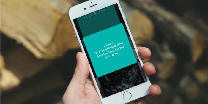
Say hello to our handy new app!

We’re all about helping our customers put their best face forward. While the Business Cards is one of the most effective ways to introduce yourself to potential clients, what about those times you need to show your work while on the move? We put our brightest minds on the case, and they built something special. Like, uber special.
Ta da! Monogram is a free new mobile app that’s built to help you share what you do, simply and beautifully. It makes it easy to share your latest creations over a cup of coffee or in an impromptu networking opportunity. Living somewhere between the simplicity of a business card and the richness of a website, Monogram is your mobile portfolio, which you can now carry around in your pocket.
So how did Monogram come to be?
We sat down with Chad Jennings, VP of Product and Design here at MOO, to find out. All day every day, Chad and his team figure out what products we’re going to build, how we’ll build them, and then fine-tune the slick user experience to add a splash of delight.
They’ve been busy building futuristic tools like NFC-enabled Business Cards and the Paper+ platform, genius right?!
This time around, they decided to really shake things up by taking a different approach. “We set up a small team in a different office away from our London headquarters to allow us to get together and think about problems in a new way,” Chad said.
Exploring the challenge
The team set off to explore new possibilities for what this thing could be. “The big breakthrough was focusing on the in-person meeting,” Chad explained. “Say you’re an illustrator, a business owner, or a designer. When you sit down with someone, or even just meet them in passing or while networking, you’re sharing something personal. We thought about, step-by-step, what that experience is like, and the tools that could really help you show your work.”
Sure, you could pull up your online portfolio as a meeting prop. But as Chad pointed out, “many people update their portfolio once every few years when they’re looking for a job or clients,” he said. “What we imagined is something that can be much more flexible, curated, and updated regularly.”
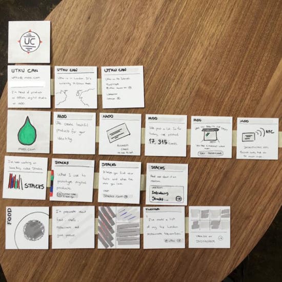
The team looked to the physical world for ways to turn what they had imagined into reality. Creative eyes fell upon the stacks of Square Business Cards piled high around the office. They started sketching directly on the cards, with each square representing an item you might share with a curious acquaintance: screenshots, product shots, Instagrams. In the process of sorting and resorting these cards, the tool began to come to life.
MOO’s Head of Digital Products explains in a Product Hunt thread; the idea was “to let you create something that was between an online profile, portfolio, and a CV that lived on your mobile phone and used a bunch of services you connected to it.”

Design, test, repeat
With preliminary designs at the ready, the team turned the idea into a working iOS prototype. OK, maybe it had some bugs… But being able to tap through an actual app, the team learned a lot about what worked and what may be missing from the experience.
The team didn’t hesitate to get the product in front of people early on. Approximately 800 MOO customers and friends used initial iterations of the app, providing feedback along the way. “We built a new version of the app about every two weeks,” Chad said. “That’s been an important part of our process to make this easy to use.”
Plenty of the feedback blew the team away, like this one: “I really love how flexible it is. It lets me tell a story.” But, as any good beta test does, this phase also unveiled a few key issues—for one, people were getting lost navigating the app. With that in mind, designer Jesse began experimenting with subtle movements that guide people through the app. You can get into the specifics behind Monogram’s user interface design over on Medium.
“We’re excited to see what creative uses people come up with.”
Another issue that came up was personalization. “Of course we could have tons of customization, but this is really about celebrating people’s own projects and enabling the work to stand out,” Chad explained. That said, the team gave people the ability to customize colors so they can brand the experience while still letting the work itself shine brightest.
Conversations with early testers also showed some unexpected approaches. One beta tester created a Monogram to tell a behind-the-scenes story, using images to guide listeners from a project’s nascent stages all the way to launch.
The most exciting possibilities still lie ahead, as Chad says. “We don’t really know exactly how everyone will use it, and we’re excited to see what creative uses people come up with.”
Last, but not least, the team set about preparing for the launch, including storyboards and moodboards for Monogram’s first starring role, the intro video:
We’re excited to see how YOU use Monogram to show your work and the process behind it.
Written by Katherine Leonard
Whether you’re hoping to attract new customers, inject some newness into your masthead, or maintain your market position, a brand refresh may be in order. For Las Vegas-based punk music label GC Records, staying current and reimagining a brand over time is directly tied to their success. Here’s their story.

The Label
Throughout the music industry crisis of the early 2000s, when file sharing and piracy became more widespread, GC Records continued to support bands through merchandise sales. “Sometimes we would find ourselves bankrolling the whole album to get a 7″ out,” Zargari says. They also saw the value in helping their artists during tours to get to the next city.
With the changing climate in the music industry, as bands gain access to platforms like iTunes to sell their music, artists don’t always think they need music labels. The major appeal for GC Records – aside from the small, boutique-like quality and personal relationship with the artists – is and has always been about the merchandise. When a band member or customer notices the labels’ artwork and attention to detail, they’re drawn in. Now, in their 16th year, Zargari credits the “transparent company culture” as a reason why they’re still going strong, “as opposed to a big label where you have no idea who is running the show.”
Evolving Visual Identity
The GC visual identity has taken many forms, beginning in 1999 with a symbolic star. “I was in college, and we didn’t know what we were doing. The first logo looked like the Converse star or a baseball logo — it was too simplistic and got lost in the shuffle,” Zargari admits.

After a solid three-year run and a falling out with the original logo artist, the label was ready for something that “would stand out — something hand-drawn and not built in Photoshop.” They approached a new artist in 2002, who created the monk concept which they all loved. The monk, jumping in the air while strumming the guitar, had a very distinct look and feel. “The billowing monk attire, the wildly pointy guitar, and angles made by his legs … It was very eye-catching and original,” says Zargari. “Because it was an illustration, you could see the meticulous design work that had to go into the creation of such an angular piece versus the super simple baseball star. And, in the end, it looked mighty sexy on the back sleeve of our releases.”
Building upon the success of the all black-and-white 2002 monk identity design, the angry comet logo of 2010 offered more options for printing and rendering on merchandise: one colour, two colours, or full colour. (The comet was also the inspiration for the bigger rebrand of 2015).
In 2008, Zargari and his team started work on their 10-year anniversary project – a DVD of highlights from the last decade – and GC Records commissioned London-based designer Delme Rosser to work on the design and artwork. “At that point in time I was designing a lot of artwork that ended up as stickers on walls or on the bottom of skate decks — strong colors, clean lines, passing pop culture references, and often containing some kind of mascot character.”
“The (existing) GC Records logo had a particular illustrative quality that I don’t work in,” Rosser explains.
But with so many logos and different music, GC needed people to care about the brand, and more importantly, to recognize it. And it’s worked.

The Big Brand Refresh
But why did they decide to completely rebrand in 2015? Zargari knew that a clear and consistent identity was in order, as he wanted to have one clear mark that represented the whole business. He and Rosser already had an established working relationship, and Rosser was an ideal artist to remake the logo. “I like what Shahab does,” Rosser says, “and working with his brand has been relaxed and organic. My aim has always been the same: Give the GC folks something that their fans will be happy to see, and that I know will look fun however they decide to implement it.”
“Given the chance to reboot the logo, I went with something that was more in line with what I was doing,” Rosser explains, “and something that captured what the ‘GC’ in GC Records represented.” “Geykido” is the English spelling of a Japanese word, meaning “ultimate anger,” so the name roughly translates to Angry Comet Records.
The New GC Vision
Delme Rosser’s signature style incorporates scary, stylized demonic cartoons — making his designs especially memorable. Devil-like horns with mouse ears is ironic, and he took the existing gloves concept to remake the chopped hand logo. But by the end of 2015, Rosser knew the logo design wasn’t translating well across the brand’s channels (especially social media), so he reworked it for all of the social platform constraints. The resulting design was colorful, clean, minimal and, of course, cartoonish.
“There’s something to be said for the one iconic logo that embodies the tone and voice of what we do. It gives all the personality that you need for the brand. Emoji-style —it’s universal,” Zargari says of the recent brand refresh. The easily discernible rocker hand symbolically represented their beginning as a punk label, while the bone-white hand contrasted nicely with the red blood.
While the prior star (1999) and monk designs (2002) were both flat, this logo brought consistency. Zargari was looking to achieve a more uniform brand identity and consistency after years of flexing and shape-shifting.

The Launch
The launch of the new GC Records identity was about reaction, put the design out there and let people react. You can see the new GC Records identity on every new release, profile image on social media, and die-cut stickers. Zargari rolled it out for the label’s 15 year anniversary marketing campaign with shirts rocking the new logo.
GC Records also ran a scavenger hunt across multiple cities to coincide with SXSW, and everything found by participants showcased the new GC logo. “One of the cities they hit was Austin, which fell in love with Peelander-Z, whose first 7″ we released in the early 2000s,” Zargari explains. The city falling in love with the band gave them a lot of exposure—which eventually led to Peelander-Z signing to an Austin record label.
The introduction to the new GC logo was subtle, yet strategic. Zargari wanted audiences to feel like this was always the logo — this is who GC Records is.
So how do they know the new logo is a win? Well, there’s always the wait-and-see period when a brand rolls out a new identity. Lucky for GC Records, they have an especially vocal audience, and the vocals have been raging positive since the latest chopped-hand logo release.
Time to reset your brand too? Check out our brand refresh checklist.
Written by Erin Prus
We recently ran a webcast with our friends MarketingProfs called Unlocking the Secrets of Employee Advocacy in which expert Julio Viskovich spilled the beans on how to make employees advocates for your brand. He also shares some tips on how to leverage your employee’s social media networks and the advocacy program to help drive the organic growth of your content marketing initiatives. If you missed it, fear not, we’ve got you covered. Here are the things you need to know.
Firstly, what is employee advocacy?
Your employees work for you, so you need to put a little work into them. The best way to do this is to channel passion in your employees so they feel empowered to become brand advocates. ‘Activating’ and engaging your employees affects all tiers of your business, from improved customer service to increased productivity—all joining forces to produce amazing results in your organization. But employee advocacy programs have some additional unexpected benefits that can boost your marketing strategy. We promised there would be secrets to unlock, didn’t we?
Tap into the employee (social) network
Your employees have social media profiles. You know this because you’ve caught one too many of them checking their Facebook when they should have been finishing that proposal. Instead of getting mad, you could actually harness your employee’s social media presence to promote your brand. If you add up the number of social media followers your employees have across their accounts and multiply those by the number of employees, you’ll see the kind of significant potential impressions from employee advocates. By creating an employee advocacy program, your employees will feel more inclined to share marketable content on their social media channels, leading to increased organic impressions to your content.
Rolling it out
Rolling out the employee advocacy program through employee social media networks is the first step towards actionable results on your new marketing campaign. But how do you communicate the program to your employees? Julio thinks this should be the core focus of your employee advocacy program. Many successful employee-led content initiatives programs have been rolled out by HR and Marketing departments as a part of a larger professional development program. This will present the program as advantageous and beneficial to the employees.
With both HR and Marketing working in unison, begin with a grassroots campaign led by your most ‘social’ employees, which will have a bubble-up effect to generate excitement amongst employees. Marketing teams should help employee participants deliver consistent messaging through the shared content—and it may even establish some employees as thought leaders in their online networks. Julio also notes to ensure a nice balance between educational content and promotional content, which will help grow your following while not coming across as hard-sellers to your customers.
Reaping the benefits
Julio shared a recent case study he worked on with Microsoft’s partner network to help rollout their first employee advocacy program. The company found that it had 1256 unique social media accounts, with over 222k total connections across popular social media platforms. This reach drove the cost-per-thousand impressions down to $.14 from $8 on average. That’s no small feat! While this will drive your costs and budgets down, it will also boost employee satisfaction, brand awareness, and lead generation. A true win-win scenario.
Pitching the program
But (there’s always a but) you can’t pitch this program to higher-ups on cost savings alone. The real value, according to Julio, comes from the fact that the program will scale past the marketing division into various departments—tearing down the silos. Before you seek the executive buy-in for a program like this, establish a team from different departments to share best practices and give input across the board. Be sure to include some higher ups from HR and Marketing in this group so they can provide influence over the implementation.
The takeaway
Social media networks are transforming business and marketing as we know it. Fostering the passion in your employees can create boundless opportunities for communicating your brand’s offering, whether by sharing original content on Facebook, or by just simply posting about what a great job they have. After all, studies show that people are more likely to engage with content shared by people as opposed to corporate messaging. So, content advocated by employees who feel advocated by their employers who advocate…well, you get what we mean. Advocate!
Interested in more info? Watch the webinar here:
Our Tailored Collection is inspiring creative minds everywhere and we love it when you share your experiences and results of using our Gloss and Gold Foil options.
Texas-based visual designer Jessica Kay Farris opted for Gold Foil when redesigning these stunning business cards. As well as taking these shots of the finished product, Jessica wrote a full review of how she found the experience.


When you’re tooting your own horn, networking is evergreen. But with an ever changing social and digital landscape it’s important to keep on top of the effective ways you communicate yourself and ensure you’re remembered. Here are some fool proof and trusty tips to make sure you don your next conference.
Before
Look ahead o the days you’ll be away at the conference and move any key projects or deadlines for those days, or make like wonder women and ensure they’re delivered in advance. Your aim is to be relaxed and undistracted to maximise your mingling.
Next turn your mind to why you’re attending this event. Are you looking to learn a new skill? Or looking for new clients? Or service providers? Conferences often have programmes with a range of events, make the most of these by matching your intention with the session. So save skill learning for the expert lectures, finding clients at lunchtime mixers and service providers during happy hour.
If your focus is growing your own profile, being active on the event hashtag with your social handle is a great way to be visible and also start new conversations. Familiarise yourself with the speakers and their chosen subject matter. Create a short list of relevant hashtags handles and write a few posts to go out a day or so before the event.
With a week to go, now is the time to refresh your Business Cards. Do they literally leave a lasting a impression? Do they have the most up to date contact details? Yes to all this? Ok, you’re ready to level up with NFC-enabled Business Cards+. These cards can be tapped on the back of a Android phone, giving your recipient instant access to whatever destination you’ve preset, i.e. LinkedIn profile page, your new app download page or your latest album on Spotify. Cool right?

During
Now you’ve arrived fresh and ready to implement your game plan! When meeting so many people in a day, it’s easy to get both overwhelmed and forget who you spoke to about what. No one is good with names right?! But as you’re meeting people and exchanging Business Cards make sure, that before you move on to, take a few moments to send them an email / instant message referring to yourself and what you spoke about. For example, “Hi, Toby! We met at the keynote today and talked about Kanye and sales strategy. Let’s stay in touch about our plans for 2016. Next time you’re in Boston, lunch is on me!”
Another great way of tracking conversations and contacts is to use Evernote, an app which has a great function allowing you to take pictures of Business Cards. The information on the card is then automatically inputted into your phone contacts. You could also immediately add your new contact on LinkedIn and save a note to remind you of who and why you want to follow up with them.
Finally, at the end of each day, organise all of the Business Cards you’ve received. Keep the ones you need, sort them into relevant groups, making notes in a document of your next actions or thoughts and get rid of the ones you don’t need. Doing this each day means you avoid that moment when, two weeks later, your four day schedule turns into one long action packed memory with a jumble of names and faces!

After
Woop, you did it! Post-conference glow usually last 48 hours before you’re knee deep in email and to-do lists. So to keep it fresh, refer back to your document no later than a week later. Set yourself a helpful reminder to either arrange a time to meet, speak or simply a thank the people you met for their time and attention. We know there’s a 1001 ways to digitally contact anyone, so going beyond the e-thanks with a personalised Notecard always stands out. If you don’t have any yet, choose here from plenty of pre-designed, professional options.
Written by Jillian Richardson