Designing for tomorrow: MOO, NFC and Paper+
-
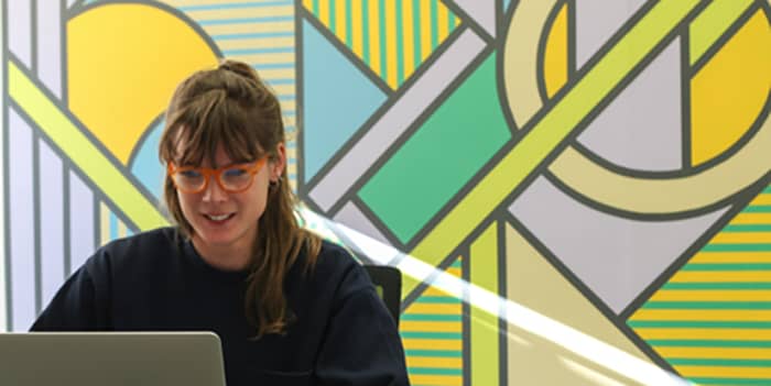
 The MOO Team
We’re on a mission to support the needs of MOO fandom and customers. So how do we design an easy-to-use, accessible system which helps them interact with our NFC technology, when it hasn’t even been invented yet? We caught up with the wonderful Suzy Willis, MOO’s Experience Designer. She shares some of the problem solving that came into play when designing our new Paper+ platform. Over to you Suzy!
Firstly, NFC stands for Near-Field Communication. This might sound a bit ‘sci-fi’ but we’re actually all using NFC regularly and probably don’t even realise it! If you have ever used a hotel room swipe key or a contactless payment system you are using NFC technology to help simplify certain tasks.
Each of these products has visual cues to help guide how we use them; like how Transport for London’s NFC ticket barriers direct you to sweep your Oyster cards across the readers. These visual cues are part of what we call an ‘“affordance”.
An affordance is the relationship between an object and its environment. For example, a door handle might ‘afford’ the action of pulling; it’s mounted at hip level and looks like you can clasp it with your hands. The design leads this action. When successfully designed, a person will unconsciously carry out an action with an object.
In the digital domain, affordance is communicated via screen objects (things like buttons, or hyperlinks). How they look sets expectations on how they perform. The more consistent the design, the stronger the affordance becomes. We understand how hyperlinks work now, because it has become a standard design pattern which we’ve been using for a while.
NFC technology is relatively new, so there is no standardized visual cue to communicate its affordance. With the absence of learnt behaviour, the design needs to work harder to be adopted as intuitive behaviour. Common NFC icon designs are similar to the Wi-Fi logo, with graphic lines that look like active pulses. Much like the way cartoon movement is indicated by sweeping lines, which help to indicate the tapping interaction.
So what does this mean for MOO?
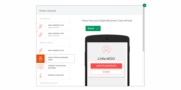
Paper+ is ‘smart’ paper which, when tapped by an NFC reader or smartphone, links to online content or triggers a digital action. As this is a new product and behaviour, the initial use of the card and the platform’s visuals must establish easily understood actions. Metaphors. This is in order to guide users intuitively and to help them feel confident and in control.
The Paper+ symbol aims to communicate the embedded technology and associated action to take upon the product. It follows the common convention of NFC ‘pulses’ with the ‘+’ to contextualise the environment in which the paper is used. Justin Hallstrom, who designed the symbol – together with Millie Davies – describes the design rationale:
“We went through an extensive exploration of various marks and symbols. The main issue was distilling the brief and defining the main purpose of the icon. Was it a stand alone brandmark? Or a symbol to signify the “tap” action? Once this had been established the solution became pretty obvious to us.

The end result uses the NFC ‘pulses’, which have become a recognised contactless icon. Combined with the + sign, it ties it together with the overarching Business Cards+ branding without sacrificing the user experience”.
What if you could have the ease of NFC technology applied to business networking? We know that NFC might sound like a football team, but it’s actually an amazing way to stand out out from the crowd and get yourself noticed.
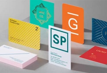
Welcome to Business Cards+.
Keep in touch
Get design inspiration, business tips and special offers straight to your inbox with our MOOsletter, out every two weeks.
Share post
Keep in touch
Get design inspiration, business tips and special offers straight to your inbox with our MOOsletter, out every two weeks.