About this design
Back to designs
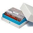
I’ve used the negatives to steer the design. The imagery is meant to be beautiful, almost epic. And to me, monochrome just feels quite classic. The other side continues the negative theme, but overlays bold monochrome details over the top. It’s a great design if you’re a director or producer .
About the designer
Stephen Turner is a graphic/product designer who grew up in Kent, and graduated from London's Brunel University with a BA in Industrial Design. Steve has a particular interest in brands, and loves everything minimal. When not at a computer, he’ll be playing sport (until injured, probably).
Browse Luxe Notecards designs by category
By style
- graphic (92)
- illustration (6)
- photographic (14)
By use
By colour
By category
Share this design
New to MOO?
-

Business Cards
From AU$20.00(incl. GST AU$1.82) -
MiniCards
From AU$19.00(incl. GST AU$1.73) -
StickerBooks
From AU$8.00(incl. GST AU$0.73) -

Sticky Labels
From AU$30.00(incl. GST AU$2.73)